Key Things to Remember
Not all charts need to be pretty!

What to Remember from this Section
Exploratory data analysis plotting should be quick and simple and base R excels at this
| Visualization | Function |
|---|---|
| Strip chart | stripchart() |
| Histogram | hist() |
| Density plot | plot(density()) |
| Box plot | boxplot() |
| Bar chart | barplot() |
| Dot plot | dotchart() |
| Scatter plot | plot(), pairs() |
| Line chart | plot() |
What to Remember from this Section
In R, graphs are typically created interactively:
attach(mtcars)
plot(wt, mpg)
abline(lm(mpg~wt))
title("Regression of MPG on Weight")

What to Remember from this Section
You can specify fonts, colors, line styles, axes, reference lines, etc. by specifying graphical parameters
This allows a wide degree of customization; however…
I have found that ggplot is an easier syntax for customization needs
Data Used…
Import the following data sets from the data folder
facebook.tsv
reddit.csv
race-comparison.csv
Supermarket Transactions.xlsx
Univariate Visualizations
Continuous Variables: Strip Chart
Useful when sample sizes are small but not when sample size are large
stripchart(mtcars$mpg, pch = 16)
stripchart(facebook$tenure, pch = 16)

Continuous Variables: Histogram
hist(facebook$tenure)

hist(facebook$tenure, breaks = 100, col = "grey", main = "Facebook User Tenure", xlab = "Tenure (Days)")

Continuous Variables: Histogram
A perfect example of why customization with base R is not always enjoyable; in ggplot this is far simpler
x <- na.omit(facebook$tenure)

# histogram
h<-hist(x, breaks = 100, col = "grey", main = "Facebook User Tenure", xlab = "Tenure (Days)")

# add a normal curve
xfit <- seq(min(x), max(x), length = 40)
yfit <- dnorm(xfit, mean = mean(x), sd = sd(x))
yfit <- yfit * diff(h$mids[1:2]) * length(x)
lines(xfit, yfit, col = "red", lwd = 2)

Continuous Variables: Density Plot
Enclose density(x) within plot()
# basic density plot
d <- density(facebook$tenure, na.rm = TRUE)

plot(d, main = "Kernel Density of Tenure")

# fill denisty plot by adding polygon()
polygon(d, col = "red", border = "blue")

Continuous Variables: Box Plot
The previous methods provide good insights into the shape of the distribution but don't necessarily tell us about specific summary statistics such as:
summary(facebook$tenure)
##    Min. 1st Qu.  Median    Mean 3rd Qu.    Max.    NA's
##     0.0   226.0   412.0   537.9   675.0  3139.0       2
However, boxplots provide a concise way to illustrate these standard statistics, the shape, and outliers of data:
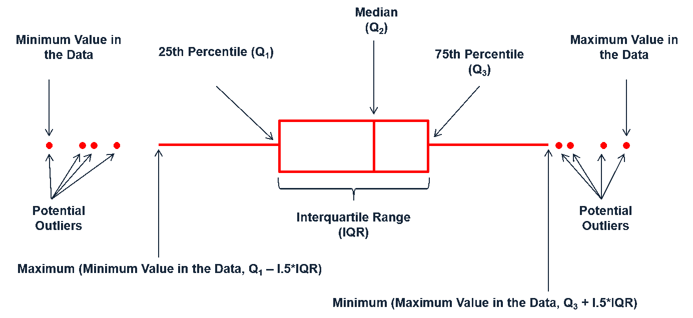
Continuous Variables: Box Plot
boxplot(facebook$tenure, horizontal = TRUE)
boxplot(facebook$tenure, horizontal = TRUE, notch = TRUE, col = "grey40")

Your Turn
Using the facebook.tsv data…
Visually assess the continuous variables. What do you find?
Categorical Variables: Bar Chart
reddit <- read.csv("data/reddit.csv")

table(reddit$dog.cat)
##
##    I like cats.    I like dogs. I like turtles.
##           11156           17151            4442

barplot(table(reddit$dog.cat))

Categorical Variables: Bar Chart
pets <- table(reddit$dog.cat)

barplot(pets, main = "Reddit User Animal Preferences", col = "cyan")

par(las = 1)
barplot(pets, main = "Reddit User Animal Preferences", horiz = TRUE, names.arg = c("Cats", "Dogs", "Turtles"))

Categorical Variables: Bar Chart
What if we want to visualize data regarding many categories…
library(dplyr)

state <- reddit %>%
        group_by(state) %>%
        tally() %>%
        arrange(n) %>%
        filter(state != "")

state
## # A tibble: 52 x 2
##            state     n
##           <fctr> <int>
## 1        Ontario     1
## 2        Wyoming    20
## 3   South Dakota    28
## 4   North Dakota    34
## 5        Montana    46
## 6    Mississippi    48
## 7  West Virginia    51
## 8       Delaware    59
## 9         Hawaii    68
## 10  Rhode Island    72
## # ... with 42 more rows
Categorical Variables: Bar Chart
Bar charts work but…

Categorical Variables: Dot Plot
dot plots provide less noise
dotchart(state$n,labels = state$state, cex = .7)

Your Turn
Using the reddit.csv data…
1. Assess the frequency of education levels. What does this tell you?
Hint: preceed your plot function with par(mar = c(5,15,1,1), las = 2)
2. Assess how the different cheeses rank with Reddit users. What does this tell you?
Multivariate Visualizations
Scatter Plot
plot(x = race$White_unemployment, y = race$Black_unemployment, pch = 16, col = "blue")
plot(x = race$Black_unemployment, y = race$black_college, pch = 16, col = "blue")

Scatter Plot
We can fit lines to the data but need to use ~ instead of x & y
par(mar = c(5,5,1,1))
plot(White_unemployment ~ Black_unemployment, data = race)
abline(lm(White_unemployment ~ Black_unemployment, data = race), col = "red")
lines(lowess(race$White_unemployment ~ race$Black_unemployment), col = "blue")

Scatter Plot Matrix
We can assess scatter plots for multiple variables at once
par(mar = c(2,2,2,2))
pairs(race)

Line Chart
plot(x = race$Year, y = race$black_college, type = "l")
plot(x = race$Year, y = race$black_college, type = "s")
plot(x = race$Year, y = race$Black_unemployment, type = "b")

Line Chart
plot(x = race$Year, y = race$Black_hs, type = "l", ylim = c(0, max(race$Black_hs)))       # initial plot
lines(x = race$Year, y = race$black_college, col = "red")  # add points to second line
lines(x = race$Year, y = race$Black_unemployment, col = "blue", lty = 2)
legend("topleft", legend = c("HS Rate", "College Rate", "Unemployment"),
       col = c("black", "red", "blue"), lty = c(1, 1, 2))

Box Plot
library(readxl)
supermarket <- read_excel("data/Supermarket Transactions.xlsx", sheet = "Data")

boxplot(supermarket$Revenue)
boxplot(Revenue ~ Gender, data = supermarket)
boxplot(Revenue ~ Gender + `Marital Status`, data = supermarket)

Your Turn
Using the supermarket data analyze revenue by…
- Date
- Homeownership
- City
- Product family/category
- Etc.
What do you find?
Bar Chart
Bar chart can help to compare multiple categories
counts <- table(supermarket$`Marital Status`, supermarket$Children)

barplot(counts, col = c("darkblue", "red"), legend = c("Married", "Single"))
barplot(counts, col = c("darkblue", "red"), legend = c("Married", "Single"), beside = TRUE)

Your Turn
Using the supermarket data compare counts of…
- Product Family by Homeownership
- Annual Income by Homeownership
- Country by Gender
- Etc.
What do you find?
Key Things to Remember
Remember These Functions!
| Visualization | Function |
|---|---|
| Strip chart | stripchart() |
| Histogram | hist() |
| Density plot | plot(density()) |
| Box plot | boxplot() |
| Bar chart | barplot() |
| Dot plot | dotchart() |
| Scatter plot | plot(), pairs() |
| Line chart | plot() |
Break
5 minutes!