![]() Follow me on twitter @bradleyboehmke
Follow me on twitter @bradleyboehmke
![]() Follow me on twitter @bradleyboehmke
Follow me on twitter @bradleyboehmke
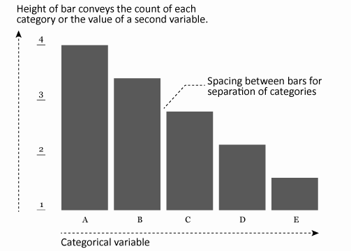
Bar charts are one of the most commonly used data visualizations. The primary purpose of a bar chart is to illustrate and compare the values for a set of categorical variables. To accomplish this, bar charts display the categorical variables of interest (typically) along the x-axis and the length of the bar illustrates the value along the y-axis. Consequently, the length of the bar is the primary visual cue in bar chart and this length can represent counts of cases in the data set or values for a second variable.
This tutorial will cover how to go from a basic bar chart to a more refined, publication worthy graphic. If you’re short on time jump to the sections of interest:
To reproduce the code throughout this tutorial you will need to load the following packages. The primary package of interest is ggplot2, which is a plotting system for R. You can build bar charts with base R graphics, but when I’m building more refined graphics I lean towards ggplot2.
library(xlsx)           # for reading in Excel data
library(dplyr)          # for data manipulation
library(tidyr)          # for data manipulation
library(magrittr)       # for easier syntax in one or two areas
library(gridExtra)      # for generating some comparison plots
library(ggplot2)        # for generating the visualizations
☛ See Working with packages for more information on installing, loading, and getting help with packages.
In addition, for most of my examples I will illustrate with the built in mtcars data set. However, for the final section I use some data that comes from Pew Research on America’s shrinking middle class. You can obtain the data from here. After importing and cleaning up the worksheet a bit the data looks as follows, which includes the distribution of adults by income tiers in 2000 and 2014 across 229 metro locations across the U.S.
# read in PEW data
income <- read.xlsx("Data/PEW Middle Class Data.xlsx",
                    sheetIndex = "1. Distribution, metro",
                    startRow = 10, colIndex = c(1:4, 6:8)) %>%
        set_colnames(c("Metro", "Lower_00", "Middle_00", "Upper_00", "Lower_14",
                       "Middle_14", "Upper_14")) %>%
        filter(Metro != "NA")

head(income)
##                               Metro Lower_00 Middle_00 Upper_00 Lower_14 Middle_14 Upper_14
## 1                         Akron, OH    19.90     59.82    20.28    24.49     54.64    20.87
## 2       Albany-Schenectady-Troy, NY    22.09     60.07    17.84    20.15     55.08    24.78
## 3                   Albuquerque, NM    28.62     55.35    16.03    33.02     50.67    16.32
## 4 Allentown-Bethlehem-Easton, PA-NJ    23.04     60.74    16.21    25.21     55.73    19.06
## 5                      Amarillo, TX    32.25     54.72    13.04    27.42     52.56    20.02
## 6                     Anchorage, AK    21.97     58.22    19.81    20.25     55.52    24.23
As mentioned in the introduction bar charts are used to represent either the counts of cases of each category or the values of a second variable for each category. For instance, the mtcars data set comprises fuel consumption and 10 aspects of automobile design and performance for 32 automobiles.
head(mtcars)
##                    mpg cyl disp  hp drat    wt  qsec vs am gear carb
## Mazda RX4         21.0   6  160 110 3.90 2.620 16.46  0  1    4    4
## Mazda RX4 Wag     21.0   6  160 110 3.90 2.875 17.02  0  1    4    4
## Datsun 710        22.8   4  108  93 3.85 2.320 18.61  1  1    4    1
## Hornet 4 Drive    21.4   6  258 110 3.08 3.215 19.44  1  0    3    1
## Hornet Sportabout 18.7   8  360 175 3.15 3.440 17.02  0  0    3    2
## Valiant           18.1   6  225 105 2.76 3.460 20.22  1  0    3    1
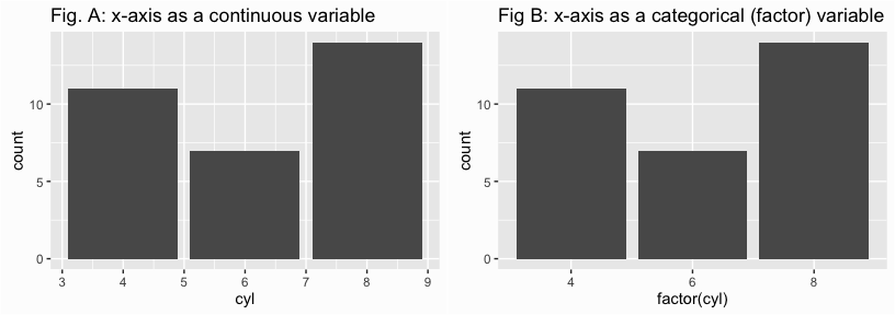
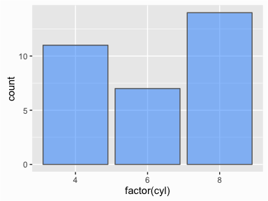
If we wanted to get the count of vehicles that have 4, 6 and 8 cylinders we can simply identify the x-axis variable and apply geom_bar(). This, by default will plot the count of 4, 6, and 8 cylinder vehicles in the data set. However, note that if the variable is numeric it may be interpreted as a continous variable. This is the case in Fig. A which is why the x-axis is continous in nature. We can force the cylinder variable to a categorical (factor) variable by applying x = factor(cyl) as in Fig. B, which produces a discrete x-axis.
library(ggplot2)
library(gridExtra)

# x-axis as continuous
p1 <- ggplot(mtcars, aes(x = cyl)) +
        geom_bar() +
        ggtitle("Fig. A: x-axis as a continuous variable")

# x-axis as categorical
p2 <- ggplot(mtcars, aes(x = factor(cyl))) +
        geom_bar() +
        ggtitle("Fig B: x-axis as a categorical (factor) variable")

grid.arrange(p1, p2, ncol = 2)
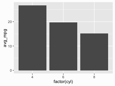
An alternative use of a bar chart is to plot a second variable on the y-axis to compare the x-axis categories across. For instance, we may want to assess the average mpg that 4, 6, and 8 cylinder cars get. To do this, we first calculate the average mpg for each cylinder and then incorprate mpg as the y-axis variable. We also need to include the argument stat = "identity" in geom_bar() which tells R to use the y values for the height of the bars.
library(dplyr)

cyl_mpg <- mtcars %>%
        group_by(cyl) %>%
        summarise(avg_mpg = mean(mpg, na.rm = TRUE))

ggplot(cyl_mpg, aes(x = factor(cyl), y = avg_mpg)) +
        geom_bar(stat = "identity")
☛ See the dplyr tutorial for more information on data transformation with the dplyr package.
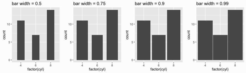
Although the default width of the bars is aesthetically pleasing, you do have the ability to adjust this attribute by setting the width in geom_bar(). The default width is 0.9; smaller values make the bars narrower and larger values (max width of 1) make the bars wider.
p1 <- ggplot(mtcars, aes(x = factor(cyl))) +
        geom_bar(width = .5) +
        ggtitle("bar width = 0.5")


p2 <- ggplot(mtcars, aes(x = factor(cyl))) +
        geom_bar(width = .75) +
        ggtitle("bar width = 0.75")

p3 <- ggplot(mtcars, aes(x = factor(cyl))) +
        geom_bar(width = .9) +
        ggtitle("bar width = 0.9")

p4 <- ggplot(mtcars, aes(x = factor(cyl))) +
        geom_bar(width = .99) +
        ggtitle("bar width = 0.99")

grid.arrange(p1, p2, p3, p4, ncol = 4)
We can also adjust the fill and outline colors of the bars along with the opacity by applying fill, color, and alpha arguments respectively in the geom_bar() function.
ggplot(mtcars, aes(x = factor(cyl))) +
        geom_bar(fill = "dodgerblue", color = "grey40", alpha = .5)
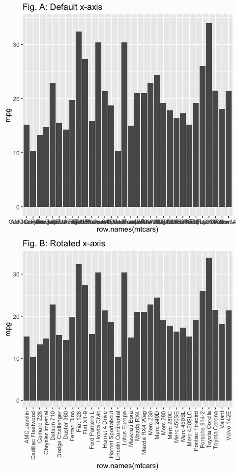
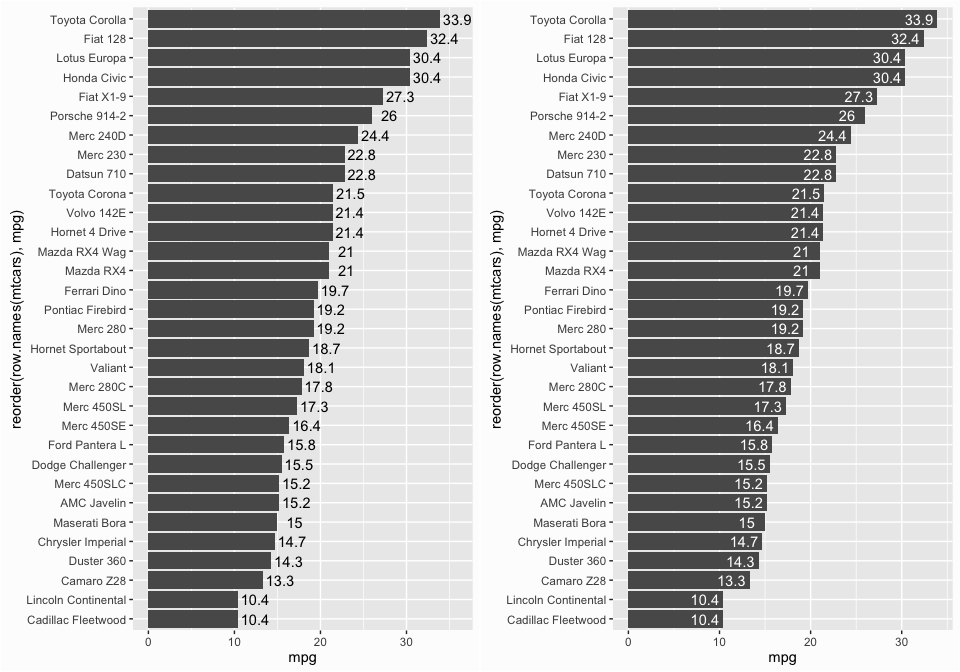
There are also times when we want to plot many categories along the x-axis and the length of the names make it difficult to read. One approach to resolving this issue is to use axis.text.x argument within the theme() function to rotate the text.
p1 <- ggplot(mtcars, aes(x = row.names(mtcars), y = mpg)) +
        geom_bar(stat = "identity") +
        ggtitle("Fig. A: Default x-axis")

p2 <- ggplot(mtcars, aes(x = row.names(mtcars), y = mpg)) +
        geom_bar(stat = "identity") +
        theme(axis.text.x = element_text(angle = 90, hjust = 1, vjust = .5)) +
        ggtitle("Fig. B: Rotated x-axis")

grid.arrange(p1, p2, ncol = 1)
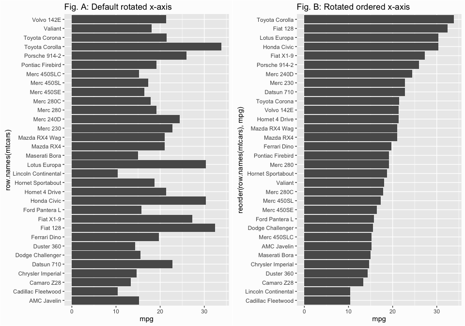
However, if you’re like me then you probably hate to read rotated x-axis labels. In cases like these I think rotated bar charts are far more appealing. We can rotate the the axes by applying the coord_flip() function, which flips the x and y coordinates. To make this even easier to digest we can order the vehicles based on their mpg values as illustrated in Fig B. To do this just reorder the x variable by applying the reorder() function.
# rotate to make more readable
p1 <- ggplot(mtcars, aes(x = row.names(mtcars), mpg)) +
        geom_bar(stat = "identity") +
        coord_flip() +
        ggtitle("Fig. A: Default rotated x-axis")

# order bars
p2 <- ggplot(mtcars, aes(x = reorder(row.names(mtcars), mpg), y = mpg)) +
        geom_bar(stat = "identity") +
        coord_flip() +
        ggtitle("Fig. B: Rotated ordered x-axis")

grid.arrange(p1, p2, ncol = 2)
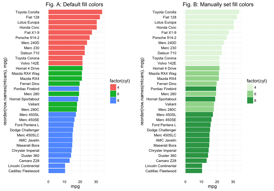
Sometimes we want to compare different groups across the categorical variables of interest. This is primarily done via color, side-by-side bars, or stacked bars. To add a color dimension we simply add a fill argument to our first line of code to tell R what variable we want to use to color our bars. In this example we compare mpg across all the vehicles but also color the vehicles based on number of cylinders. R will use default color codings but you can set the colors manually using scale_fill_manual as in Fig. B; you can also use scale_fill_hue to change the hue across vehicles, scale_fill_brewer to color with preset color schemes (see more about ColorBrewer at http://colorbrewer2.org), etc. There are many coloring options and if you type scale_fill into your RStudio help search field you will see all the possibilities.
# compare mpg across all cars and color based on cyl
p1 <- ggplot(mtcars, aes(x = reorder(row.names(mtcars), mpg), y = mpg, fill = factor(cyl))) +
        geom_bar(stat = "identity") +
        coord_flip() +
        theme_minimal() +
        ggtitle("Fig. A: Default fill colors")

p2 <- ggplot(mtcars, aes(x = reorder(row.names(mtcars), mpg), y = mpg, fill = factor(cyl))) +
        scale_fill_manual(values = c("#e5f5e0", "#a1d99b", "#31a354")) +
        geom_bar(stat = "identity") +
        coord_flip() +
        theme_minimal() +
        ggtitle("Fig. B: Manually set fill colors")

grid.arrange(p1, p2, ncol = 2)
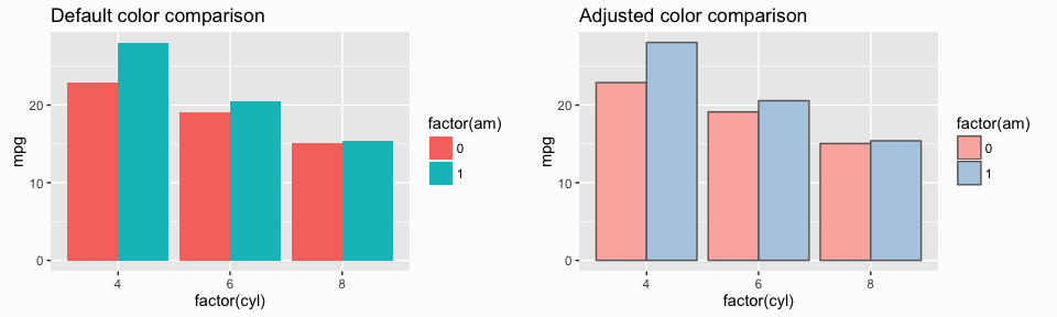
We can also use side-by-side bars to make comparisons. Say we want to compare the average mpg for cars across the different 4, 6, and 8 cylinder categories but also assess the impact that transmission (variable am where 0 = automatic, 1 = manual) has. In this case we want to first summarize our data by calculating mean mpg by cylinder and transmission and then we apply the fill argument to color bars based on transmission type then include the position = "dodge" in the geom_bar() function. This tells R to have two bars for each cylinder type, color fill each bar based on the type of transmission and then adjust (aka “dodge”) the position of the bars so that they are side-by-side.
library(dplyr)
avg_mpg <- mtcars %>%
        group_by(cyl, am) %>%
        summarise(mpg = mean(mpg, na.rm = TRUE))

avg_mpg
## Source: local data frame [6 x 3]
## Groups: cyl [?]
##
##     cyl    am      mpg
##   (dbl) (dbl)    (dbl)
## 1     4     0 22.90000
## 2     4     1 28.07500
## 3     6     0 19.12500
## 4     6     1 20.56667
## 5     8     0 15.05000
## 6     8     1 15.40000

p1 <- ggplot(avg_mpg, aes(factor(cyl), mpg, fill = factor(am))) +
        geom_bar(stat = "identity", position = "dodge") +
        ggtitle("Default color comparison")

# more pleasing colors
p2 <- ggplot(avg_mpg, aes(factor(cyl), mpg, fill = factor(am))) +
        geom_bar(stat = "identity", position = "dodge", color = "grey40") +
        scale_fill_brewer(palette = "Pastel1") +
        ggtitle("Adjusted color comparison")

grid.arrange(p1, p2, ncol = 2)
☛ See the dplyr tutorial for more information on data transformation with the dplyr package.
You can adjust the dodge width by incorporating the position = position_dodge(width = x) argument in the geom_bar() function. By default, the width is .90 and a lower value will create overlap of your side-by-side bars and a larger value will create spacing between the bars.
p1 <- ggplot(avg_mpg, aes(factor(cyl), mpg, fill = factor(am))) +
        geom_bar(stat = "identity", position = "dodge") +
        ggtitle("Default dodge positioning") +
        theme(legend.position = "none")

p2 <- ggplot(avg_mpg, aes(factor(cyl), mpg, fill = factor(am))) +
        geom_bar(stat = "identity", position = position_dodge(width = .5)) +
        ggtitle("Overlap of side-by-side bars") +
        theme(legend.position = "none")

p3 <- ggplot(avg_mpg, aes(factor(cyl), mpg, fill = factor(am))) +
        geom_bar(stat = "identity", position = position_dodge(width = 1)) +
        ggtitle("Spacing between side-by-side bars") +
        labs(fill = "AM") +
        theme(legend.position = c(1,1), legend.justification = c(1,1),
              legend.background = element_blank())

grid.arrange(p1, p2, p3, ncol = 3)

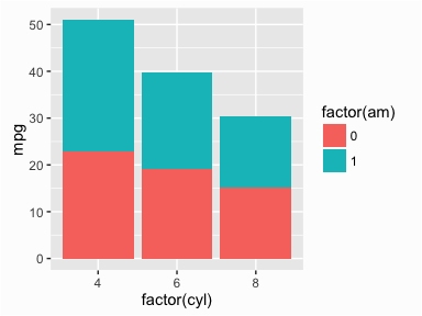
Stacked bars are the third common approach to compare groups with bar charts. By default, when you introduce a variable to color fill with in the first line, if you enter no other arguments ggplot will produce a stacked bar chart.
ggplot(avg_mpg, aes(factor(cyl), mpg, fill = factor(am))) +
        geom_bar(stat = "identity")
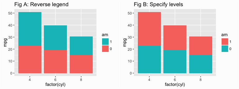
Unfortunately, the way ggplot color codes the bars is opposite to how the colors are displayed in the legend. We can resolve this two different ways; either reverse the legend with the arguments displayed in the guides() function in Fig A. or specify the direction of the levels when transforming the transmission (am) variable into a factor as displayed in the first line of code in Fig B. Both will align the legend color coding layout to the color coding of the stacked bars but each option also helps determine which color is top versus on the bottom.
# Reverse legend color coding layout
p1 <- ggplot(avg_mpg, aes(factor(cyl), mpg, fill = factor(am))) +
        geom_bar(stat = "identity") +
        guides(fill = guide_legend(reverse = TRUE)) +
        labs(fill = "am") +
        ggtitle("Fig A: Reverse legend")

# or reverse stacking order by changing the factor levels
p2 <- ggplot(avg_mpg, aes(factor(cyl), mpg, fill = factor(am, levels = c(1, 0)))) +
        geom_bar(stat = "identity") +
        labs(fill = "am") +
        ggtitle("Fig B: Specify levels")

grid.arrange(p1, p2, ncol = 2)
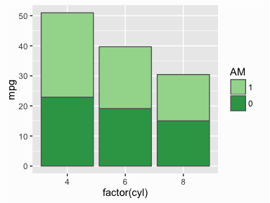
And as before we can change the color of our stacked bars by incorporating one of the many scale_fill_xxxx arguments. Here I manually specify the colors to apply with scale_fill_manual().
ggplot(avg_mpg, aes(factor(cyl), mpg, fill = factor(am, levels = c(1, 0)))) +
        geom_bar(stat = "identity", color = "grey40") +
        scale_fill_manual(values = c("#a1d99b", "#31a354")) +
        labs(fill = "AM")
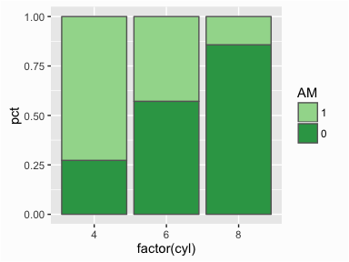
A common version of the stacked bar chart that you will see is the proportional stacked bar chart. In the proportional stacked bar chart each x-axis category will have stacked bars that combine to equal 100%. This allows you to see what percentage of that x-axis category is determined by an additional variable. For example, what if we want to understand what percentage of cars with 4, 6, and 8 cylinders are manual versus automatic transmission? In this case, we first tally the number of vehicles in each cylinder and transmission category and then calculate the percentages of the total cars in each cylinder category. We then use this information to create a stacked bar chart.
# calculate percentages of each cyl & am category
proportion <- mtcars %>%
        group_by(cyl, am) %>%
        tally() %>%
        group_by(cyl) %>%
        mutate(pct = n / sum(n))

proportion
## Source: local data frame [6 x 4]
## Groups: cyl [3]
##
##     cyl    am     n       pct
##   (dbl) (dbl) (int)     (dbl)
## 1     4     0     3 0.2727273
## 2     4     1     8 0.7272727
## 3     6     0     4 0.5714286
## 4     6     1     3 0.4285714
## 5     8     0    12 0.8571429
## 6     8     1     2 0.1428571

# create proportional stacked bars
ggplot(proportion, aes(factor(cyl), pct, fill = factor(am, levels = c(1, 0)))) +
        geom_bar(stat = "identity", color = "grey40") +
        scale_fill_manual(values = c("#a1d99b", "#31a354")) +
        labs(fill = "AM")
☛ See the dplyr tutorial for more information on data transformation with the dplyr package.
Often, it is helpful to provide labels/markers on the bar charts to help the reader interpret the results correctly or just to make it easier to read the graphic. For instance, we can add the actual mpg value to the following vertical bar chart by incorporating the geom_text() function and telling the function to label each bar with the mpg value. I can also tell ggplot to nudge the values left or right sit within or outside the bar and also color the text.
p1 <- ggplot(mtcars, aes(reorder(row.names(mtcars), mpg), mpg)) +
        geom_bar(stat = "identity") +
        coord_flip() +
        geom_text(aes(label = mpg), nudge_y = 2)

p2 <- ggplot(mtcars, aes(reorder(row.names(mtcars), mpg), mpg)) +
        geom_bar(stat = "identity") +
        coord_flip() +
        geom_text(aes(label = mpg), nudge_y = -2, color = "white")

grid.arrange(p1, p2, ncol = 2)
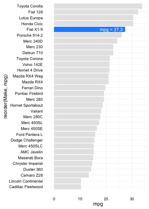
If you want to draw attention to one specific bar you can create a new TRUE/FALSE variable that marks the specific vehicle of interest. In the following case I also add the Make of the car as a variable since the mtcars only uses the make as a row name, which can be erased when making changes to the data frame. You can then fill by the new ID variable in the first line of code and use annotate() to specify the exact text you want to highlight for that bar.
cars <- mtcars %>%
        mutate(Make = row.names(mtcars),
               ID = ifelse(Make == "Fiat X1-9", TRUE, FALSE))

ggplot(cars, aes(reorder(Make, mpg), mpg, fill = ID)) +
        geom_bar(stat = "identity") +
        coord_flip() +
        scale_fill_manual(values = c("grey90", "dodgerblue")) +
        annotate("text", x = "Fiat X1-9", y = 22, label = "mpg = 27.3", color = "white") +
        theme_minimal() +
        theme(legend.position = "none")
☛ See the dplyr tutorial for more information on data transformation with the dplyr package.
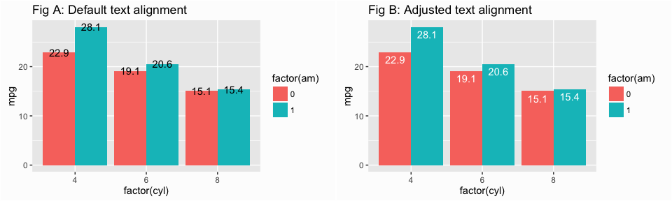
Labelling grouped bars is similar, however, we need to add a position = position_dodge(0.9) argument to the geom_text() function to tell ggplot to adjust the text location. By default, the values will be centered on the top of the bar (Fig. A) but you can adjust the text to the top of the bar by including a vjust = .5 argument or adjust the text to within the bar with vjust = 1.5 (Fig. B).
p1 <- ggplot(avg_mpg, aes(factor(cyl), mpg, fill = factor(am))) +
        geom_bar(stat = "identity", position = "dodge") +
        geom_text(aes(label = round(mpg, 1)), position = position_dodge(0.9)) +
        ggtitle("Fig A: Default text alignment")

p2 <- ggplot(avg_mpg, aes(factor(cyl), mpg, fill = factor(am))) +
        geom_bar(stat = "identity", position = "dodge") +
        geom_text(aes(label = round(mpg, 1)), position = position_dodge(0.9),
                  vjust = 1.5, color = "white") +
        ggtitle("Fig B: Adjusted text alignment")

grid.arrange(p1, p2, ncol = 2)
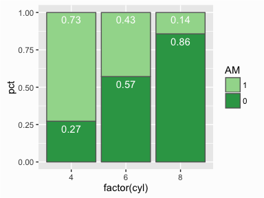
To add labels to a proportional bar chart we need to create a new variable in or data frame to specify the location. To do this I create a label_y variable that just cumsums the proportions for each cylinder. You can then map the label variables to these values by incorporating the y = label_y argument in geom_text() which will place the labels at the top of of each stacked proportion bar.
# create label location for each proportional bar
proportion <- proportion %>%
        group_by(cyl) %>%
        mutate(label_y = cumsum(pct))

ggplot(proportion, aes(factor(cyl), pct, fill = factor(am, levels = c(1, 0)))) +
        geom_bar(stat = "identity", color = "grey40") +
        geom_text(aes(label = round(pct, 2), y = label_y), vjust = 1.5, color = "white") +
        scale_fill_manual(values = c("#a1d99b", "#31a354")) +
        labs(fill = "AM")
☛ See the dplyr tutorial for more information on data transformation with the dplyr package.
We can bring a lot of these components together, plus add some nice finishing touches to create a publication worthy. To illustrate I’ll use the income data that we imported in the Replication Requirements section; however, being that I live in Dayton, OH I am primarily interested in assessing how the distribution of adults by income tier has changed from 2000 to 2014. To assess this let’s first filter our data to focus just on the Dayton, OH metro area and then create our basic categories to compare the percent of adults across.
dayton <- income %>%
        filter(Metro == "Dayton, OH") %>%
        gather(metric, value, -Metro) %>%
        separate(metric, into = c("class", "year")) %>%
        mutate(year = ifelse(year == "00", 2000, 2014),
               value = value/100)

dayton
##        Metro  class year  value
## 1 Dayton, OH  Lower 2000 0.2209
## 2 Dayton, OH Middle 2000 0.5802
## 3 Dayton, OH  Upper 2000 0.1989
## 4 Dayton, OH  Lower 2014 0.2693
## 5 Dayton, OH Middle 2014 0.5272
## 6 Dayton, OH  Upper 2014 0.2035
☛ See the dplyr tutorial for more information on data transformation with the dplyr package.
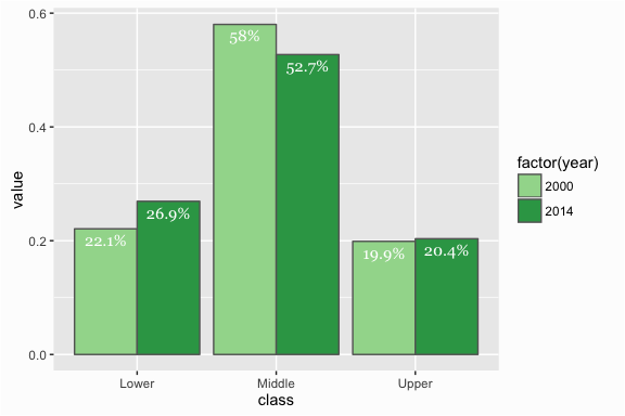
We can now create our basic bar chart that is a side-by-side comparison.
plot <- ggplot(dayton, aes(x = class, y = value, fill = factor(year))) +
        geom_bar(stat = "identity", position = "dodge", color = "grey40")+
        scale_fill_manual(values = c("#a1d99b", "#31a354"))

plot

Now let’s add some labels to the plot; however, I want to create nicely formatted labels so rather than just use the value variable I’ll create a new y_label variable with a percent formatted number. We can now add these values to our plot with geom_text().
dayton <- dayton %>%
        mutate(y_label = paste0(round(value*100, 1), "%"))

dayton
##        Metro  class year  value y_label
## 1 Dayton, OH  Lower 2000 0.2209   22.1%
## 2 Dayton, OH Middle 2000 0.5802     58%
## 3 Dayton, OH  Upper 2000 0.1989   19.9%
## 4 Dayton, OH  Lower 2014 0.2693   26.9%
## 5 Dayton, OH Middle 2014 0.5272   52.7%
## 6 Dayton, OH  Upper 2014 0.2035   20.4%

plot <- ggplot(dayton, aes(x = class, y = value, fill = factor(year))) +
        geom_bar(stat = "identity", position = "dodge", color = "grey40") +
        scale_fill_manual(values = c("#a1d99b", "#31a354")) +
        geom_text(aes(label = y_label), position = position_dodge(0.9),
                 vjust = 1.5, color = "white", family = "Georgia")

plot
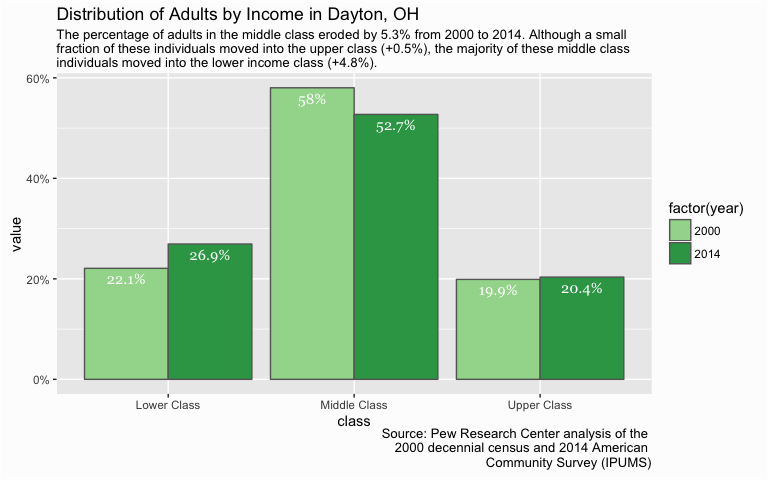
This is looking pretty good but now let’s add some clarity to our message by making the y axis displayed in percent form via scale_y_continuous(), create better labels for our x-axis categories via scale_x_discrete(), and add a title, subtitle and caption via labs().
plot <- plot +
        scale_y_continuous(labels = scales::percent) +
        scale_x_discrete(labels = c("Lower" = "Lower Class",
                         "Middle" = "Middle Class", "Upper" = "Upper Class")) +
        labs(title = "Distribution of Adults by Income in Dayton, OH",
             subtitle = "The percentage of adults in the middle class eroded by 5.3% from 2000 to 2014. Although a small \nfraction of these individuals moved into the upper class (+0.5%), the majority of these middle class \nindividuals moved into the lower income class (+4.8%).",
             caption = "Source: Pew Research Center analysis of the \n2000 decennial census and 2014 American \nCommunity Survey (IPUMS)")

plot
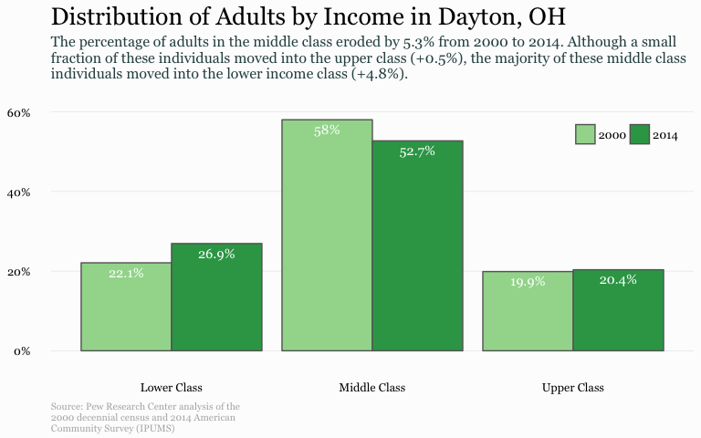
Lastly, let’s do some theme editing. I usually use a minimalistic plot so I set my base theme via theme_minimal(). Next, I remove axis titles since it become self explanatory through the title and subtitle. I also remove unecessary gridlines, rotate the legend, set the font family, and then do some title, subtitle, and caption editing.
plot +
        theme_minimal() +
        theme(axis.title = element_blank(),
              panel.grid.major.x = element_blank(),
              panel.grid.minor = element_blank(),
              legend.position = c(1,1), legend.justification = c(1,1),
              legend.background = element_blank(),
              legend.direction="horizontal",
              legend.title = element_blank(),
              text = element_text(family = "Georgia"),
              plot.title = element_text(size = 20, margin = margin(b = 10)),
              plot.subtitle = element_text(size = 12, color = "darkslategrey", margin = margin(b = 25)),
              plot.caption = element_text(size = 8, margin = margin(t = 10), color = "grey70", hjust = 0))
Bar charts are a common chart that can simplistically illustrate and compare your data. When refined, they can easily communicate important aspects of your data to viewers. Hopefully this sheds some light on how to get started developing and refining bar charts with ggplot.