![]() Follow me on twitter @bradleyboehmke
Follow me on twitter @bradleyboehmke
![]() Follow me on twitter @bradleyboehmke
Follow me on twitter @bradleyboehmke
For quick data exploration, base R plotting functions can provide an expeditious and straightforward approach to understanding your data. These functions are installed by default in base R and do not require additional visualization packages to be installed. This straightforward tutorial should teach you the basics, and give you a good idea of what you want to do next.
In addition, I’ll show how to make similar graphics with the qplot() function in ggplot2, which has a syntax similar to the base graphics functions. For each qplot() graph, there is also an equivalent using the more powerful ggplot() function which I illustrate in later visualization tutorials. This will, hopefully, help you transition to using ggplot2 when you want to make more sophisticated graphics.
Don’t have the time to scroll through the full tutorial? Skip directly to the section of interest:
To illustrate these quick plots I’ll use several built in data sets that come with base R. R has 104 built in data sets that can be viewed with data(). The ones I’ll use below include mtcars, pressure, BOD, and faithful. You can type these in your R console at anytime to see the data. Also, in addition to base R plotting functions I illustrate how to use the qplot() function from the ggplot2 package.
# data sets used
mtcars
pressure
BOD
faithful

# package used
library(ggplot2)
☛ See Working with packages for more information on installing, loading, and getting help with packages.
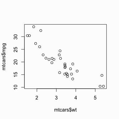
To make a scatter plot use plot() with a vector of x values and a vector of y values:
# base R
plot(x = mtcars$wt, y = mtcars$mpg)
You can get a similar result using qplot():
library(ggplot2)
qplot(x = mtcars$wt, y = mtcars$mpg)
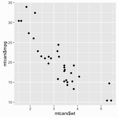
If the two vectors are already in the same data frame, note that the following functions produce the same output:
# specifying only x and y vectors
qplot(x = mtcars$wt, y = mtcars$mpg)

# specifying x and y vectors from a data frame
qplot(x = wt, y = mpg, data = mtcars)

# using full ggplot syntax
ggplot(data = mtcars, aes(x = wt, y = mpg)) +
        geom_point()
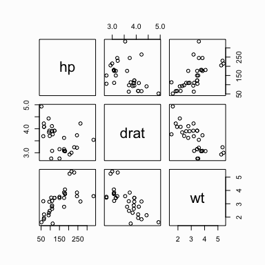
You can also get a scatter plot matrix to observe several plots at once. In this case you just pass the multiple variables (columns) in the data frame to plot() and a scatter plot matrix will be returned. The qplot() function does not have this same functionality; however, you can do more advanced plotting matrices by using ggplot()’s facetting arguments. This will be covered in later tutorials.
# passing multiple variables to plot
plot(mtcars[, 4:6])
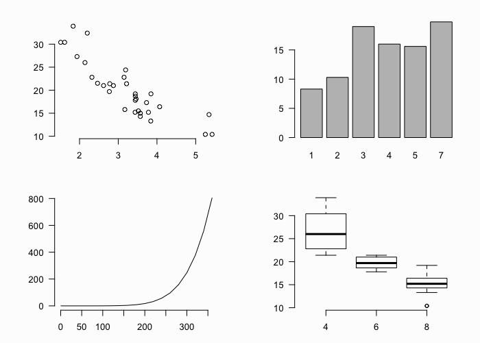
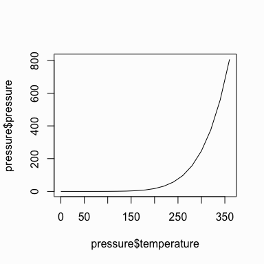
By default the plot() function produces a scatter plot with dots. To make a line graph, pass it the vector of x and y values, and specify type = "l" for line:
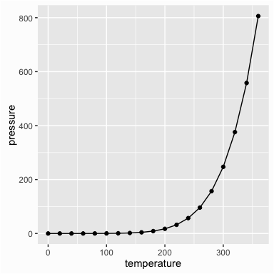
plot(x = pressure$temperature, y = pressure$pressure, type = "l")
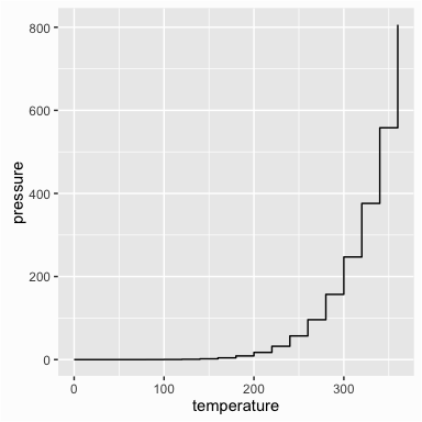
Similarly, you can pass it the argument type = "s" to produce a stepped line chart:
plot(x = pressure$temperature, y = pressure$pressure, type = "s")

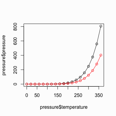
To include multiple lines or to plot the points, first call plot() for the first line, then add additional lines and points with lines() and points() respectively:
# base graphic
plot(x = pressure$temperature, y = pressure$pressure, type = "l")

# add points
points(x = pressure$temperature, y = pressure$pressure)

# add second line in red color
lines(x = pressure$temperature, y = pressure$pressure/2, col = "red")

# add points to second line
points(x = pressure$temperature, y = pressure$pressure/2, col = "red")
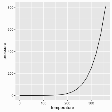
We can use qplot() to get similar results by using the geom argument. geom means adding a geometric object (line, points, etc.) to visually represent the data and in this case we want to represent the data using a line and then also points:
# using qplot for a line chart
qplot(temperature, pressure, data = pressure, geom = "line")
# using qplot for a stepped line chart
qplot(temperature, pressure, data = pressure, geom = "step")
# using qplot for a line chart with points
qplot(temperature, pressure, data = pressure, geom = c("line", "point"))
We can get the same output using the full ggplot() syntax:
# line chart
ggplot(pressure, aes(x = temperature, y = pressure)) +
        geom_line()

# step chart
ggplot(pressure, aes(x = temperature, y = pressure)) +
        geom_step()

# line chart with points
ggplot(pressure, aes(x = temperature, y = pressure)) +
        geom_line() +
        geom_point()
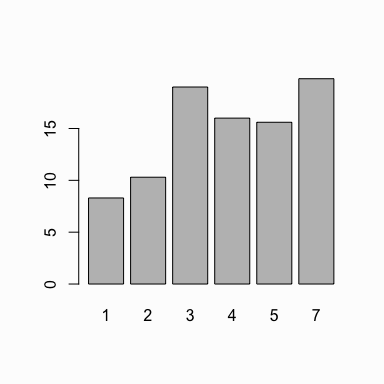
To make a bar chart of values, use barplot() and pass it a vector of values for the height of each bar and (optionally) a vector of labels for each bar. If the vector has names for the elements, the names will automatically be used as labels:
barplot(height = BOD$demand, names.arg = BOD$Time)
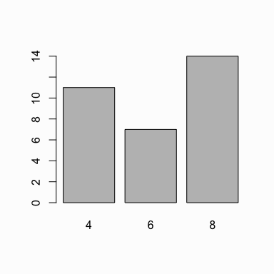
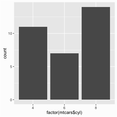
When you want the bar chart to represent the count of cases in each category then you need to generate the count of unique values. For instance, in the mtcars dataset we may want to look at the cylinder variable and understand the distribtion. To do this we can use the table() function which will provide us the count of each unique value in this variable. We can then pass this to the barplot() function to plot the counts of cylinders:
# the cylinder variable in the mtcars dataset is made up of values of 4, 6 & 8
mtcars$cyl
##  [1] 6 6 4 6 8 6 8 4 4 6 6 8 8 8 8 8 8 4 4 4 4 8 8 8 8 4 4 4 8 6 8 4

# get the count of 4, 6 & 8 cylinder cars in the dataset
table(mtcars$cyl)
##
##  4  6  8
## 11  7 14

# plot the count of 4, 6 & 8 cylinder cars in the dataset
barplot(table(mtcars$cyl))
To get the same result using qplot() we use geom = "bar".
# x defaults to a continuous variable
qplot(mtcars$cyl, geom = "bar")
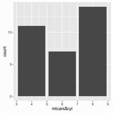
Note how the x axis defaults to a continuous variable in the plot above. Since bar charts are designed for categorical variables we want our x variable to a factor variable so that our x axis appropriately represents the data.
# use factor(x) to make it discrete
qplot(as.factor(mtcars$cyl), geom = "bar")
☛ See the Factors tutorial for more information on categorical variables (aka factors) in R.
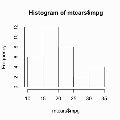
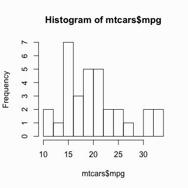
To make a histogram, use hist() and pass it a single vector of values. You can also use the breaks argument to determine the size of the bins.
# default bins
hist(mtcars$mpg)
# adjust binning
hist(mtcars$mpg, breaks = 10)
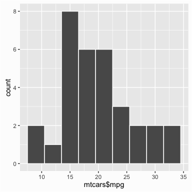
To get the same result using qplot() we don’t need to specify a geom argument as when you feed qplot() with a single variable it will default to using a histogram. You can also control the binning by using the binwidth argument. Although not necessary I add the color argument to outline the bars.
qplot(mtcars$mpg, binwidth = 3, color = I("white"))
To make a box-whisker plot (aka box plot), use plot() and pass it x values that are categorical (aka factor) and a vector of y values. However, you need to ensure that the x values are factors otherwise you will get a scatter plot by default:
# if x is not a factor it will produce a scatter plot
plot(mtcars$cyl, mtcars$mpg)
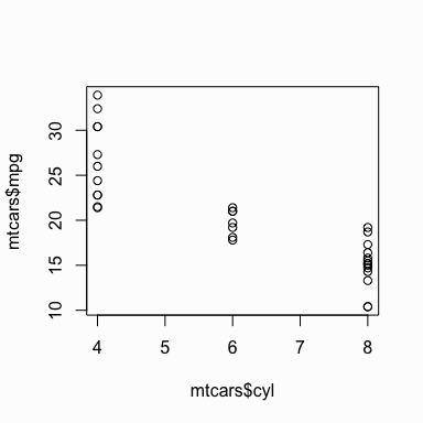
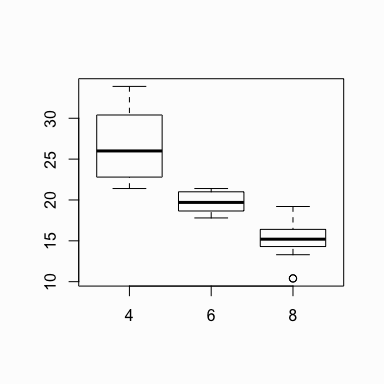
When x is a factor (as opposed to a numeric vector), it will automatically create a box plot:
# if x is a factor it will produce a box plot
plot(as.factor(mtcars$cyl), mtcars$mpg)

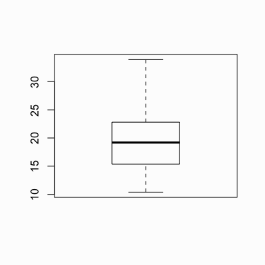
Alternatively, we can use the boxplot() function to create a box plot. We can create a single box plot with the following:
# boxplot of mpg
boxplot(mtcars$mpg)
To get a box plot that displays the distribution of mpg values across the different cylinders we use the “~” to state that we want to assess y by x:
# boxplot of mpg by cyl
boxplot(mpg ~ cyl, data = mtcars)
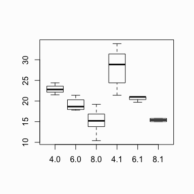
We can also assess interactions. In this case we look at the distribution of mpg by cylinders and transmission. Note on the y axis is mpg and on the x axis are the cylinder ~ transmission interaction. Note that the transmission variable is coded as 0 for automatic and 1 for manual. So the x-axis values of 4.0, 6.0, 8.0, 4.1, etc. represent 4 cylinder with automatic transmission, 6 cylinder with automatic transmission, 8 cylinder with automatic transmission, 4 cylinder with manual transmission, etc.
# boxplot of mpg based on interaction of two variables
boxplot(mpg ~ cyl + am, data = mtcars)
Similar results are attained with qplot() using geom = "boxplot":
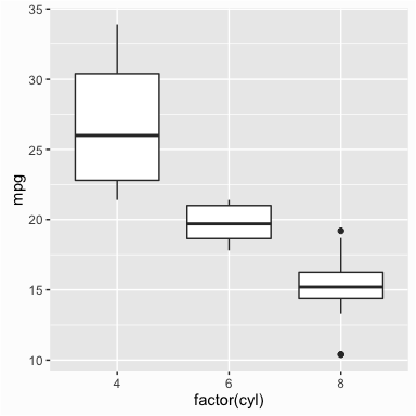
qplot(x = factor(cyl), y = mpg, data = mtcars, geom = "boxplot")
To make a stem-and-leaf plot we can simply use the stem() function and pass it a vector of numeric values:
stem(faithful$eruptions)

##
##   The decimal point is 1 digit(s) to the left of the |
##
##   16 | 070355555588
##   18 | 000022233333335577777777888822335777888
##   20 | 00002223378800035778
##   22 | 0002335578023578
##   24 | 00228
##   26 | 23
##   28 | 080
##   30 | 7
##   32 | 2337
##   34 | 250077
##   36 | 0000823577
##   38 | 2333335582225577
##   40 | 0000003357788888002233555577778
##   42 | 03335555778800233333555577778
##   44 | 02222335557780000000023333357778888
##   46 | 0000233357700000023578
##   48 | 00000022335800333
##   50 | 0370
airquality, create a scatter plot comparing the Temp and Ozone variables. Does there appear to be a relationship?longley, create a line chart that illustrates the number of unemployed over the years.