![]() Follow me on twitter @bradleyboehmke
Follow me on twitter @bradleyboehmke
![]() Follow me on twitter @bradleyboehmke
Follow me on twitter @bradleyboehmke
![]()
Data visualization is a critical tool in the data analysis process. Visualization tasks can range from generating fundamental distribution plots to understanding the interplay of complex influential variables in machine learning algorithms. In this tutorial we focus on the use of visualization for initial data exploration.
Visual data exploration is a mandatory intial step whether or not more formal analysis follows. When combined with descriptive statistics, visualization provides an effective way to identify summaries, structure, relationships, differences, and abnormalities in the data. Often times no elaborate analysis is necessary as all the important conclusions required for a decision are evident from simple visual examination of the data. Other times, data exploration will be used to help guide the data cleaning, feature selection, and sampling process.
Regardless, visual data exploration is about investigating the characteristics of your data set. To do this, we typically create numerous plots in an interactive fashion. This tutorial will show you how to create plots that answer some of the fundamental questions we typically have of our data.
Don’t have the time to scroll through the full tutorial? Skip directly to the section of interest:
We’ll illustrate the key ideas by primarily focusing on data from the AmesHousing package. We’ll use tidyverse to provide some basic data manipulation capabilities along with ggplot2 for plotting. We also demonstrate some useful functions from a few other packages throughout the chapter.
library(tidyverse)
library(caret)
library(GGally)
library(treemap)
ames <- AmesHousing::make_ames()
Before moving on to more sophisticated visualizations that enable multidimensional investigation, it is important to be able to understand how an individual variable is distributed. Visually understanding the distribution allows us to describe many features of a variable.
A variable is continuous if it can take any of an infinite set of ordered values. There are several different plots that can effectively communicate the different features of continuous variables. Features we are generally interested in include:
Histograms are often overlooked, yet they are a very efficient means for communicating these features of continuous variables. Formulated by Karl Pearson, histograms display numeric values on the x-axis where the continuous variable is broken into intervals (aka bins) and the the y-axis represents the frequency of observations that fall into that bin. Histograms quickly signal what the most common observations are for the variable being assessed (the higher the bar the more frequent those values are observed in the data); they also signal the shape (spread and symmetry) of your data by illustrating if the observed values cluster towards one end or the other of the distribution.
To get a quick sense of how sales prices are distributed across the 2,930 properties in the ames data we can generate a simple histogram by applying ggplot’s geom_histogram function1. This histogram tells us several important features about our variable:
Sale_Price is around the low $100K.Sale_Price ranges from near zero to over $700K.Sale_Price is skewed right (a common issue with financial data). Depending on the analytic technique we may want to apply later on this suggests we will likely need to transform this variable.Sale_Price values. Whether these are outliers in the mathematical sense or outliers to be concerned about is another issue but for now we at least know they exist.Sale_Price values around $650K and $700K+.ggplot(ames, aes(Sale_Price)) +
geom_histogram()
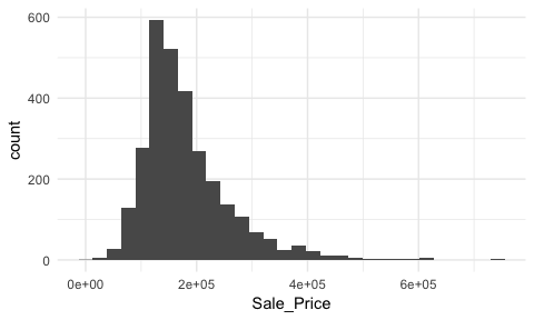
By default, geom_histogram will divide your data into 30 equal bins or intervals. Since sales prices range from $12,789 - $755,000, dividing this range into 30 equal bins means the bin width is $24,740. So the first bar will represent the frequency of Sale_Price values that range from about $12,500 to about $37,5002, the second bar represents the income range from about 37,500 to 62,300, and so on.
However, we can control this parameter by changing the bin width argument in geom_histogram. By changing the bin width when doing exploratory analysis you can get a more detailed picture of the relative densities of the distribution. For instance, in the default histogram there was a bin of $136,000 - $161,000 values that had the highest frequency but as the histograms that follow show, we can gather more information as we adjust the binning.
p1 <- ggplot(ames, aes(Sale_Price)) +
  geom_histogram(binwidth = 100000) +
  ggtitle("Bin width = $100,000")

p2 <- ggplot(ames, aes(Sale_Price)) +
  geom_histogram(binwidth = 50000) +
  ggtitle("Bin width = $50,000")

p3 <- ggplot(ames, aes(Sale_Price)) +
  geom_histogram(binwidth = 5000) +
  ggtitle("Bin width = $5,000")

p4 <- ggplot(ames, aes(Sale_Price)) +
  geom_histogram(binwidth = 1000) +
  ggtitle("Bin width = $1,000")

gridExtra::grid.arrange(p1, p2, p3, p4, ncol = 2)
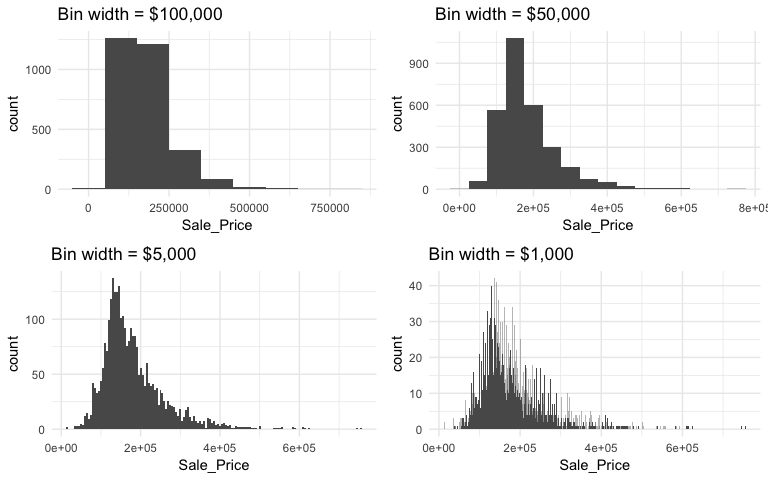
Overall, the histograms consistently show the most common income level to be right around $130,000. We can also find the most frequent bin by combining ggplot2::cut_width (ggplot2::cut_interval and ggplot2::cut_number are additional options) with dplyr::count. We see that the most frequent bin when using increments of $5,000 is $128,000 - $132,000.
ames %>%
  count(cut_width(Sale_Price, width = 5000)) %>%
  arrange(desc(n))
## # A tibble: 106 x 2
##    `cut_width(Sale_Price, width = 5000)`     n
##    <fctr>                                <int>
##  1 (1.28e+05,1.32e+05]                     137
##  2 (1.42e+05,1.48e+05]                     130
##  3 (1.32e+05,1.38e+05]                     125
##  4 (1.38e+05,1.42e+05]                     125
##  5 (1.22e+05,1.28e+05]                     118
##  6 (1.52e+05,1.58e+05]                     103
##  7 (1.48e+05,1.52e+05]                     101
##  8 (1.18e+05,1.22e+05]                      99
##  9 (1.58e+05,1.62e+05]                      92
## 10 (1.72e+05,1.78e+05]                      92
## # ... with 96 more rows
Our histogram with binwidth = 1000 also shows us that there are spikes at specific intervals. This is likely due to home sale prices usually occuring around increments of $5,000. In addition to our primary central tendency (bins with most frequency), we also get a clearer picture of the spread of our variable and its skewness. This suggests there may be a concern with our variable meeting assumptions of normality. If we were to apply an analytic technique that is sensitive to normality assumptions we would likely need to transform our variable.
We can assess the applicability of a log transformation by adding scale_x_log() to our ggplot visual3. This log transformed histogram provides a few new insights:
Sale_Price is near zero. In fact, further investigation identifies two observations, one with a Sale_Price of $12,789 and another at $13,100.ggplot(ames, aes(Sale_Price)) +
geom_histogram(bins = 100) +
geom_vline(xintercept = c(150000, 170000), color = "red", lty = "dashed") +
scale_x_log10(
labels = scales::dollar,
breaks = c(50000, 125000, 300000)
)
![]()
Let’s take a closer look at the second two insights. First, we’ll consider the issue of normality.
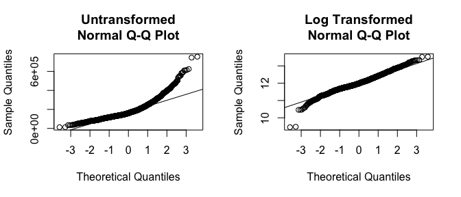
If you really want to look at normality, then Q-Q plots are a great visual to assess. This graph plots the cumulative values we have in our data against the cumulative probability of a particular distribution (the default is a normal distribution). In essence, this plot compares the actual value against the expected value that the score should have in a normal distribution. If the data are normally distributed the plot will display a straight (or nearly straight) line. If the data deviates from normality then the line will display strong curvature or “snaking.” These plots illustrate how much the untransformed variable deviates from normality whereas the log transformed values align much closer to a normal distribution.
par(mfrow = c(1, 2))

# non-log transformed
qqnorm(ames$Sale_Price, main = "Untransformed\nNormal Q-Q Plot")
qqline(ames$Sale_Price)

# log transformed
qqnorm(log(ames$Sale_Price), main = "Log Transformed\nNormal Q-Q Plot")
qqline(log(ames$Sale_Price))
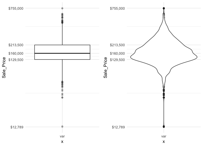
I also mentioned how we obtained a new insight regarding a new potential outlier that we did not see earlier. So far our histogram identified potential outliers at the lower end and upper end of the sale price spectrum. Unfortunately histograms are not very good at delineating outliers. Rather, we can use a boxplot which does a better job identifying specific outliers.
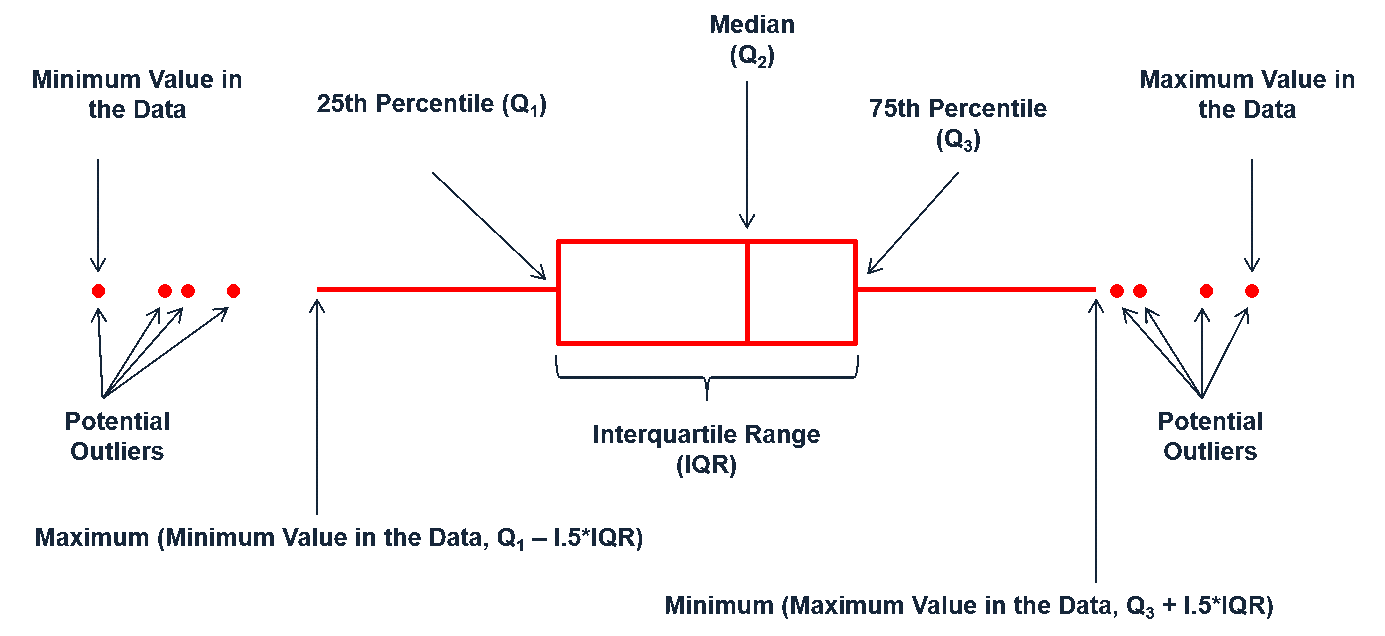
Boxplots are an alternative way to illustrate the distribution of a variable and is a concise way to illustrate the standard quantiles and outliers of data. As the below visual indicates, the box itself extends, left to right, from the 1st quartile to the 3rd quartile. This means that it contains the middle half of the data. The line inside the box is positioned at the median. The lines (whiskers) coming out either side of the box extend to 1.5 interquartile ranges (IQRs) from the quartiles. These generally include most of the data outside the box. More distant values, called outliers, are denoted separately by individual points. Now we have a more analytically specific approach to identifying outliers.
There are two efficient graphs to get an indication of potential outliers in our data. The classic boxplot on the left will identify points beyond the whiskers which are beyond from the first and third quantile. This illustrates there are several additional observations that we may need to assess as outliers that were not evident in our histogram. However, when looking at a boxplot we lose insight into the shape of the distribution. A violin plot on the right provides us a similar chart as the boxplot but we lose insight into the quantiles of our data and outliers are not plotted (hence the reason I plot geom_point prior to geom_violin). Violin plots will come in handy later when we start to visualize multiple distributions along side each other.
p1 <- ggplot(ames, aes("var", Sale_Price)) +
  geom_boxplot(outlier.alpha = .25) +
  scale_y_log10(
    labels = scales::dollar,
    breaks = quantile(ames$Sale_Price)
  )

p2 <- ggplot(ames, aes("var", Sale_Price)) +
  geom_point() +
  geom_violin() +
  scale_y_log10(
    labels = scales::dollar,
    breaks = quantile(ames$Sale_Price)
  )

gridExtra::grid.arrange(p1, p2, ncol = 2)
The boxplot starts to answer the question of what potential outliers exist in our data. Outliers in data can distort predictions and affect their accuracy. Consequently, its important to understand if outliers are present and, if so, which observations are considered outliers. Boxplots provide a visual assessment of potential outliers while the outliers package provides a number of useful functions to systematically extract these outliers. The most useful function is the scores function, which computes normal, t, chi-squared, IQR and MAD scores of the given data which you can use to find observation(s) that lie beyond a given value.
Here, I use the outliers::score function to extract those observations beyond the whiskers in our boxplot and then use a stem-and-leaf plot to assess them. A stem-and-leaf plot is a special table where each data value is split into a “stem” (the first digit or digits) and a “leaf” (usually the second digit). Since the decimal point is located 5 digits to the right of the “” the last stem of “7” and and first leaf of “5” means an outlier exists at around $750,000. The last stem of “7” and and second leaf of “6” means an outlier exists at around $760,000. This is a concise way to see approximately where our outliers are. In fact, I can now see that I have 28 lower end outliers ranging from $10,000-$60,000 and 32 upper end outliers ranging from $450,000-$760,000.
outliers <- outliers::scores(log(ames$Sale_Price), type = "iqr", lim = 1.5)
stem(ames$Sale_Price[outliers])
##
##   The decimal point is 5 digit(s) to the right of the |
##
##   0 | 1134444445555555666666666666
##   1 |
##   2 |
##   3 |
##   4 | 56666777788899
##   5 | 000445566889
##   6 | 1123
##   7 | 56
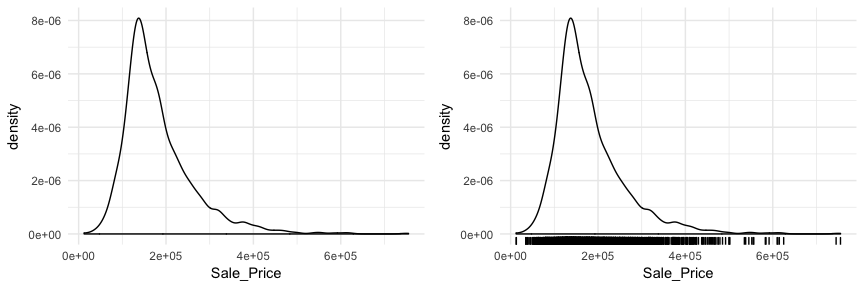
Another useful plot for univariate assessment includes the smoothed histogram in which a non-parametric approach is used to estimate the density function. Displaying in density form just means the y-axis is now in a probability scale where the proportion of the given value (or bin of values) to the overall population is displayed. In essence, the y-axis tells you the estimated probability of the x-axis value occurring. This results in a smoothed curve known as the density plot that allows us visualize the distribution. Since the focus of a density plot is to view the overall distribution rather than individual bin observations we lose insight into how many observations occur at certain x values. Consequently, it can be helpful to use geom_rug with geom_density to highlight where clusters, outliers, and gaps of observations are occuring.
p1 <- ggplot(ames, aes(Sale_Price)) +
  geom_density()

p2 <- ggplot(ames, aes(Sale_Price)) +
  geom_density() +
  geom_rug()

gridExtra::grid.arrange(p1, p2, nrow = 1)
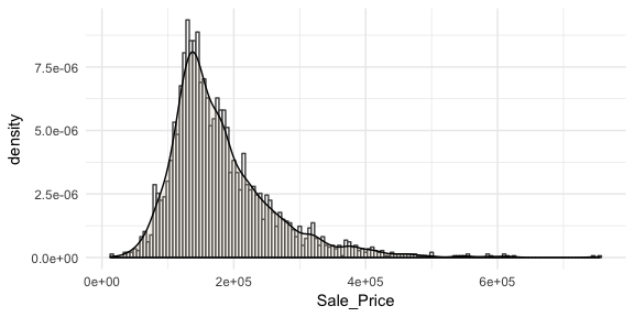
Often you will see density plots layered onto histograms. To layer the density plot onto the histogram we need to first draw the histogram but tell ggplot to have the y-axis in density form rather than count. You can then add the geom_density function to add the density plot on top.
ggplot(ames, aes(Sale_Price)) +
  geom_histogram(aes(y = ..density..),
                 binwidth = 5000, color = "grey30", fill = "white") +
  geom_density(alpha = .2, fill = "antiquewhite3")
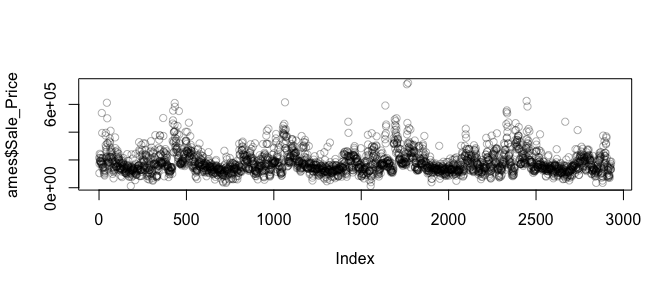
You may also be interested to see if there are any systematic groupings with how the data is structured. For example, using base R’s plot function with just the Sale_Price will plot the sale price versus the index (row) number of each observation. In the plot below we see a pattern which indicates that groupings of homes with high versus lower sale prices are concentrated together throughout the data set.
plot(ames$Sale_Price, col = rgb(0,0,0, alpha = 0.3))
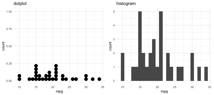
There are also a couple plots that can come in handy when dealing with smaller data sets. For example, the dotplot below provides more clarity than the histogram for viewing the distribution of mpg in the built-in mtcars dataset with only 32 observations. An alternative to this would be using a strip chart (see stripchart).
p1 <- ggplot(mtcars, aes(x = mpg)) +
  geom_dotplot(method = "histodot", binwidth = 1) +
  ggtitle("dotplot")

p2 <- ggplot(mtcars, aes(x = mpg)) +
  geom_histogram(binwidth = 1) +
  ggtitle("histogram")

gridExtra::grid.arrange(p1, p2, nrow = 1)
As demonstrated, several plots exist for examining univariate continuous variables. Several exampes were provided here but still more exist (i.e. frequency polygon, beanplot, shifted histograms). There is some general advice to follow such as histograms being poor for small data sets, dotplots being poor for large data sets, histograms being poor for identifying outlier cut-offs, boxplots being good for outliers but obscuring multimodality. Conseqently, it is important to draw a variety of plots. Moreover, it is important to adjust parameters within plots (i.e. binwidth, axis transformation for skewed data) to get a comprehensive picture of the variable of concern.
A categorical variable is a variable that can take on one of a limited, and usually fixed, number of possible values, assigning each individual or other unit of observation to a particular group or nominal category on the basis of some qualitative property (i.e. gender, grade, manufacturer). There are a few different plots that can effectively communicate features of categorical variables. Features we are generally interested in include:
Bar charts are one of the most commonly used data visualizations for categorical variables. Bar charts display the levels of a categorical variable of interest (typically) along the x-axis and the length of the bar illustrates the value along the y-axis. Consequently, the length of the bar is the primary visual cue in a bar chart and in a univariate visualization this length represents counts of cases in that particular level.
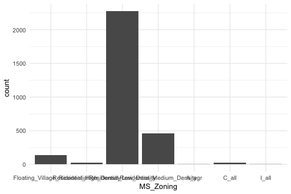
If we look at the general zoning classification for each property sold in our ames dataset we see that the majority of all properties fall within one category. Here, geom_bar simply counts up all observations for each zoning level.
ggplot(ames, aes(MS_Zoning)) +
  geom_bar()
Here, MS_Zoning represents a nominal categorical variable where there is no logical ordering of the labels; they simply represent mutually exclusive levels within our variable. To get better clarity of nominal variables we can make some refinements. Here I use dplyr::count to count the observations in each level prior to plotting. In the second plot I use mutate to compute the percent that each level makes up of all observations. I then feed these summarized data into ggplot where I can reorder the MS_Zoning variable from most frequent to least and then apply coord_flip to rotate the plot and make it easier to read the level categories. Also, notice that now I feeding an x (MS_Zoning) and y (n in the left plot and pct in the right plot) arguments so I apply geom_col rather than geom_bar.
# total count
p1 <- ames %>%
  count(MS_Zoning) %>%
  ggplot(aes(reorder(MS_Zoning, n), n)) +
  geom_col() +
  coord_flip() +
  ggtitle("Total count")

# percent of whole
p2 <- ames %>%
  count(MS_Zoning) %>%
  mutate(pct = n / sum(n)) %>%
  ggplot(aes(reorder(MS_Zoning, pct), pct)) +
  geom_col() +
  coord_flip() +
  ggtitle("Percent of whole")

gridExtra::grid.arrange(p1, p2, nrow = 1)
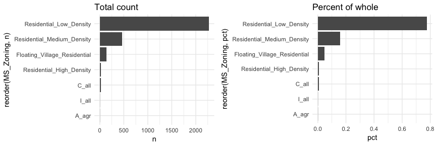
Now we can see that properties zoned as residential low density make up nearly 80% of all observations . We also see that properties zoned as aggricultural (A_agr), industrial (I_all), commercial (C_all), and residential high density make up a very small amount of observations. In fact, below we see that these imbalanced category levels each make up less than 1\% of all observations.
ames %>%
  count(MS_Zoning) %>%
  mutate(pct = n / sum(n)) %>%
  arrange(pct)
## # A tibble: 7 x 3
##   MS_Zoning                        n      pct
##   <fctr>                       <int>    <dbl>
## 1 A_agr                            2 0.000683
## 2 I_all                            2 0.000683
## 3 C_all                           25 0.00853
## 4 Residential_High_Density        27 0.00922
## 5 Floating_Village_Residential   139 0.0474
## 6 Residential_Medium_Density     462 0.158
## 7 Residential_Low_Density       2273 0.776
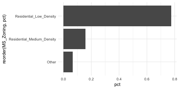
This imbalanced nature can cause problems in future analytic models so it may make sense to combine these infrequent levels into an “other” category. An easy way to do that is to use fct_lump.4 Here we use n = 2 to retain the top 2 levels in our variable and condense the remaining into an “other” category. You can see that this combined category still represents less than 10% of all observations.
ames %>%
  mutate(MS_Zoning = fct_lump(MS_Zoning, n = 2)) %>%
  count(MS_Zoning) %>%
  mutate(pct = n / sum(n)) %>%
  ggplot(aes(reorder(MS_Zoning, pct), pct)) +
  geom_col() +
  coord_flip()
Basic bar charts such as these are great when the number of category levels is smaller. However, as the number of levels increase the thick nature of the bar can be distracting. Cleveland dot plots and lollipop charts are useful for assessing the frequency or proportion of many levels while minizing the amount of ink on the graphic.
For example, if we assess the frequencies and proportions of home sales by the 38 different neighborhoods a dotplot simplifies the chart.
ames %>%
  count(Neighborhood) %>%
  mutate(pct = n / sum(n)) %>%
  ggplot(aes(pct, reorder(Neighborhood, pct))) +
  geom_point()
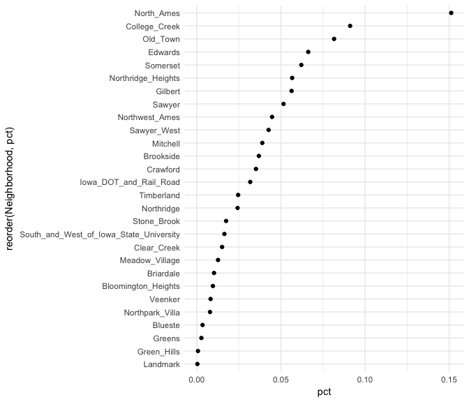
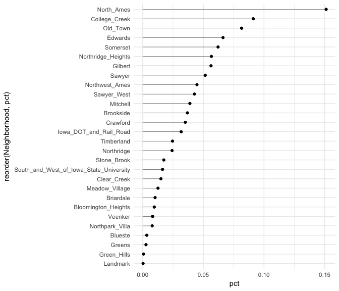
Similar to the Cleveland dot plot, a lollipop chart minimizes the visual ink but uses a line to draw the readers attention to the specific x-axis value achieved by each category. In the lollipop chart we use geom_segment to plot the lines and we explicitly state that we want the lines to start at x = 0 and extend to the neighborhood value with xend = pct. We simply need to include y = neighborhood and yend = neighborhood to tell R the lines are horizontally attached to each neighborhood.
ames %>%
  count(Neighborhood) %>%
  mutate(pct = n / sum(n)) %>%
  ggplot(aes(pct, reorder(Neighborhood, pct))) +
  geom_point() +
  geom_segment(aes(x = 0, xend = pct, y = Neighborhood, yend = Neighborhood), size = .15)
Sometimes we have categorical data that have natural, ordered categories. These types of categorical variables can be ordinal or interval. An ordinal variable is one in which the order of the values can be important but the differences between each one is not really known. For example, our ames data categorizes the quality of kitchens into five buckets and these buckets have a natural order that is not captured with a regular bar chart.
ggplot(ames, aes(Kitchen_Qual)) +
  geom_bar()
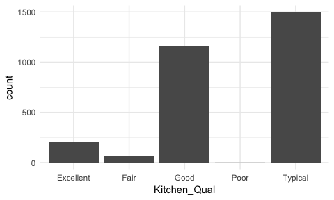
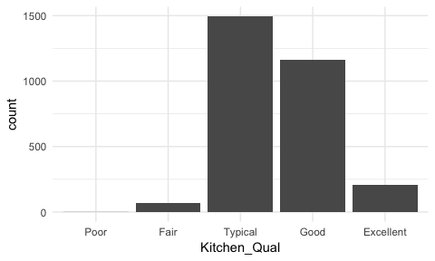
Here, rather than order by frequency it may be important to order the bars by the natural order of the quality lables: Poor, Fair, Typical, Good, Excellent. This can provide better insight into where most observations fall within this spectrum of quality. To do this we reorder the factor levels with fct_relevel and now its easier to see that most homes have average to slightly above average quality kitchens.
ames %>%
  mutate(Kitchen_Qual = fct_relevel(Kitchen_Qual, "Poor", "Fair", "Typical", "Good")) %>%
  ggplot(aes(Kitchen_Qual)) +
  geom_bar()
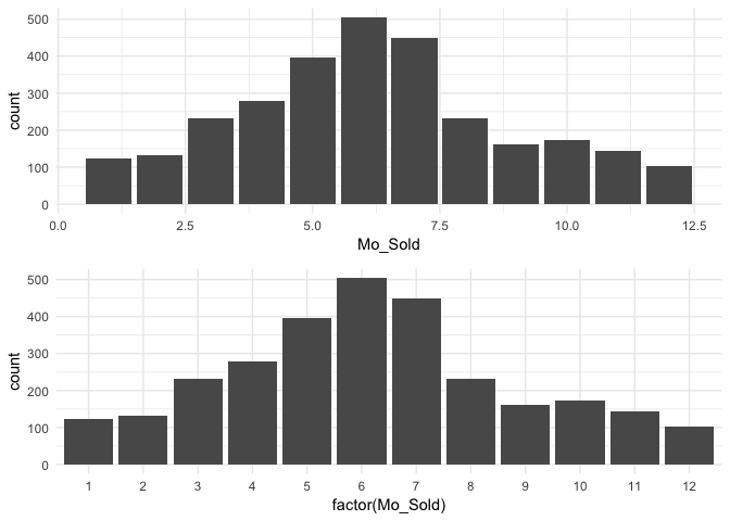
We may also have a categorical variable that has set intervals and may even be identified by integer values. For example, our data identifies the month each home was sold but uses integer values to represent the months. In this case we do not need to reorder our factor levels but we should ensure we visualize these as discrete factor levels (note how I apply factor(Mo_Sold) within ggplot) so that the home sale counts are appropriately bucketed into each month.
p1 <- ggplot(ames, aes(Mo_Sold)) +
  geom_bar()

p2 <- ggplot(ames, aes(factor(Mo_Sold))) +
  geom_bar()

gridExtra::grid.arrange(p1, p2, nrow = 2)
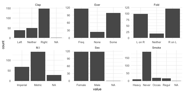
Bar charts can also illustrate how our missing values are disbursed across categorical variables. Using the MASS::survey data (since our ames data does not have any missing data) we can make small multiples (more on this in the next section) using facet_wrap to visualize the NAs.
MASS::survey %>%
  select(Sex, Exer, Smoke, Fold, Clap, M.I) %>%
  gather(var, value, Sex:M.I) %>%
  ggplot(aes(value)) +
  geom_bar() +
  facet_wrap(~ var, scales = "free")
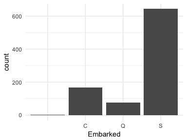
Or in some cases observations are not labeled correctly. If we look at the Embarked variable in the titanic package we see that the levels are labeled as C, Q, and S; however, there are two cases that have no label (these values are coded as "" in the actual data set). These are missing values that are just not coded as NAs. For modeling purposes we would likely recode these as either NAs or impute them as one of the other three levels (C, Q, or S).
ggplot(titanic::titanic_train, aes(Embarked)) +
  geom_bar()
Bar charts and their cousins are a simple form of visual display, yet they can provide much information about our categorical variables. Whether viewing nominal, ordinal, or interval data we can make minor adjustments in our bar charts to highlight the important features of our variables.
Having a solid understanding of univariate distributions is important; however, most analyses want to take the next step to understand associations and relationships between variables. Features we are generally interested in include:
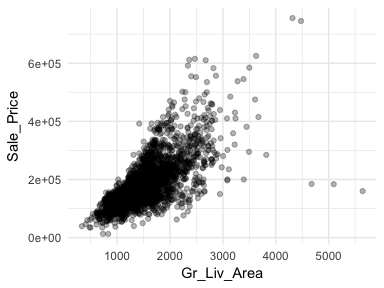
One of the most popular plots to assess association is the scatter plot. The scatter plot helps us to see multiple features between two continuous variables. Here we look at the relationship between Sale_Price and total above ground square footage (Gr_Liv_Area). A few features that pop out from this plot includes:
alpha = .3 to increase transparency. This allows us to see the clustering of data points in the center of the variable relationship.ggplot(ames, aes(x = Gr_Liv_Area, y = Sale_Price)) +
geom_point(alpha = .3)
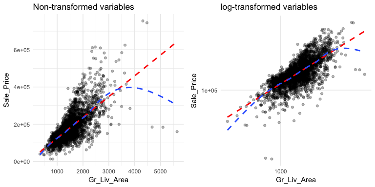
This relationship appears to be fairly linear but it is unclear. We can add trend lines to assess the linearity. In the below plot we add a linear line with geom_smooth(method = "lm") (note the method = "lm" means to add a linear model line) and then we add a non-linear line (the second geom_smooth without a specified method adds uses a generalized additive model). This allows us to assess how non-linear a relationship may be. Our new plot shows that for homes with less than 2,250 square feet the relationship is fairly linear; however, beyond 2,250 square feet we see strong deviations from linearity.
Also, note the funneling in the left scatter plot. This is called heteroskedasticity (non-constant variance) and this can cause concerns with certain future modeling approaches (i.e. forms of linear regression). We can assess if transforming our variables can alleviate this concern by adding scale_?_log10. The right plot shows that transforming our variables makes our variability across the plot more constant. We see that for the majority of the plot the relationship is now linear with the exception of the two ends where we see the non-linear line being pulled down. This suggests that there are some influential observations with low and high square footage that are pulling the expected sale price down.
p1 <- ggplot(ames, aes(x = Gr_Liv_Area, y = Sale_Price)) +
geom_point(alpha = .3) +
geom_smooth(method = "lm", se = FALSE, color = "red", lty = "dashed") +
geom_smooth(se = FALSE, lty = "dashed") +
ggtitle("Non-transformed variables")
p2 <- ggplot(ames, aes(x = Gr_Liv_Area, y = Sale_Price)) +
geom_point(alpha = .3) +
geom_smooth(method = "lm", se = FALSE, color = "red", lty = "dashed") +
geom_smooth(se = FALSE, lty = "dashed") +
scale_x_log10() +
scale_y_log10() +
ggtitle("log-transformed variables")
gridExtra::grid.arrange(p1, p2, nrow = 1)
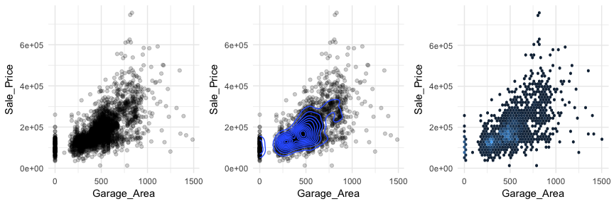
Scatter plots can also signal distinct clustering or gaps. For example, if we plot Sale_Price versus Garage_Area (left) we see a couple areas of concentrated points. By incorporating a density plot (middle) we can draw attention to the centers of these clusters which appears to be located at homes with zero garage square footage and homes with just over 250 square feet and just under 500 square feet of garage area. We can also change our plot to a hexbin plot, that replaces bunches of points with a larger hexagonal symbol. This provides us with a heatmap-like plot to signal highly concentrated regions. It also does a better job identifying gaps in our data where no observations exist.
p1 <- ggplot(ames, aes(x = Garage_Area, y = Sale_Price)) +
geom_point(alpha = .2)
p2 <- ggplot(ames, aes(x = Garage_Area, y = Sale_Price)) +
geom_point(alpha = .2) +
geom_density2d()
p3 <- ggplot(ames, aes(x = Garage_Area, y = Sale_Price)) +
geom_hex(bins = 50, show.legend = FALSE)
gridExtra::grid.arrange(p1, p2, p3, nrow = 1)
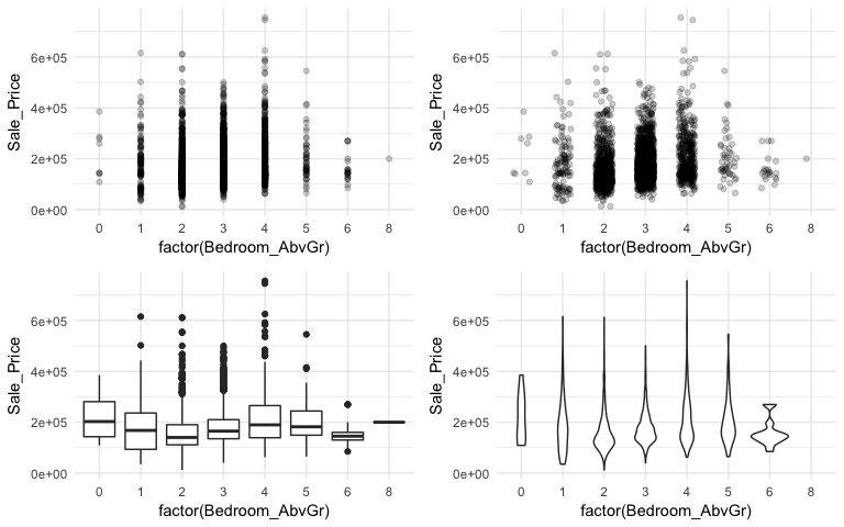
When using a scatter plot to assess a continuous variable against a categorical variable a stip plot will form. Here we assess the Sale_Price to the number of above ground bedrooms (Bedroom_AbvGr). Due to the size of this data set, the top left strip plot has a lot of overlaid data points. We can use geom_jitter to add a little variation to our plot (top right), which allows us to see where heavier concentrations of points exist. Alternatively, we can use boxplots and violin plots to compare the distributions of Sale_Price to Bedroom_AbvGr. Each plot provides different insights to the different features (i.e. outliers, clustering, median values).
p1 <- ggplot(ames, aes(x = factor(Bedroom_AbvGr), y = Sale_Price)) +
geom_point(alpha = .2)
p2 <- ggplot(ames, aes(x = factor(Bedroom_AbvGr), y = Sale_Price)) +
geom_jitter(alpha = .2, width = .2)
p3 <- ggplot(ames, aes(x = factor(Bedroom_AbvGr), y = Sale_Price)) +
geom_boxplot()
p4 <- ggplot(ames, aes(x = factor(Bedroom_AbvGr), y = Sale_Price)) +
geom_violin()
gridExtra::grid.arrange(p1, p2, p3, p4, nrow = 2)
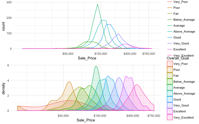
An alternative approach to view the distribution of a continuous variable across multiple categories includes overlaying distribution plots. For example, we could assess the Sale_Price of homes across the overall quality of homes. We can do this with a frequency polygon (left), which display the outline of a histogram. However, since some quality levels have very low counts it is tough to see the distribution of costs within each category. A better approach is to overlay density plots which allows us to see how each quality level’s distribution differs from one another.
p1 <- ggplot(ames, aes(x = Sale_Price, color = Overall_Qual)) +
geom_freqpoly() +
scale_x_log10(breaks = c(50, 150, 400, 750) * 1000, labels = scales::dollar)
p2 <- ggplot(ames, aes(x = Sale_Price, color = Overall_Qual, fill = Overall_Qual)) +
geom_density(alpha = .15) +
scale_x_log10(breaks = c(50, 150, 400, 750) * 1000, labels = scales::dollar)
gridExtra::grid.arrange(p1, p2, nrow = 2)
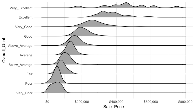
When there are many levels in a categorical variable, overlaid plots become difficult to decipher. Rather than overlay plots, we can also use small multiples to compare the distribution of a continuous variable. Ridge plots provide a form of small multiples by partially overlapping distribution plots. They can be quite useful for visualizing changes in continuous distributions over discrete variable levels. In this example I use the ggridges package which provides an add-on geom_density_ridges for ggplot. Now we get a much clearer picture how the sales price differs for each quality level.
ggplot(ames, aes(x = Sale_Price, y = Overall_Qual)) +
ggridges::geom_density_ridges() +
scale_x_continuous(labels = scales::dollar)
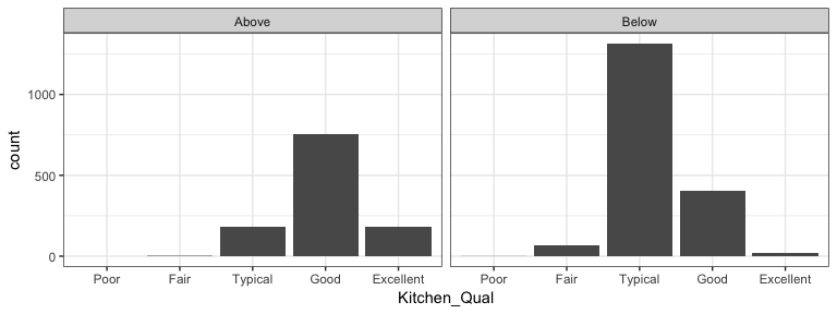
It is important to understand how a categorical response is associated with multiple variables. We can use faceting (facet_wrap and facet_grid) to produce small multiples of bar charts across the levels of 1 or more categorical variable. For example, here we assess the quality of kitchens for homes that sold above and below the mean sales price. Not surprisingly we see homes above average sales price have higher quality kitchens.
ames %>%
mutate(
Above_Avg = ifelse(Sale_Price > mean(Sale_Price), "Above", "Below"),
Kitchen_Qual = fct_relevel(Kitchen_Qual, "Poor", "Fair", "Typical", "Good")
) %>%
ggplot(aes(Kitchen_Qual)) +
geom_bar() +
facet_wrap(~ Above_Avg) +
theme_bw()
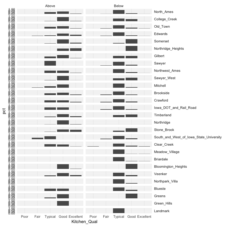
We can build onto this with facet_grid which allows us to create small multiples across two additional dimensions. In this example we assess the quality of kitchens for homes that sold above and below the mean sales price by neighborhood. This plot allows us to see gaps across the different categorical levels along with which category combinations are most frequent.
ames %>%
mutate(
Above_Avg = ifelse(Sale_Price > mean(Sale_Price), "Above", "Below"),
Kitchen_Qual = fct_relevel(Kitchen_Qual, "Poor", "Fair", "Typical", "Good")
) %>%
group_by(Neighborhood, Above_Avg, Kitchen_Qual) %>%
tally() %>%
mutate(pct = n / sum(n)) %>%
ggplot(aes(Kitchen_Qual, pct)) +
geom_col() +
facet_grid(Neighborhood ~ Above_Avg) +
theme(strip.text.y = element_text(angle = 0, hjust = 0))
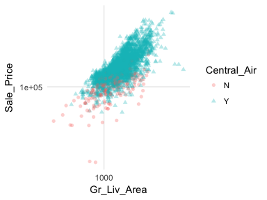
In most analyses, data are usually multivariate by nature, and the analytics are designed to capture and measure multivariate relationships. Visual exploration should therefore also incorporate this important aspect. We can extend these basic principles and add in additional features to assess multidimensional relationships. One approach is to add additional variables with features such as color, shape, or size. For example, here we compare the sales price to above ground square footage of homes with and without central air conditioning. We can see that there are far more homes with central air and that those homes without central air tend to have less square footage and sell for lower sales prices.
ggplot(ames, aes(x = Gr_Liv_Area, y = Sale_Price, color = Central_Air, shape = Central_Air)) +
geom_point(alpha = .3) +
scale_x_log10() +
scale_y_log10()
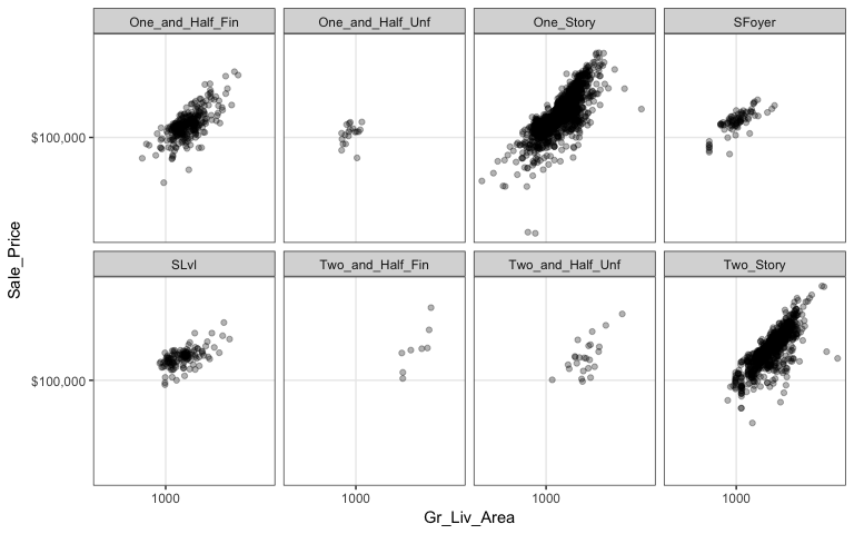
However, as before, when there are many levels in a categorical variable it becomes hard to compare differences by only incorporating color or shape features. An alternative is to create small multiples. Here we compare the relationship between sales price and above ground square footage and we assess how this relationship may differ across the different house styles (i.e. one story, two story, etc.).
ggplot(ames, aes(x = Gr_Liv_Area, y = Sale_Price)) +
geom_point(alpha = .3) +
scale_x_log10() +
scale_y_log10(labels = scales::dollar) +
facet_wrap(~ House_Style, nrow = 2) +
theme_bw()
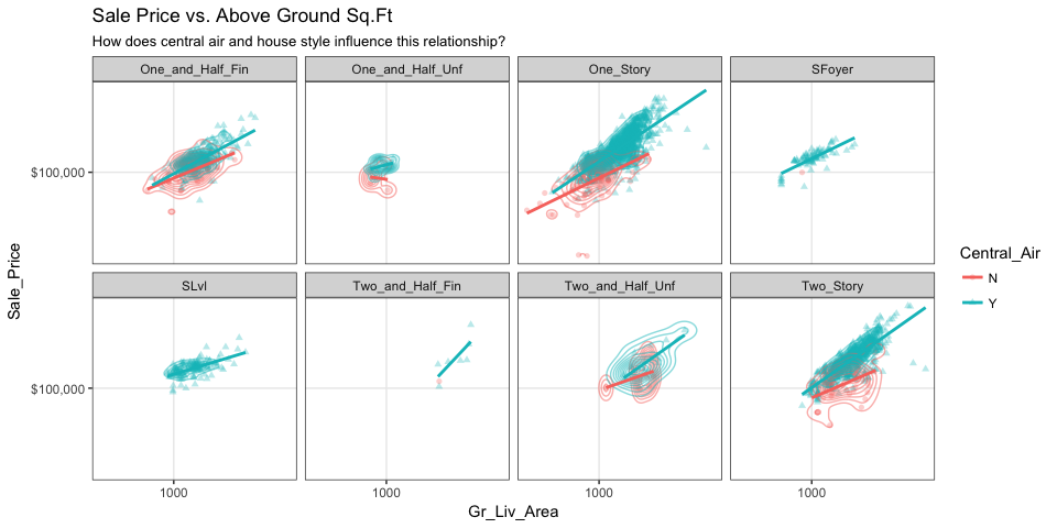
We can start to add several of the features discussed in this chapter to highlight mutlivariate features. For example, here we assess the relationship between sales price and above ground square footage for homes with and without central air conditioning and across the different housing styles. For each house style and central air category we can see where the values are clustered and how the linear relationship changes. For all home styles, houses with central air have a higher selling price with a steeper slope than those without central air. Also, those plots without density markings and linear lines for the no central air category (red) tell us that there are no more than one observation in these groups; so this identifies gaps across multivariate categories of interest.
ggplot(ames, aes(x = Gr_Liv_Area, y = Sale_Price, color = Central_Air, shape = Central_Air)) +
  geom_point(alpha = .3) +
  geom_density2d(alpha = .5) +
  geom_smooth(method = "lm", se = FALSE) +
  scale_x_log10() +
  scale_y_log10(labels = scales::dollar) +
  facet_wrap(~ House_Style, nrow = 2) +
  ggtitle("Sale Price vs. Above Ground Sq.Ft",
          subtitle = "How does central air and house style influence this relationship?") +
  theme_bw()
Parallel coordinate plots (PCP) are also a great way to visualize continuous variables across multiple variables. In these plots, a vertical axis is drawn for each variable. Then each observation is represented by drawing a line that connects its values on the different axes, thereby creating a multivariate profile. To create a PCP, we can use ggparcoord from the GGally package. By default, ggparcoord will standardize the variables based on a Z-score distribution; however, there are many options for scaling (see ?ggparcoord). One benefit of of a PCP is that you can visualize your observations across continuous and categorical variables. In this example I include Overall_Qual which is an ordered factor with levels “Very Poor”, “Poor”, “Fair”, …, “Excellent”, “Very Excellent” having values of 1-10. When including a factor variable ggparcoord will use the factor integer levels for their value so it is important to appropriately order any factors you want to include.
variables <- c("Sale_Price", "Year_Built", "Year_Remod_Add", "Overall_Qual")

ames %>%
  select(variables) %>%
  ggparcoord(alpha = .05, scale = "center")
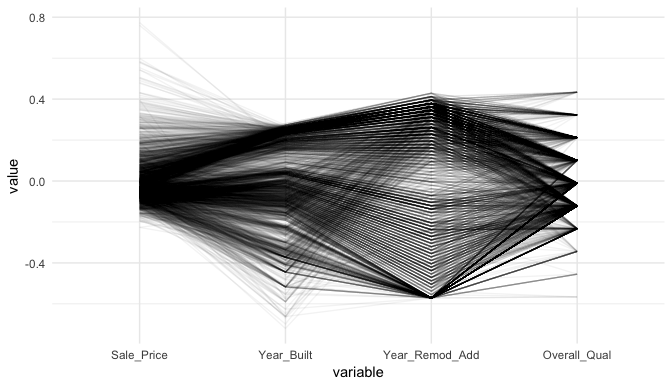
The darker bands in the above plot illustrate several features. The observations with higher sales prices tend to be built in more recent years, be remodeled in recent years and be categorized in the top half of the overall quality measures. In contracts, homes with lower sales prices tend to be more out-dated (based on older built and remodel dates) and have lower quality ratings. We also see some homes with exceptionally old build dates that have much newer remodel dates but still have just average quality ratings.
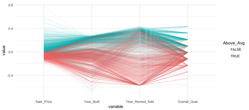
We can make this more explicit by adding a new variable to indicate if a sale price is above average. We can then tell ggparcood to group by this new variable. Now we clearly see that above average sale prices are related to much newer homes.
ames %>%
  select(variables) %>%
  mutate(Above_Avg = Sale_Price > mean(Sale_Price)) %>%
  ggparcoord(
    alpha = .05,
    scale = "center",
    columns = 1:4,
    groupColumn = "Above_Avg"
    )
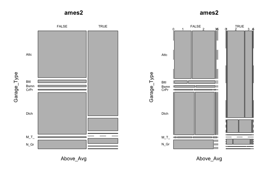
Mosaic plots are a graphical method for visualizing data from two or more qualitative variables. In this visual the graphics area is divided up into rectangles proportional in size to the counts of the combinations they represent.
ames2 <- ames %>%
  mutate(
    Above_Avg = Sale_Price > mean(Sale_Price),
    Garage_Type = abbreviate(Garage_Type),
    Garage_Qual = abbreviate(Garage_Qual)
         )

par(mfrow = c(1, 2))
mosaicplot(Above_Avg ~ Garage_Type, data = ames2, las = 1)
mosaicplot(Above_Avg ~ Garage_Type + Garage_Cars, data = ames2, las = 1)
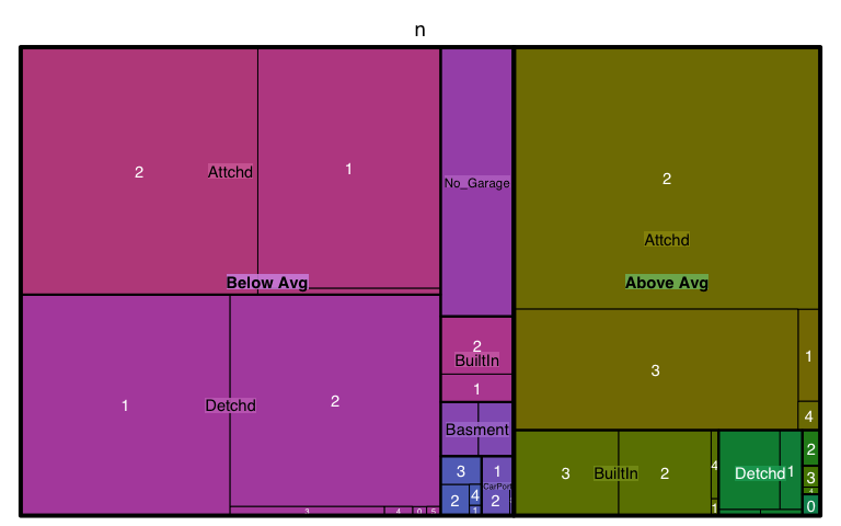
Treemaps are also a useful visualization aimed at assessing the hierarchical structure of data. Treemaps are primarily used to assess a numeric value across multiple categories. It can be useful to assess the counts or porportions of a categorical variable nested within other categorical variables. For example, we can use a treemap to visualize the above right mosaic plot that illustrates the number of homes sold above and below average sales price with different garage characteristics. We can see in the treemap that houses with above average prices tend to have attached 2 and 3-car garages. Houses sold below average price have more attached 1-car garages and also have far more detached garages.
ames %>%
  mutate(Above_Below = ifelse(Sale_Price > mean(Sale_Price), "Above Avg", "Below Avg")) %>%
  count(Garage_Type, Garage_Cars, Above_Below) %>%
  treemap(
    index = c("Above_Below", "Garage_Type", "Garage_Cars"),
    vSize = "n"
  )
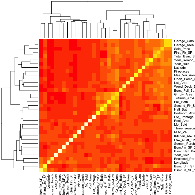
A heatmap is a graphical display of numerical data where color is used to denote the case value realtive to other values in the column. Heatmaps can be extremely useful in identify clusters of strongly correlated values. We can select all numeric variables in our ames data set, compute the correlation matrix and visualize this matrix with a heatmap. Those locations with dark red represent correlations with smaller values while lighter colored cells represent larger values. Looking at Sale_Price (3rd row from top) you can see that the smaller values are clustered to the left of the plot suggestion weaker linear relationships with variables such as BsmtFin_Sf_1, Bsmt_Unf_SF, Longitude, Enclosed_Porch, etc. The larger correlations values for Sale_Price align with variables to the right of the plot such as Garage_Cars, Garage_Area, First_Flr_SF, etc.
ames %>%
  select_if(is.numeric) %>%
  cor() %>%
  heatmap()
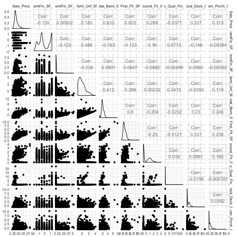
A heatmap is a great way to assess the relationship across a large data set. However, when you are dealing with a smaller data set (or subset), you may want to create a matrix plot to compare relationships across all variables. For example, here I select Sale_Price and all variables that contain “sf” (all square footage variables), I scale all variables, and then visualize the scatter plot and correlation values with GGally::ggpairs.
ames %>%
  select(Sale_Price, contains("sf")) %>%
  map_df(scale) %>%
  ggpairs()
Graphical displays can also assist in summarizing certain data quality features. In the previous sections we illustrated how we can identify outliers but missing data also represent an important characteristic of our data. This tutorial has been using the processed version of the Ames housing data set. However, if we use the raw data we see that there are 13,997 missing values. It is important to understand how these missing values are dispersed acrossed a data set as that can determine if you need to eliminate a variable or if you can impute.
sum(is.na(AmesHousing::ames_raw))
## [1] 13997
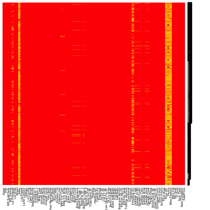
Heatmaps have a nice alternative use case for visualizing missing values across a data set. In this example is.na(AmesHousing::ames_raw) will return a Boolean (TRUE/FALSE) output indicating the location of missing values and by multiplying this value by 1 converts the output to 0/1 binary to be plotted. All yellow locations in our heatmap represent missing values. This allows us to see those variables where the majority of the observations have missing values (i.e. Alley, Fireplace Qual, Pool QC, Fence, and Misc Feature). Due to their high frequency of missingness, these variables would likely need to be removed from future analytic approaches. However, we can also spot other unique features of missingness. For example, missing values appear to occur across all garage variables for the same observations.
heatmap(1 * is.na(AmesHousing::ames_raw), Rowv = NA, Colv = NA)
If we dig a little deeper into these variables we would notice that Garage Cars and Garage Area all contain the value 0 for every observation where the other Garage_xx variables have missing values. This is because in the raw Ames housing data set, they did not have an option to identify houses with no garages. Therefore, all houses with no garage were identified by including nothing. This would be opportunity to create a new categorical level (“None”) for these garage variables.
AmesHousing::ames_raw %>%
  filter(is.na(`Garage Type`)) %>%
  select(contains("garage"))
## # A tibble: 157 x 7
##    `Garage Type` `Garage Yr Blt` `Garage Finish` `Gara… `Gara… `Gar… `Gar…
##    <chr>                   <int> <chr>            <int>  <int> <chr> <chr>
##  1 <NA>                       NA <NA>                 0      0 <NA>  <NA>
##  2 <NA>                       NA <NA>                 0      0 <NA>  <NA>
##  3 <NA>                       NA <NA>                 0      0 <NA>  <NA>
##  4 <NA>                       NA <NA>                 0      0 <NA>  <NA>
##  5 <NA>                       NA <NA>                 0      0 <NA>  <NA>
##  6 <NA>                       NA <NA>                 0      0 <NA>  <NA>
##  7 <NA>                       NA <NA>                 0      0 <NA>  <NA>
##  8 <NA>                       NA <NA>                 0      0 <NA>  <NA>
##  9 <NA>                       NA <NA>                 0      0 <NA>  <NA>
## 10 <NA>                       NA <NA>                 0      0 <NA>  <NA>
## # ... with 147 more rows
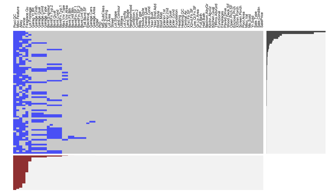
An alternative approach is to use extracat::visna, which allows us to visualize missing patters. The columns represent the 82 variables and the rows the missing patterns. The cells for the variables with missing values in a pattern are drawn in blue. The variables and patterns have been ordered by numbers of missings on both rows and columns (sort = "b"). The bars beneath the columns show the proporations of missings by variable and the bars on the right show the relative frequencies of patterns.
extracat::visna(AmesHousing::ames_raw, sort = "b")
Data can be missing for different reasons. It could be that a value was not recorded, or that it was, but was obviously an error. As in our case with the garage variables it could be because there was not an option to record the specific value observed so the default action was to not record any value. Regardless, it is important to identify and understand how missing values are observed across a data set as they can provide insight into how to deal with these observations.
We could also use hist(ames$Sale_Price) to produce a histogram with base R graphics. ↩
These are approximates because the binning will round to whole numbers (12,800 rather than 12,370.) ↩
Two things to note here. 1. If you want to change the binwidth you either need to feed a log tranformed number to binwidth or, as I did, increase the bins by using bins = 100. 2. If you have values of zero in your variable try `scale_x_continuous(trans = “log1p”), which adds 1 prior to the log transformation. ↩
A great resource to learn more about which you can learn more about managing factors is R for Data Science, Ch. 15. ↩