![]() Follow me on twitter @bradleyboehmke
Follow me on twitter @bradleyboehmke
![]() Follow me on twitter @bradleyboehmke
Follow me on twitter @bradleyboehmke
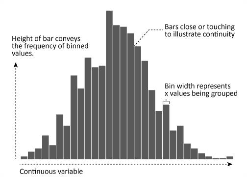
Histograms are often overlooked, yet they are a very efficient means for communicating the distribution of numerical data. Formulated by Karl Pearson, histograms display numeric values on the x-axis where the continuous variable is broken into intervals (aka bins) and the the y-axis represents the frequency of observations that fall into that bin. Histograms quickly signal what the most common observations are for the variable being assessed (the higher the bar the more frequent those values are observed in the data); they also signal the shape of your data by illustrating if the observed values cluster towards one end or the other of the distribution.
This tutorial will cover how to go from a basic histogram to a more refined, publication worthy histogram graphic. If you’re short on time jump to the sections of interest:
To reproduce the code throughout this tutorial you will need to load the following packages. The primary package of interest is ggplot2, which is a plotting system for R. You can build histograms with base R graphics, but when I’m building more refined graphics I lean towards ggplot2.
library(xlsx)           # for reading in Excel data
library(dplyr)          # for data manipulation
library(tidyr)          # for data manipulation
library(magrittr)       # for easier syntax in one or two areas
library(gridExtra)      # for generating the bin width comparison plot
library(ggplot2)        # for generating the visualization
☛ See Working with packages for more information on installing, loading, and getting help with packages.
In addition, for all of my examples I will illustrate with data that was used for Pew Research on America’s shrinking middle class. You can obtain the data from here. After importing and cleaning up the worksheet a bit the data looks as follows, which includes median income stats for 1999 and 2014 across 229 metro locations across the U.S.
# read in PEW data
income <- read.xlsx("Middle-Class-U.S.-Metro-Areas-5-12-16-Supplementary-Tables.xlsx",
                    sheetIndex = "3. Median HH income, metro",
                    startRow = 8, colIndex = c(1:5, 7:10)) %>%
          set_colnames(c("Metro", "All_99", "Lower_99", "Middle_99", "Upper_99",
                         "All_14", "Lower_14", "Middle_14", "Upper_14")) %>%
          filter(Metro != "NA")

head(income)
##                               Metro    All_99  Lower_99  Middle_99  Upper_99  All_14    Lower_14  Middle_14  Upper_14
## 1                         Akron, OH  77688.32  27587.97  81671.30   180745.0  68190.98  25969.68  75771.61   173668.5
## 2       Albany-Schenectady-Troy, NY  73185.16  27322.46  79718.21   177674.0  76767.68  24641.59  77120.00   163299.3
## 3                   Albuquerque, NM  66067.18  26426.87  76363.59   186766.8  58864.75  21442.49  71643.16   178378.0
## 4 Allentown-Bethlehem-Easton, PA-NJ  71607.73  29007.45  78782.43   180202.6  69499.99  25739.85  76530.15   169741.0
## 5                      Amarillo, TX  60599.32  27014.16  76296.73   183931.1  63254.27  25958.56  71626.16   162210.0
## 6                     Anchorage, AK  76652.96  27813.29  81361.67   173445.9  77459.67  24474.62  79652.79   173913.0
To get a quick sense of how 2014 median incomes are distributed across the metro locations we can generate a simple histogram by applying ggplot’s geom_histogram() function. We can see that median incomes range from about $40,000 - $90,000 with the majority of metros clustered in the mid $60,000 range.
# basic histogram
ggplot(income, aes(x = All_14)) +
        geom_histogram()
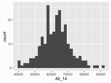
By default, geom_histogram() will divide your data into 30 equal bins or intervals. Since 2014 median incomes range from $39,751 - $90,743, dividing this range into 30 equal bins means the bin width is about $1,758. So the first bar will represent the frequency of 2014 median incomes that range from $39,751 to 41,510, the second bar represents the income range from 41,510 to 43,268, and so on.
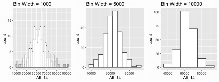
However, we can control this parameter by changing the bin width argument in geom_histogram(). By changing the bin width when doing exploratory analysis you can get a clearer picture of the relative densities of the distribution. For instance, in the default histogram there was a bin of high $50,000 income values that had the highest frequency but as the histograms that follow show, this changes as we change the bin width. Overall, the histograms consistently show the most common income level to be in the mid $60,000 range. In addition, I usually change the outline and fill color of the bars with color and fill arguments to better illustrate the bars.
p1 <- ggplot(income, aes(x = All_14)) +
        geom_histogram(binwidth = 1000, color = "grey30", fill = "white") +
        ggtitle("Bin Width = 1000")

p2 <- ggplot(income, aes(x = All_14)) +
        geom_histogram(binwidth = 5000, color = "grey30", fill = "white") +
        ggtitle("Bin Width = 5000")

p3 <- ggplot(income, aes(x = All_14)) +
        geom_histogram(binwidth = 10000, color = "grey30", fill = "white") +
        ggtitle("Bin Width = 10000")

grid.arrange(p1, p2, p3, ncol=3)
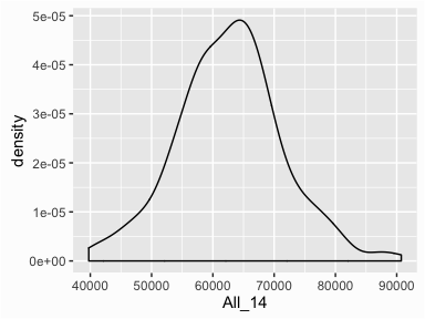
We can also view a smoothed histogram in which a non-parametric approach is used to estimate the density function. This results in a smoothed curve known as the density plot that allows us visualize the distribution. More on the finer details of density plots in another tutorial, but you will often see density plots layered on histograms so they are appropriate to demonstrate here. We can get a simple density plot with the geom_density() function:
# look at the density
ggplot(income, aes(x = All_14)) +
        geom_density()
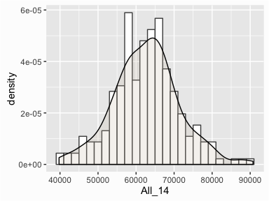
To layer the density plot onto the histogram we need to first draw the histogram but tell ggplot() to have the y-axis in density1 form rather than count. You can then add the geom_density() function to add the density plot on top. In addition, I add some color to the density plot along with an alpha parameter to give it some transparency.
# overlap density and histogram
ggplot(income, aes(x = All_14)) +
        geom_histogram(aes(y = ..density..),
                       binwidth = 2000, color = "grey30", fill = "white") +
        geom_density(alpha = .2, fill = "antiquewhite3")
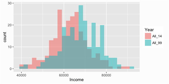
Often, we want to compare the distributions of different groups within our data. For instance, so far we have been simply assessing the distribution of 2014 median incomes but what if we want to know how 2014 incomes differ from 1999 incomes? To answer this we’ll want to compare these groups visually. We can do this a couple different ways.
First we can overlay the histograms by using the fill parameter. The fill parameter will color code the values based on a categorical variable. In this case, I collapsed the data to long form and created a Year variable that identifies 1999 versus 2014 incomes:
# turn data to long form
compare <- income %>%
        select(Metro, All_99, All_14) %>%
        gather(Year, Income, All_99:All_14)

# Overlaying histograms
ggplot(compare, aes(x = Income, fill = Year)) +
        geom_histogram(binwidth = 2000, alpha = .5, position = "identity")
☛ See the tutorial on tidying and transforming your data for more information on the functions used to turn the data to long form.
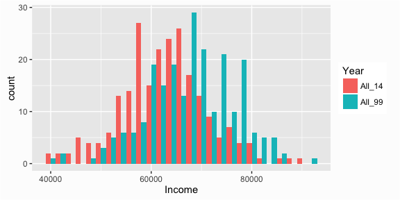
We can also interweave the histograms:
# Interweaving histograms
ggplot(compare, aes(x = Income, fill = Year)) +
        geom_histogram(binwidth = 2000, position = "dodge")
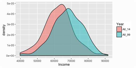
And we can overlay the density plots:
# Overlaying density plots
ggplot(compare, aes(x = Income, fill = Year)) +
        geom_density(alpha = .5)
We can also separate the histograms by using facets with the facet_grid() function:
ggplot(compare, aes(x = Income)) +
        geom_histogram(binwidth = 2000, color = "grey30", fill = "white") +
        facet_grid(Year ~ .)
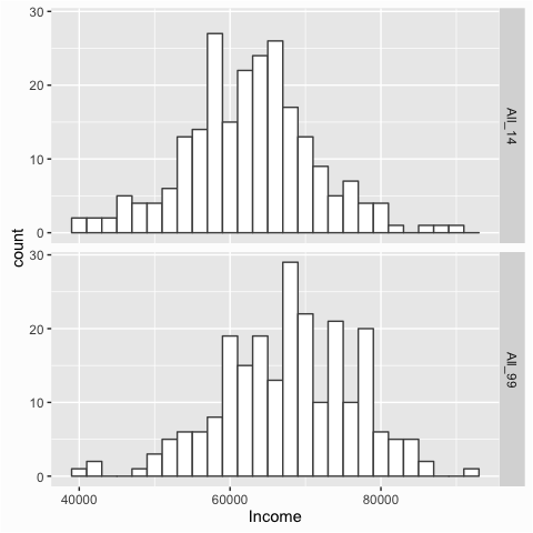
The facet_grid() utility becomes very useful when assessing multiple groupings. In essence, it produces a series of similar graphs based on similar scales and axes, which allows them to be easily compared. This series of small graphs is also known as small multiples and was popularized by Edward Tufte.
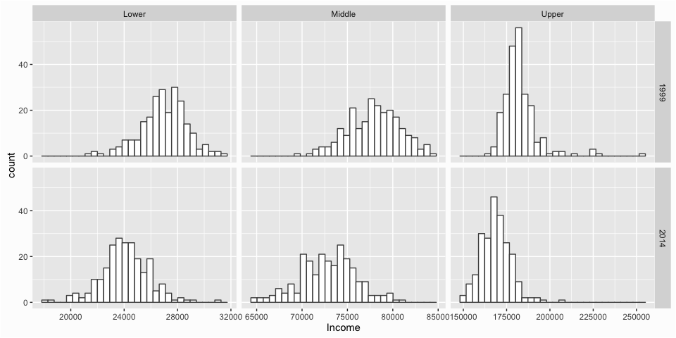
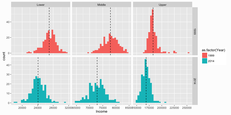
We can illustrate their usefulness by producing small multiples for each income tier (lower, middle, and upper) for both 1999 and 2014. To do so, first we need to manipulate the data to get it in the proper form. You can read more about what these manipulation functions are doing
here. Then we feed the categorical variables that we want to act as the columns (Class) and rows (Year) to facet_grid() and apply the scales = free_x argument to allow the x-axis to be independent for each column. The result allows you to quickly compare the distributions and most-likely values for each income tier from 1999 to 2014.
# Let's compare the three classes from 1999 to 2014
class_comparison <- income %>%
        select(Metro, Lower_99:Upper_99, Lower_14:Upper_14) %>%
        gather(Class, Income, -Metro) %>%
        separate(Class, into = c("Class", "Year")) %>%
        mutate(Year = ifelse(Year == 99, 1999, 2014))

ggplot(class_comparison, aes(x = Income)) +
        geom_histogram(color = "grey30", fill = "white") +
        facet_grid(Year ~ Class, scales = "free_x")
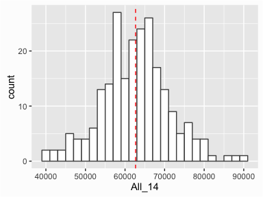
Many times we want to draw attention to specific values in our graphic such as the mean, median, outliers, or any specific observation that may provide unique insight. We can do this by adding markers to our graphic. For instance, we can add a line to indicate the mean value of incomes in 2014 by using the geom_vline() function. This helps to illustrate how much of the distribution is above and below the average.
# Add mean line to single histogram
ggplot(income, aes(x = All_14)) +
        geom_histogram(binwidth = 2000, color = "grey30", fill = "white") +
        geom_vline(xintercept = mean(income$All_14), color = "red", linetype = "dashed")
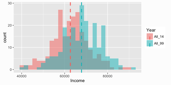
To add lines for grouped data we need to do a little computation prior to graphing. Here we simply create a new data frame with the mean values for each group and use that data to plot the mean lines:
# Add median line to overlaid histograms
compare_mean <- compare %>%
        group_by(Year) %>%
        summarise(Mean = mean(Income))

ggplot(compare, aes(x = Income, fill = Year)) +
        geom_histogram(binwidth = 2000, alpha = .5, position = "identity") +
        geom_vline(data = compare_mean, aes(xintercept = Mean, color = Year),
                   linetype = "dashed", size = 1)
Similarly, to add lines to small multiples we need to create a new data frame with the mean values for each group and use that data to plot the mean lines:
# Create data frame of means to add mean line to faceted histograms
class_mean <- class_comparison %>%
        group_by(Class, Year) %>%
        summarise(Mean = mean(Income))

ggplot(class_comparison, aes(x = Income, fill = as.factor(Year))) +
        geom_histogram() +
        geom_vline(data = class_mean, aes(xintercept = Mean), linetype = "dashed") +
        facet_grid(Year ~ Class, scales = "free")

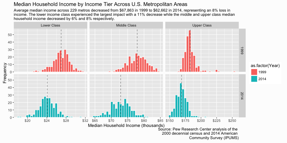
The charts above provide us some pretty good insights regarding the distribution of household median income across U.S. metro locations. However, once you’ve decided the message you want to get across with a graphic, a significant determination of the visualization’s success in transmitting the message to your audience is predicated on the aesthetics and clarity of your graphic. Let’s say our goal is to illustrate how the distribution of incomes in each tier has changed from 1999 to 2014. We can take the following graphic, which we produced in the last section and refine it further to better communicate this message.
ggplot(class_comparison, aes(x = Income, fill = as.factor(Year))) +
        geom_histogram() +
        geom_vline(data = class_mean, aes(xintercept = Mean), linetype = "dashed") +
        facet_grid(Year ~ Class, scales = "free")
First, let’s change the naming of the income tiers so that it is explicit that we are discussing the lower, middle and upper class incomes. I need to do this to both the main data frame I use for the graphic (class_comparison) plus the data frame I use for marking the means of each small multiple (class_mean).
# Turn Class into a factor and revalue
class_comparison$Class <- as.factor(class_comparison$Class)
class_comparison$Class <- plyr::revalue(class_comparison$Class,
                                        c("Lower" = "Lower Class",
                                          "Middle" = "Middle Class",
                                          "Upper" = "Upper Class"))

class_mean$Class <- as.factor(class_mean$Class)
class_mean$Class <- plyr::revalue(class_mean$Class,
                                  c("Lower" = "Lower Class",
                                    "Middle" = "Middle Class",
                                    "Upper" = "Upper Class"))
Now I can start refining my visual. First, I re-scale the income values on the x-axis so there is less clutter. I then refine the x and y scales via the scales... argument. I also rename the x and y axes. I then add the title, subtitle and caption with the labs() function to provide some explanation to the key findings I want the audience to take away.
p <- ggplot(class_comparison, aes(x = Income/1000, fill = as.factor(Year))) +
        geom_histogram(color = "white") +
        geom_vline(data = class_mean, aes(xintercept = Mean/1000), linetype = "dashed", alpha = .5) +
        facet_grid(Year ~ Class, scales = "free") +
        scale_x_continuous(labels = scales::dollar) +
        scale_y_continuous(limits = c(0, 58), expand = c(0, 0)) +
        ylab("Frequency") +
        xlab("Median Household Income (thousands)") +
        labs(title = "Median Household Income by Income Tier Across U.S. Metropolitan Areas",
             subtitle = "Average median income across 229 metros decreased from $67,863 in 1999 to $62,662 in 2014, representing an 8% loss in \nincome. The lower income class experienced the largest impact with a 11% decrease while the middle and upper class median \nhousehold income decreased by 6% and 8% respectively.",
             caption = "Source: Pew Research Center analysis of the \n2000 decennial census and 2014 American \nCommunity Survey (IPUMS)")

p
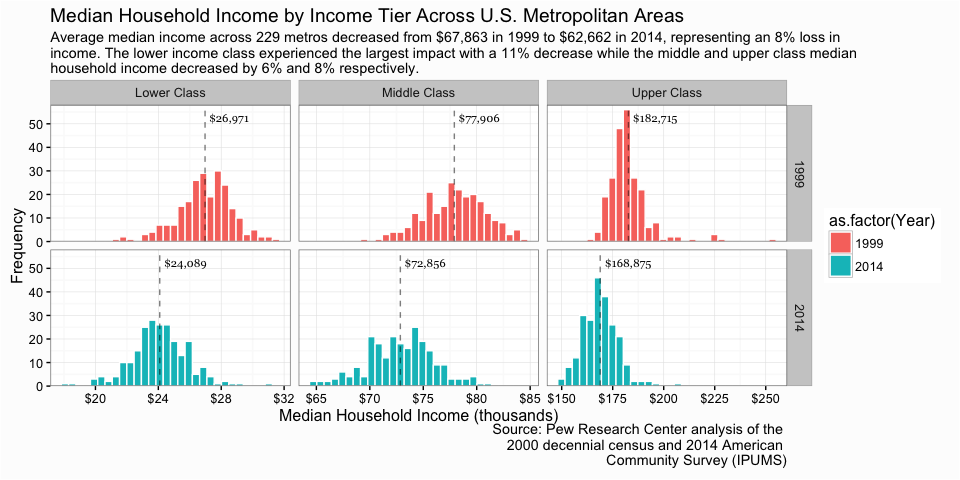
So far not too bad. Next, let’s add the mean value for each small mutliple so that the viewer can get actual dollar comparisons. Since this is for a final output I want the dollar values to appear polished so I use paste0("$", prettyNum(round(Mean, 0), big.mark = ",")) to produce a “pretty” number such as $26,971 rather than 26971.27. I also change the theme to a black and white version…personal preferences.
# create a column for nice looking label numbers to add to the graphic
class_mean <- class_mean %>%
        mutate(Label = paste0("$", prettyNum(round(Mean, 0), big.mark = ",")))

p <- p +
        geom_text(data = class_mean, aes(x = Mean/1000, y = 52.5, id = Class, label = Label),
                  family = "Georgia", size = 3, hjust = -.1) +
        theme_bw()

p
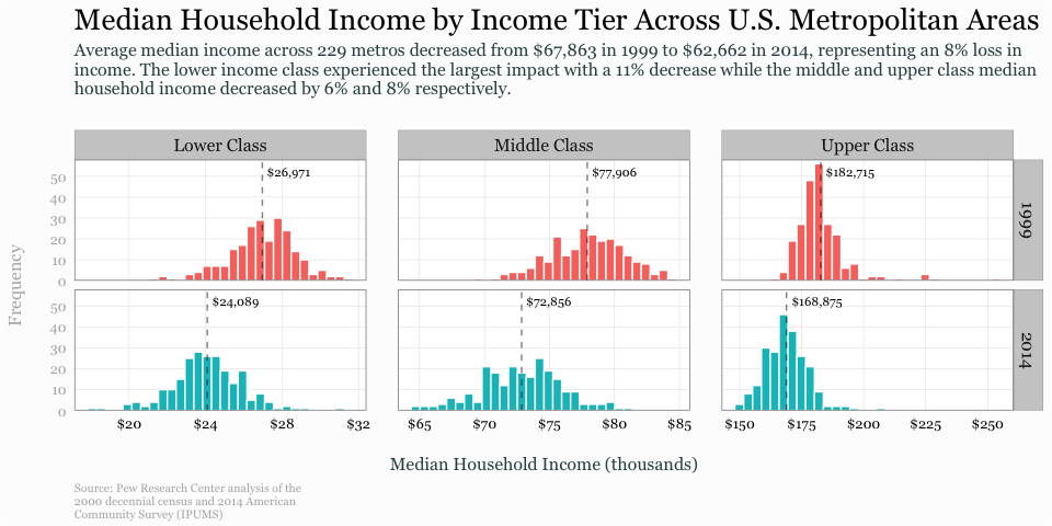
Getting better. Now let’s do some final theme changes. I remove the legend, minor grid lines, and axis tick marks because they are not necessary and it simplifies the visual. I mute the text and title of the y-axis since it is not a critical requirement. I add some margins around the title, subtitle, and caption along with slight adjustment in color and size. I also increase the size of the strip text, which is the facet titles to help them stand out. And I mute the caption text and right-align the text. Lastly I change the text to a Georgia font because, well, I like it.
p <- p +
        theme(legend.position = "none",
              panel.margin.x = unit(1.5, "lines"),
              panel.grid.minor = element_blank(),
              axis.ticks = element_blank(),
              axis.text.y = element_text(color = "grey70"),
              axis.title.y = element_text(margin = margin(r = 20), color = "grey70"),
              axis.title.x = element_text(margin = margin(t = 20), color = "darkslategrey"),
              plot.title = element_text(size = 20, margin = margin(b = 10)),
              plot.subtitle = element_text(size = 12, color = "darkslategrey", margin = margin(b = 25)),
              plot.caption = element_text(size = 8, margin = margin(t = 10), color = "grey70", hjust = 0),
              strip.text = element_text(size = 12),
              text = element_text(family = "Georgia"))

p
Like I stated at the beginning of this tutorial, histrograms are an efficient means for viewing and comparing distributions. And when refined, they can communicate several different distributional aspects of data to viewers. Hopefully this sheds some light on how to get started developing and refining histograms with ggplot.
Density form just means the y-axis is now in a probability scale where the proportion of the given value (or bin of values) to the overall population is displayed. In essence, the y-axis tells you the estimated probability of the x-axis value occurring. ↩