![]() Follow me on twitter @bradleyboehmke
Follow me on twitter @bradleyboehmke
![]() Follow me on twitter @bradleyboehmke
Follow me on twitter @bradleyboehmke
![]() Machine learning (ML) models are often considered “black boxes” due to their complex inner-workings. More advanced ML models such as random forests, gradient boosting machines (GBM), artificial neural networks (ANN), among others are typically more accurate for predicting nonlinear, faint, or rare phenomena. Unfortunately, more accuracy often comes at the expense of interpretability, and interpretability is crucial for business adoption, model documentation, regulatory oversight, and human acceptance and trust. Luckily, several advancements have been made to aid in interpreting ML models.
Machine learning (ML) models are often considered “black boxes” due to their complex inner-workings. More advanced ML models such as random forests, gradient boosting machines (GBM), artificial neural networks (ANN), among others are typically more accurate for predicting nonlinear, faint, or rare phenomena. Unfortunately, more accuracy often comes at the expense of interpretability, and interpretability is crucial for business adoption, model documentation, regulatory oversight, and human acceptance and trust. Luckily, several advancements have been made to aid in interpreting ML models.
Moreover, it’s often important to understand the ML model that you’ve trained on a global scale, and also to zoom into local regions of your data or your predictions and derive local explanations. Global interpretations help us understand the inputs and their entire modeled relationship with the prediction target, but global interpretations can be highly approximate in some cases. Local interpretations help us understand model predictions for a single row of data or a group of similar rows.
This post demonstrates how to use the lime package to perform local interpretations of ML models. This will not focus on the theoretical and mathematical underpinnings but, rather, on the practical application of using lime. 1
This tutorial leverages the following packages.
# required packages
# install vip from github repo: devtools::install_github("koalaverse/vip")
library(lime)       # ML local interpretation
library(vip)        # ML global interpretation
library(pdp)        # ML global interpretation
library(ggplot2)    # visualization pkg leveraged by above packages
library(caret)      # ML model building
library(h2o)        # ML model building

# initialize h2o
h2o.init()
##
## H2O is not running yet, starting it now...
##
## Note:  In case of errors look at the following log files:
##     /var/folders/ws/qs4y2bnx1xs_4y9t0zbdjsvh0000gn/T//RtmpIqxdOK/h2o_bradboehmke_started_from_r.out
##     /var/folders/ws/qs4y2bnx1xs_4y9t0zbdjsvh0000gn/T//RtmpIqxdOK/h2o_bradboehmke_started_from_r.err
##
##
## Starting H2O JVM and connecting: .. Connection successful!
##
## R is connected to the H2O cluster:
##     H2O cluster uptime:         2 seconds 469 milliseconds
##     H2O cluster timezone:       America/New_York
##     H2O data parsing timezone:  UTC
##     H2O cluster version:        3.18.0.11
##     H2O cluster version age:    15 days
##     H2O cluster name:           H2O_started_from_R_bradboehmke_tnu907
##     H2O cluster total nodes:    1
##     H2O cluster total memory:   1.78 GB
##     H2O cluster total cores:    4
##     H2O cluster allowed cores:  4
##     H2O cluster healthy:        TRUE
##     H2O Connection ip:          localhost
##     H2O Connection port:        54321
##     H2O Connection proxy:       NA
##     H2O Internal Security:      FALSE
##     H2O API Extensions:         XGBoost, Algos, AutoML, Core V3, Core V4
##     R Version:                  R version 3.5.0 (2018-04-23)
h2o.no_progress()
To demonstrate model visualization techniques we’ll use the employee attrition data that has been included in the rsample package. This demonstrates a binary classification problem (“Yes” vs. “No”) but the same process that you’ll observe can be used for a regression problem. Note: I force ordered factors to be unordered as h2o does not support ordered categorical variables.
For this exemplar I retain most of the observations in the training data sets and retain 5 observations in the local_obs set. These 5 observations are going to be treated as new observations that we wish to understand why the particular predicted response was made.
# create data sets
df <- rsample::attrition %>%
  dplyr::mutate_if(is.ordered, factor, ordered = FALSE) %>%
  dplyr::mutate(Attrition = factor(Attrition, levels = c("Yes", "No")))

index <- 1:5
train_obs <- df[-index, ]
local_obs <- df[index, ]

# create h2o objects for modeling
y <- "Attrition"
x <- setdiff(names(train_obs), y)
train_obs.h2o <- as.h2o(train_obs)
local_obs.h2o <- as.h2o(local_obs)
We will explore how to visualize a few of the more popular machine learning algorithms and packages in R. For brevity I train default models and do not emphasize hyperparameter tuning. The following produces:
ranger via the caret packageh2oh2oh2oranger directly# Create Random Forest model with ranger via caret
fit.caret <- train(
Attrition ~ .,
data = train_obs,
method = 'ranger',
trControl = trainControl(method = "cv", number = 5, classProbs = TRUE),
tuneLength = 1,
importance = 'impurity'
)
# create h2o models
h2o_rf <- h2o.randomForest(x, y, training_frame = train_obs.h2o)
h2o_glm <- h2o.glm(x, y, training_frame = train_obs.h2o, family = "binomial")
h2o_gbm <- h2o.gbm(x, y, training_frame = train_obs.h2o)
# ranger model --> model type not built in to LIME
fit.ranger <- ranger::ranger(
Attrition ~ .,
data = train_obs,
importance = 'impurity',
probability = TRUE
)
The most common ways of obtaining global interpretation is through:
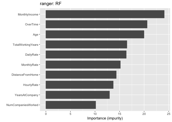
Variable importance quantifies the global contribution of each input variable to the predictions of a machine learning model. Variable importance measures rarely give insight into the average direction that a variable affects a response function. They simply state the magnitude of a variable’s relationship with the response as compared to other variables used in the model. For example, the ranger random forest model identified monthly income, overtime, and age as the top 3 variables impacting the objective function. 2
vip(fit.ranger) + ggtitle("ranger: RF")
After the most globally relevant variables have been identified, the next step is to attempt to understand how the response variable changes based on these variables. For this we can use partial dependence plots (PDPs) and individual conditional expectation (ICE) curves. These techniques plot the change in the predicted value as specified feature(s) vary over their marginal distribution. Consequently, we can gain some local understanding how the reponse variable changes across the distribution of a particular variable but this still only provides a global understanding of this relationships across all observed data.
For example, if we plot the PDP of the monthly income variable we see that the probability of an employee attriting decreases, on average, as their monthly income approaches $5,000 and then remains relatively flat.
# built-in PDP support in H2O
h2o.partialPlot(h2o_rf, data = train_obs.h2o, cols = "MonthlyIncome")
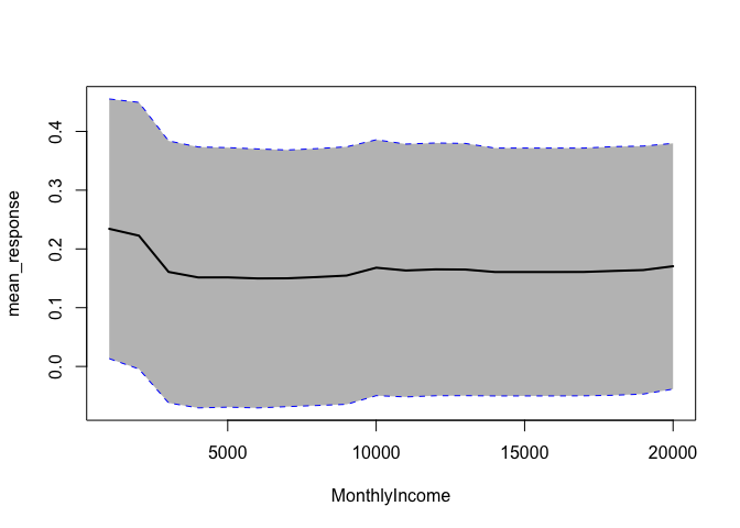
## PartialDependence: Partial Dependence Plot of model DRF_model_R_1528479431329_1 on column 'MonthlyIncome'
##    MonthlyIncome mean_response stddev_response
## 1    1009.000000      0.234259        0.221002
## 2    2008.473684      0.222587        0.226874
## 3    3007.947368      0.160894        0.222993
## 4    4007.421053      0.151488        0.222035
## 5    5006.894737      0.151570        0.220858
## 6    6006.368421      0.149795        0.220387
## 7    7005.842105      0.150014        0.218417
## 8    8005.315789      0.152143        0.218597
## 9    9004.789474      0.154683        0.219151
## 10  10004.263158      0.168048        0.217751
## 11  11003.736842      0.163311        0.215179
## 12  12003.210526      0.165249        0.215119
## 13  13002.684211      0.164922        0.214645
## 14  14002.157895      0.160730        0.210939
## 15  15001.631579      0.160730        0.210939
## 16  16001.105263      0.160730        0.210939
## 17  17000.578947      0.160840        0.210815
## 18  18000.052632      0.162573        0.211605
## 19  18999.526316      0.164061        0.211045
## 20  19999.000000      0.170573        0.209140
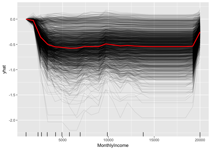
We can gain further insight by using centered ICE curves which can help draw out further details. For example, the following ICE curves show a similar trend line as the PDP above but by centering we identify the decrease as monthly income approaches $5,000 followed by an increase in probability of attriting once an employee’s monthly income approaches $20,000. Futhermore, we see some turbulence in the flatlined region between $5-$20K) which means there appears to be certain salary regions where the probability of attriting changes.
fit.ranger %>%
  partial(pred.var = "MonthlyIncome", grid.resolution = 25, ice = TRUE) %>%
  autoplot(rug = TRUE, train = train_obs, alpha = 0.1, center = TRUE)
These visualizations help us to understand our model from a global perspective: identifying the variables with the largest overall impact and the typical influence of a feature on the response variable across all observations. However, what these do not help us understand is given a new observation, what were the most influential variables that determined the predicted outcome. Say we obtain information on an employee that makes about $10,000 per month and we need to assess their probabilty of leaving the firm. Although monthly income is the most important variable in our model, it may not be the most influential variable driving this employee to leave. To retain the employee, leadership needs to understand what variables are most influential for that specific employee. This is where lime can help.
Local Interpretable Model-agnostic Explanations (LIME) is a visualization technique that helps explain individual predictions. As the name implies, it is model agnostic so it can be applied to any supervised regression or classification model. Behind the workings of LIME lies the assumption that every complex model is linear on a local scale and asserting that it is possible to fit a simple model around a single observation that will mimic how the global model behaves at that locality. The simple model can then be used to explain the predictions of the more complex model locally.
The generalized algorithm LIME applies is:
Each of these steps will be discussed in further detail as we proceed.
The application of the LIME algorithm via the lime package is split into two operations: lime::lime and lime::explain. The lime::lime function creates an “explainer” object, which is just a list that contains the machine learning model and the feature distributions for the training data. The feature distributions that it contains includes distribution statistics for each categorical variable level and each continuous variable split into n bins (default is 4 bins). These feature attributes will be used to permute data.
The following creates our lime::lime object and I change the number to bin our continuous variables into to 5.
explainer_caret <- lime(train_obs, fit.caret, n_bins = 5)

class(explainer_caret)
## [1] "data_frame_explainer" "explainer"            "list"

summary(explainer_caret)
##                      Length Class  Mode
## model                24     train  list
## bin_continuous        1     -none- logical
## n_bins                1     -none- numeric
## quantile_bins         1     -none- logical
## use_density           1     -none- logical
## feature_type         31     -none- character
## bin_cuts             31     -none- list
## feature_distribution 31     -none- list
Once we created our lime objects, we can now perform the generalized LIME algorithm using the lime::explain function. This function has several options, each providing flexibility in how we perform the generalized algorithm mentioned above.
x: Contains the one or more single observations you want to create local explanations for. In our case, this includes the 5 observations that I included in the local_obs data frame. Relates to algorithm step 1.explainer: takes the explainer object created by lime::lime, which will be used to create permuted data. Permutations are sampled from the variable distributions created by the lime::lime explainer object. Relates to algorithm step 1.n_permutations: The number of permutations to create for each observation in x (default is 5,000 for tabular data). Relates to algorithm step 1.dist_fun: The distance function to use. The default is Gower’s distance but can also use euclidean, manhattan, or any other distance function allowed by ?dist(). To compute similarity distance of permuted observations, categorical features will be recoded based on whether or not they are equal to the actual observation. If continuous features are binned (the default) these features will be recoded based on whether they are in the same bin as the observation. Using the recoded data the distance to the original observation is then calculated based on a user-chosen distance measure. Relates to algorithm step 2.kernel_width: To convert the distance measure to a similarity value, an exponential kernel of a user defined width (defaults to 0.75 times the square root of the number of features) is used. Smaller values restrict the size of the local region. Relates to algorithm step 2.n_features: The number of features to best describe predicted outcomes. Relates to algorithm step 4.feature_select: To select the best n features, lime can use forward selection, ridge regression, lasso, or a tree to select the features. In this example I apply a ridge regression model and select the m features with highest absolute weights. Relates to algorithm step 4.For classification models we also have two additional features we care about and one of these two arguments must be given:
labels: Which label do we want to explain? In this example, I want to explain the probability of an observation to attrit (“Yes”).n_labels: The number of labels to explain. With this data I could select n_labels = 2 to explain the probability of “Yes” and “No” responses.explanation_caret <- explain(
x = local_obs,
explainer = explainer_caret,
n_permutations = 5000,
dist_fun = "gower",
kernel_width = .75,
n_features = 10,
feature_select = "highest_weights",
labels = "Yes"
)
The explain function above first creates permutations, then calculates similarities, followed by selecting the m features. Lastly, explain will then fit a model (algorithm steps 5 & 6). lime applies a ridge regression model with the weighted permuted observations as the simple model.3 If the model is a regressor, the simple model will predict the output of the complex model directly. If the complex model is a classifier, the simple model will predict the probability of the chosen class(es).
The explain output is a data frame containing different information on the simple model predictions. Most importantly, for each observation in local_obs it contains the simple model fit (model_r2) and the weighted importance (feature_weight) for each important feature (feature_desc) that best describes the local relationship.
tibble::glimpse(explanation_caret)
## Observations: 50
## Variables: 13
## $ model_type       <chr> "classification", "classification", "classifi...
## $ case             <chr> "1", "1", "1", "1", "1", "1", "1", "1", "1", ...
## $ label            <chr> "Yes", "Yes", "Yes", "Yes", "Yes", "Yes", "Ye...
## $ label_prob       <dbl> 0.250, 0.250, 0.250, 0.250, 0.250, 0.250, 0.2...
## $ model_r2         <dbl> 0.5764345, 0.5764345, 0.5764345, 0.5764345, 0...
## $ model_intercept  <dbl> 0.1689023, 0.1689023, 0.1689023, 0.1689023, 0...
## $ model_prediction <dbl> 0.3289346, 0.3289346, 0.3289346, 0.3289346, 0...
## $ feature          <chr> "OverTime", "MaritalStatus", "BusinessTravel"...
## $ feature_value    <int> 2, 3, 3, 3, 4, 8, 2, 2, 1, 0, 1, 2, 2, 2, 3, ...
## $ feature_weight   <dbl> 0.15268032, 0.05166658, -0.03939269, 0.036107...
## $ feature_desc     <chr> "OverTime = Yes", "MaritalStatus = Single", "...
## $ data             <list> [[41, Yes, Travel_Rarely, 1102, Sales, 1, Co...
## $ prediction       <list> [[0.25, 0.75], [0.25, 0.75], [0.25, 0.75], [...
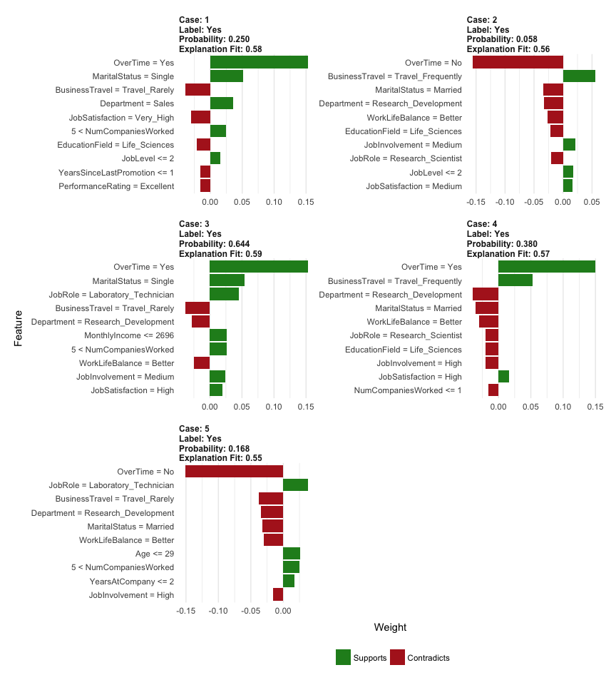
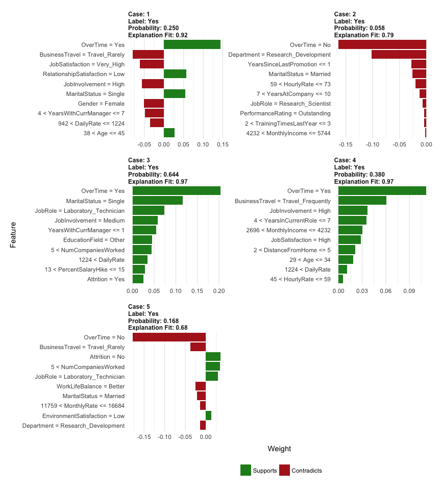
However the simplest approach to interpret the results is to visualize them. There are several plotting functions provided by lime but for tabular data we are only concerned with two. The most important of which is plot_features. This will create a visualization containing an individual plot for each observation (case 1, 2, …, n) in our local_obs data frame. Since we specified labels = "Yes" in the explain() function, it will provide the probability of each observation attriting. And since we specified n_features = 10 it will plot the 10 most influential variables that best explain the linear model in that observations local region and whether the variable is causes an increase in the probability (supports) or a decrease in the probability (contradicts). It also provides us with the model fit for each model (“Explanation Fit: XX”), which allows us to see how well that model explains the local region.
Consequently, we can infer that case 3 has the highest liklihood of attriting out of the 5 observations and the 3 variables that appear to be influencing this high probability include working overtime, being single, and working as a lab tech.
plot_features(explanation_caret)
The other plot we can create is a heatmap showing how the different variables selected across all the observations influence each case. This plot becomes useful if you are trying to find common features that influence all observations or if you are performing this analysis across many observations which makes plot_features difficult to discern.
plot_explanations(explanation_caret)
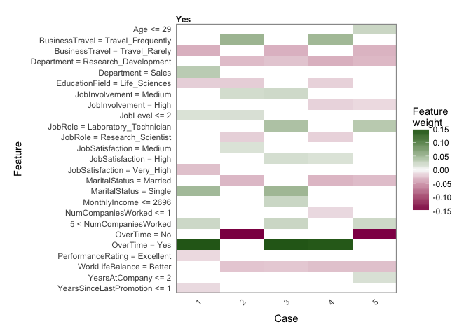
As you saw in the above plot_features plot, the output provides the model fit. In this case the best simple model fit for the given local regions was for case 3. Considering there are several knobs we can turn when performing the LIME algorithm, we can treat these as tuning parameters to try find the best fit model for the local region. This helps to maximize the amount of trust we can have in the local region explanation.
As an example, the following changes the distance function to use the manhattan distance algorithm, we increase the kernel width substantially to create a larger local region, and we change our feature selection approach to a LARS lasso model. The result is a fairly substantial increase in our explanation fits.
# tune LIME algorithm
explanation_caret <- explain(
  x = local_obs,
  explainer = explainer_caret,
  n_permutations = 5000,
  dist_fun = "manhattan",
  kernel_width = 3,
  n_features = 10,
  feature_select = "lasso_path",
  labels = "Yes"
  )

plot_features(explanation_caret)
Currently, lime supports supervised models produced in caret, mlr, xgboost, h2o, keras, and MASS::lda. Consequently, any supervised models created with these packages will function just fine with lime.
explainer_h2o_rf  <- lime(train_obs, h2o_rf, n_bins = 5)
explainer_h2o_glm <- lime(train_obs, h2o_glm, n_bins = 5)
explainer_h2o_gbm <- lime(train_obs, h2o_gbm, n_bins = 5)

explanation_rf <- explain(local_obs, explainer_h2o_rf, n_features = 5, labels = "Yes", kernel_width = .1, feature_select = "highest_weights")
explanation_glm <- explain(local_obs, explainer_h2o_glm, n_features = 5, labels = "Yes", kernel_width = .1, feature_select = "highest_weights")
explanation_gbm <- explain(local_obs, explainer_h2o_gbm, n_features = 5, labels = "Yes", kernel_width = .1, feature_select = "highest_weights")

p1 <- plot_features(explanation_rf, ncol = 1) + ggtitle("rf")
p2 <- plot_features(explanation_glm, ncol = 1) + ggtitle("glm")
p3 <- plot_features(explanation_gbm, ncol = 1) + ggtitle("gbm")
gridExtra::grid.arrange(p1, p2, p3, nrow = 1)

However, any models that do not have built in support will produce an error. For example, the model we created directly with ranger is not supported and produces an error.
explainer_ranger <- lime(train, fit.ranger, n_bins = 5)
## Error in UseMethod("lime", x): no applicable method for 'lime' applied to an object of class "function"
We can work with this pretty easily by building two functions that make lime compatible with an unsupported package. First, we need to create a model_type function that specifies what type of model this unsupported package is using. model_type is a lime specific function, we just need to create a ranger specific method. We do this by taking the class name for our ranger object and creating the model_type.ranger method and simply return the type of model (“classification” for this example).
# get the model class
class(fit.ranger)
## [1] "ranger"

# need to create custom model_type function
model_type.ranger <- function(x, ...) {
  # Function tells lime() what model type we are dealing with
  # 'classification', 'regression', 'survival', 'clustering', 'multilabel', etc

  return("classification")
}

model_type(fit.ranger)
## [1] "classification"
We then need to create a predict_model method for ranger as well. The output for this function should be a data frame. For a regression problem it should produce a single column data frame with the predicted response and for a classification problem it should create a column containing the probabilities for each categorical class (binary “Yes” “No” in this example).
# need to create custom predict_model function
predict_model.ranger <- function(x, newdata, ...) {
  # Function performs prediction and returns data frame with Response
  pred <- predict(x, newdata)
  return(as.data.frame(pred$predictions))
}

predict_model(fit.ranger, newdata = local_obs)
##          Yes        No
## 1 0.27451508 0.7254849
## 2 0.08705952 0.9129405
## 3 0.44530397 0.5546960
## 4 0.32226270 0.6777373
## 5 0.23780397 0.7621960
Now that we have those methods developed and in our global environment we can run our lime functions and produce our outputs.4
explainer_ranger <- lime(train_obs, fit.ranger, n_bins = 5)
explanation_ranger <- explain(local_obs, explainer_ranger, n_features = 5, n_labels = 2, kernel_width = .1)
plot_features(explanation_ranger, ncol = 2) + ggtitle("ranger")

LIME provides a great, model-agnostic approach to assessing local interpretation of predictions. To learn more I would start with the following resources:
To this end, you are encouraged to read through the article that introduced the lime framework as well as the additional resources linked to from the original Python repository. ↩
A soon-to-be released chapter in the Machine Learning Data Science Guide will discuss how variable importance is measured for different models. ↩
If you’ve never applied a weighted ridge regression model you can see some details on its application in the glmnet vignette ↩
If you are curious as to why simply creating the model_type.ranger and predict_model.ranger methods and hosting them in your global environment causes the lime functions to work then I suggest you read chapter 6 of Advanced R. ↩