![]() Follow me on twitter @bradleyboehmke
Follow me on twitter @bradleyboehmke
![]() Follow me on twitter @bradleyboehmke
Follow me on twitter @bradleyboehmke
 Descriptive statistics are the first pieces of information used to understand and represent a dataset. There goal, in essence, is to describe the main features of numerical and categorical information with simple summaries. These summaries can be presented with a single numeric measure, using summary tables, or via graphical representation. Here, I illustrate the most common forms of descriptive statistics for numerical data but keep in mind there are numerous ways to describe and illustrate key features of data.
This tutorial covers the key features we are initially interested in understanding for numerical data, to include:
To illustrate ways to compute different summary statistics, and to visualize the data to provide understanding of these key features, I’ll demonstrate using this data which contains data on 843 MLB players in the 2011 season:
##            Player                Team Position   Salary
## 1    A.J. Burnett    New York Yankees  Pitcher 16500000
## 2      A.J. Ellis Los Angeles Dodgers  Catcher   421000
## 3 A.J. Pierzynski   Chicago White Sox  Catcher  2000000
## 4      Aaron Cook    Colorado Rockies  Pitcher  9875000
## 5      Aaron Crow  Kansas City Royals  Pitcher  1400000
## 6    Aaron Harang    San Diego Padres  Pitcher  3500000
In addition, the packages we will leverage include the following:
library(moments)        # for calculating the skew and kurtosis
library(outliers)       # identifying and extracting outliers
library(ggplot2)        # for generating visualizations
☛ See Working with packages for more information on installing, loading, and getting help with packages.
There are three common measures of central tendency, all of which try to answer the basic question of which value is the most “typical.” These are the mean (average of all observations), median (middle observation), and mode (appears most often). Each of these measures can be calculated for an individual variable or across all variables in a particular data frame.
mean(salaries$Salary, na.rm = TRUE)
## [1] 3305055
median(salaries$Salary, na.rm = TRUE)
## [1] 1175000
Unfortunately, there is not a built in function to compute the mode of a variable1. However, we can create a function that takes the vector as an input and gives the mode value as an output:
get_mode <- function(v) {
        unique_value <- unique(v)
        unique_value[which.max(tabulate(match(v, unique_value)))]
}

get_mode(salaries$Salary)
## [1] 414000
The central tendencies give you a sense of the most typical values (salaries in this case) but do not provide you with information on the variability of the values. Variability can be summarized in different ways, each providing you unique understanding of how the values are spread out.
The range is a fairly crude measure of variability, defining the maximum and minimum values and the difference thereof. We can compute range summaries with the following:
# get the minimum value
min(salaries$Salary, na.rm = FALSE)
## [1] 414000

# get the maximum value
max(salaries$Salary, na.rm = FALSE)
## [1] 3.2e+07

# get both the min and max values
range(salaries$Salary, na.rm = FALSE)
## [1]   414000 32000000

# compute the spread between min & max values
max(salaries$Salary, na.rm = FALSE) - min(salaries$Salary, na.rm = FALSE)
## [1] 31586000
Given a certain percentage such as 25%, what is the salary value such that this percentage of salaries is below it? This type of question leads to percentiles and quartiles. Specifically, for any percentage p, the pth percentile is the value such that a percentage p of all values are less than it. Similarly, the first, second, and third quartiles are the percentiles corresponding to p=25%, p=50%, and p=75%. These three values divide the data into four groups, each with (approximately) a quarter of all observations. Note that the second quartile is equal to the median by definition. These measures are easily computed in R:
# fivenum() function provides min, 25%, 50% (median), 75%, and max
fivenum(salaries$Salary)
## [1]   414000   430325  1175000  4306250 32000000

# default quantile() percentiles are 0%, 25%, 50%, 75%, and 100%
# provides same output as fivenum()
quantile(salaries$Salary, na.rm = TRUE)
##       0%      25%      50%      75%     100%
##   414000   430325  1175000  4306250 32000000

# we can customize quantile() for specific percentiles
quantile(salaries$Salary, probs = seq(from = 0, to = 1, by = .1), na.rm = TRUE)
##       0%      10%      20%      30%      40%      50%      60%      70%
##   414000   416520   424460   441300   672000  1175000  2004000  3320000
##      80%      90%     100%
##  5500000  9800000 32000000

# we can quickly compute the difference between the 1st and 3rd quantile
IQR(salaries$Salary)
## [1] 3875925
An alternative approach to is to use the summary() function with is a generic R function used to produce min, 1st quantile, median, mean, 3rd quantile, and max summary measures. However, note that the 1st and 3rd quantiles produced by summary() differ from the 1st and 3rd quantiles produced by fivenum() and the default quantile(). The reason for this is due to the lack of universal agreement on how the 1st and 3rd quartiles should be calculated.2 Eric Cai provided a good blog post that discusses this difference in the R functions.
summary(salaries$Salary)
##     Min.  1st Qu.   Median     Mean  3rd Qu.     Max.
##   414000   430300  1175000  3305000  4306000 32000000
Although the range provides a crude measure of variability and percentiles/quartiles provide an understanding of divisions of the data, the most common measures to summarize variability are variance and its derivatives (standard deviation and mean/median absolute deviation). We can compute each of these as follows:
# variance
var(salaries$Salary)
## [1] 2.056389e+13

# standard deviation
sd(salaries$Salary)
## [1] 4534742

# mean absolute deviation
mad(salaries$Salary, center = mean(salaries$Salary))
## [1] 4229672

# median absolute deviation - note that the center argument defaults to median
# so it does not need to be specified, although I do just be clear
mad(salaries$Salary, center = median(salaries$Salary))
## [1] 1126776
Two additional measures of a distribution that you will hear occasionally include skewness and kurtosis. Skewness is a measure of symmetry for a distribution. Negative values represent a left-skewed distribution where there are more extreme values to the left causing the mean to be less than the median. Positive values represent a right-skewed distribution where there are more extreme values to the right causing the mean to be more than the median.
Kurtosis is a measure of peakedness for a distribution. Negative values indicate a flat (platykurtic) distribution, positive values indicate a peaked (leptokurtic) distribution, and a near-zero value indicates a normal (mesokurtic) distribution.
We can get both skewness and kurtosis values using the moments package:
library(moments)

skewness(salaries$Salary, na.rm = TRUE)
## [1] 2.252809
kurtosis(salaries$Salary, na.rm = TRUE)
## [1] 8.682261
Outliers in data can distort predictions and affect their accuracy. Consequently, its important to understand if outliers are present and, if so, which observations are considered outliers. The outliers package provides a number of useful functions to systematically extract outliers. The functions of most use are outlier() and scores(). The outlier() function gets the most extreme observation from the mean. The scores() function computes the normalized (z, t, chisq, etc.) score which you can use to find observation(s) that lie beyond a given value.
library(outliers)

# gets most extreme right-tail observation
outlier(salaries$Salary)
## [1] 3.2e+07

# gets most extreme left-tail observation
outlier(salaries$Salary, opposite = TRUE)
## [1] 414000

# observations that are outliers based on z-scores
z_scores <- scores(salaries$Salary, type = "z")
which(abs(z_scores) > 1.96)
##  [1]   1  11  22  24  33  34  38  54  64 132 134 138 139 146 151 161 164
## [18] 168 211 236 242 248 249 348 355 370 384 441 452 460 484 496 517 520
## [35] 535 538 576 577 585 601 627 629 649 692 695 728 729 733 737 790 794
## [52] 801 803 816 843

# outliers based on values less than or greater than the "whiskers" on a
# boxplot (1.5 x IQR or more below 1st quartile or above 3rd quartile)
which(scores(salaries$Salary, type = "iqr", lim = 1.5))
##  [1]   1  11  12  22  24  33  34  38  54  64  83  97 132 134 138 139 146
## [18] 151 161 164 168 189 208 211 236 242 248 249 293 298 300 329 336 348
## [35] 355 370 384 408 440 441 442 452 460 475 484 493 496 517 520 535 538
## [52] 547 576 577 585 601 620 627 629 649 664 679 692 695 707 728 729 733
## [69] 737 760 790 794 801 803 816 818 843
How you deal with outliers is a topic worthy of its own tutorial; however, if you want to simply remove an outlier or replace it with the sample mean or median then I recommend the rm.outlier() function provided also by the outliers package.
There are many graphical representations to illustrate these summary measures for numerical variables, but there are a couple fundamental ones that nearly everyone agrees needs to be assessed - histograms and boxplots.
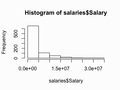
Histograms are the most common type of chart for showing the distribution of a numerical variable. Histograms display a 1D distribution by dividing into bins and counting the number of observations in each bin. Whereas the previously discussed summary measures - mean, median, standard deviation, skewness - describes only one aspect of a numerical variable, a histogram provides the complete picture by illustrating the center of the distribution, the variability, skewness, and other aspects in one convenient chart. We can quickly visualize the histogram for our MLB salaries using base R graphics:
hist(salaries$Salary)
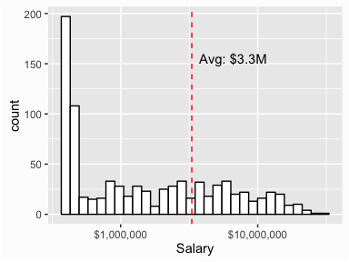
However, we can use ggplot to customize our graphic and create a more presentable product:
library(ggplot2)

ggplot(salaries, aes(Salary)) +
        geom_histogram(colour = "black", fill = "white") +
        scale_x_log10(labels = scales::dollar) +          # x axis log & $$ labels
        geom_vline(aes(xintercept = mean(Salary)),
                   color = "red", linetype = "dashed") +  # add line for mean
        annotate("text", x = mean(salaries$Salary) * 2, y = 155,
                 label = paste0("Avg: $", round(mean(salaries$Salary)/1000000, 1),"M"))
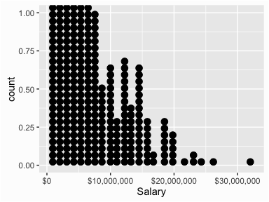
An alternative, and highly effective way to visualize data is with dotplots. In a dotplot a dot is placed at the appropriate value on the x axis for each case with multiples cases of a particular value resulting in dots stacking up. The dotplot below helps to illustrate that there is one unique player with a salary greater than $30M (Alex Rodriguez) and only six players with salaries greater than $20M.
ggplot(salaries, aes(x = Salary)) +
        geom_dotplot() +
        scale_x_continuous(labels = scales::dollar)
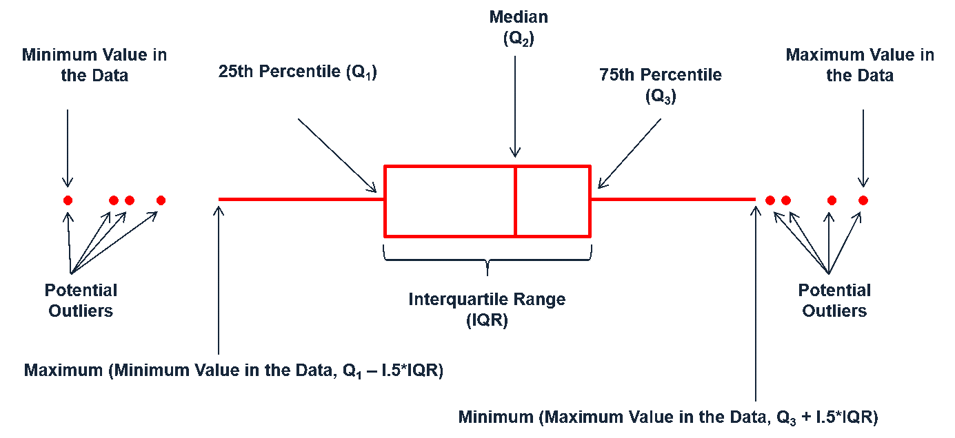
Boxplots are an alternative way to illustrate the distribution of a variable and is a concise way to illustrate the standard quantiles, shape, and outliers of data. As the generic diagram indicates, the box itself extends, left to right, from the 1st quartile to the 3rd quartile. This means that it contains the middle half of the data. The line inside the box is positioned at the median. The lines (whiskers) coming out either side of the box extend to 1.5 interquartlie ranges (IQRs) from the quartlies. These generally include most of the data outside the box. More distant values, called outliers, are denoted separately by individual points.
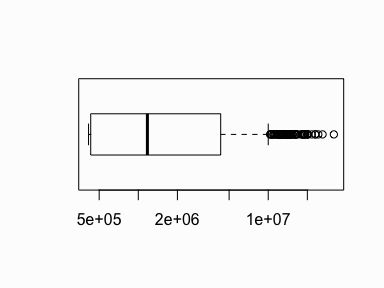
For a quick univariate assessment we can use the boxplot() function in base R graphics. This single boxplot illustrates the highly skewed nature of the distribution with many outliers on the right side.
# I use a log scale to spread out the data
boxplot(salaries$Salary, horizontal = TRUE, log = "x")
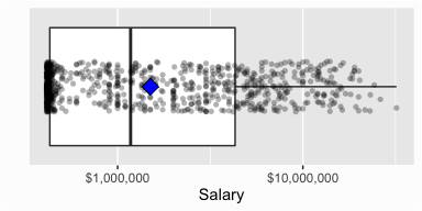
As before, we can use ggplot to refine the boxplot and add additional features such as a point illustrating the mean and also show the actual distribution of observations:
ggplot(salaries, aes(x = factor(0), y = Salary)) +
        geom_boxplot() +
        xlab("") +
        scale_x_discrete(breaks = NULL) +
        scale_y_log10(labels = scales::dollar) +
        coord_flip() +
        geom_jitter(shape = 16, position = position_jitter(0.4), alpha = .3) +
        stat_summary(fun.y = mean, geom = "point", shape = 23, size = 4, fill = "blue")
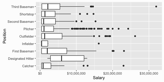
However, boxplots are more useful when comparing distributions. For instance, if you wanted to compare the distributions of salaries across the different positions boxplots provide a quick comparative assessment:
ggplot(salaries, aes(x = Position, y = Salary)) +
        geom_boxplot() +
        scale_y_continuous(labels = scales::dollar) +
        coord_flip()
There is a mode() function in R; however, it is used to get or set the type or storage mode of an object rather than to compute the statistical mode of a variable. ↩
See Hyndman, R. & Fan, Y. (1996). Sample Quantiles in Statistical Packages, The American Statistician, 50(4), 361-365 for more discussion. ↩