![]() Follow me on twitter @bradleyboehmke
Follow me on twitter @bradleyboehmke
![]() Follow me on twitter @bradleyboehmke
Follow me on twitter @bradleyboehmke
Principal Component Analysis (PCA) involves the process by which principal components are computed, and their role in understanding the data. PCA is an unsupervised approach, which means that it is performed on a set of variables , , …, with no associated response . PCA reduces the dimensionality of the data set, allowing most of the variability to be explained using fewer variables. PCA is commonly used as one step in a series of analyses. You can use PCA to reduce the number of variables and avoid multicollinearity, or when you have too many predictors relative to the number of observations.
This tutorial serves as an introduction to Principal Component Analysis (PCA).1
This tutorial primarily leverages the USArrests data set that is built into R. This is a set that contains four variables that represent the number of arrests per 100,000 residents for Assault, Murder, and Rape in each of the fifty US states in 1973. The data set also contains the percentage of the population living in urban areas, UrbanPop. In addition to loading the set, we’ll also use a few packages that provide added functionality in graphical displays and data manipulation. We use the head command to examine the first few rows of the data set to ensure proper upload.
library(tidyverse)  # data manipulation and visualization
library(gridExtra)  # plot arrangement

data("USArrests")
head(USArrests, 10)
##             Murder Assault UrbanPop Rape
## Alabama       13.2     236       58 21.2
## Alaska        10.0     263       48 44.5
## Arizona        8.1     294       80 31.0
## Arkansas       8.8     190       50 19.5
## California     9.0     276       91 40.6
## Colorado       7.9     204       78 38.7
## Connecticut    3.3     110       77 11.1
## Delaware       5.9     238       72 15.8
## Florida       15.4     335       80 31.9
## Georgia       17.4     211       60 25.8
It is usually beneficial for each variable to be centered at zero for PCA, due to the fact that it makes comparing each principal component to the mean straightforward. This also eliminates potential problems with the scale of each variable. For example, the variance of Assault is 6945, while the variance of Murder is only 18.97. The Assault data isn’t necessarily more variable, it’s simply on a different scale relative to Murder.
# compute variance of each variable
apply(USArrests, 2, var)
##     Murder    Assault   UrbanPop       Rape
##   18.97047 6945.16571  209.51878   87.72916
Standardizing each variable will fix this issue.
# create new data frame with centered variables
scaled_df <- apply(USArrests, 2, scale)
head(scaled_df)
##          Murder   Assault   UrbanPop         Rape
## [1,] 1.24256408 0.7828393 -0.5209066 -0.003416473
## [2,] 0.50786248 1.1068225 -1.2117642  2.484202941
## [3,] 0.07163341 1.4788032  0.9989801  1.042878388
## [4,] 0.23234938 0.2308680 -1.0735927 -0.184916602
## [5,] 0.27826823 1.2628144  1.7589234  2.067820292
## [6,] 0.02571456 0.3988593  0.8608085  1.864967207
However, keep in mind that there may be instances where scaling is not desirable. An example would be if every variable in the data set had the same units and the analyst wished to capture this difference in variance for his or her results. Since Murder, Assault, and Rape are all measured on occurrences per 100,000 people this may be reasonable depending on how you want to interpret the results. But since UrbanPop is measured as a percentage of total population it wouldn’t make sense to compare the variability of UrbanPop to Murder, Assault, and Rape.
The important thing to remember is PCA is influenced by the magnitude of each variable; therefore, the results obtained when we perform PCA will also depend on whether the variables have been individually scaled.
The goal of PCA is to explain most of the variability in the data with a smaller number of variables than the original data set. For a large data set with variables, we could examine pairwise plots of each variable against every other variable, but even for moderate , the number of these plots becomes excessive and not useful. For example, when there are scatterplots that could be analyzed! Clearly, a better method is required to visualize the n observations when p is large. In particular, we would like to find a low-dimensional representation of the data that captures as much of the information as possible. For instance, if we can obtain a two-dimensional representation of the data that captures most of the information, then we can plot the observations in this low-dimensional space.
PCA provides a tool to do just this. It finds a low-dimensional representation of a data set that contains as much of the variation as possible. The idea is that each of the n observations lives in p-dimensional space, but not all of these dimensions are equally interesting. PCA seeks a small number of dimensions that are as interesting as possible, where the concept of interesting is measured by the amount that the observations vary along each dimension. Each of the dimensions found by PCA is a linear combination of the p features and we can take these linear combinations of the measurements and reduce the number of plots necessary for visual analysis while retaining most of the information present in the data.
We now explain the manner in which these dimensions, or principal components, are found.
The first principal component of a data set is the linear combination of the features
that has the largest variance and where is the first principal component loading vector, with elements . The are normalized, which means that . After the first principal component of the features has been determined, we can find the second principal component . The second principal component is the linear combination of that has maximal variance out of all linear combinations that are uncorrelated with . The second principal component scores take the form
This proceeds until all principal components are computed. The elements in Eq. 1 are the loadings of the first principal component. To calculate these loadings, we must find the vector that maximizes the variance. It can be shown using techniques from linear algebra that the eigenvector corresponding to the largest eigenvalue of the covariance matrix is the set of loadings that explains the greatest proportion of the variability.
Therefore, to calculate principal components, we start by using the cov() function to calculate the covariance matrix, followed by the eigen command to calculate the eigenvalues of the matrix. eigen produces an object that contains both the ordered eigenvalues ($values) and the corresponding eigenvector matrix ($vectors).
# Calculate eigenvalues & eigenvectors
arrests.cov <- cov(scaled_df)
arrests.eigen <- eigen(arrests.cov)
str(arrests.eigen)
## List of 2
##  $ values : num [1:4] 2.48 0.99 0.357 0.173
##  $ vectors: num [1:4, 1:4] -0.536 -0.583 -0.278 -0.543 0.418 ...
For our example, we’ll take the first two sets of loadings and store them in the matrix phi.
# Extract the loadings
(phi <- arrests.eigen$vectors[,1:2])
##            [,1]       [,2]
## [1,] -0.5358995  0.4181809
## [2,] -0.5831836  0.1879856
## [3,] -0.2781909 -0.8728062
## [4,] -0.5434321 -0.1673186
Eigenvectors that are calculated in any software package are unique up to a sign flip. By default, eigenvectors in R point in the negative direction. For this example, we’d prefer the eigenvectors point in the positive direction because it leads to more logical interpretation of graphical results as we’ll see shortly. To use the positive-pointing vector, we multiply the default loadings by -1. The set of loadings for the first principal component (PC1) and second principal component (PC2) are shown below:
phi <- -phi
row.names(phi) <- c("Murder", "Assault", "UrbanPop", "Rape")
colnames(phi) <- c("PC1", "PC2")
phi
##                PC1        PC2
## Murder   0.5358995 -0.4181809
## Assault  0.5831836 -0.1879856
## UrbanPop 0.2781909  0.8728062
## Rape     0.5434321  0.1673186
Each principal component vector defines a direction in feature space. Because eigenvectors are orthogonal to every other eigenvector, loadings and, therefore, principal components are uncorrelated with one another, and form a basis of the new space. This holds true no matter how many dimensions are being used.
By examining the principal component vectors above, we can infer the the first principal component (PC1) roughly corresponds to an overall rate of serious crimes since Murder, Assault, and Rape have the largest values. The second component (PC2) is affected by UrbanPop more than the other three variables, so it roughly corresponds to the level of urbanization of the state, with some opposite, smaller influence by murder rate.
If we project the n data points onto the first eigenvector, the projected values are called the principal component scores for each observation.
# Calculate Principal Components scores
PC1 <- as.matrix(scaled_df) %*% phi[,1]
PC2 <- as.matrix(scaled_df) %*% phi[,2]

# Create data frame with Principal Components scores
PC <- data.frame(State = row.names(USArrests), PC1, PC2)
head(PC)
##        State        PC1        PC2
## 1    Alabama  0.9756604 -1.1220012
## 2     Alaska  1.9305379 -1.0624269
## 3    Arizona  1.7454429  0.7384595
## 4   Arkansas -0.1399989 -1.1085423
## 5 California  2.4986128  1.5274267
## 6   Colorado  1.4993407  0.9776297
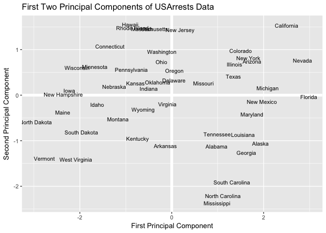
Now that we’ve calculated the first and second principal components for each US state, we can plot them against each other and produce a two-dimensional view of the data. The first principal component (x-axis) roughly corresponds to the rate of serious crimes. States such as California, Florida, and Nevada have high rates of serious crimes, while states such as North Dakota and Vermont have far lower rates. The second component (y-axis) is roughly explained as urbanization, which implies that states such as Hawaii and California are highly urbanized, while Mississippi and the Carolinas are far less so. A state close to the origin, such as Indiana or Virginia, is close to average in both categories.
# Plot Principal Components for each State
ggplot(PC, aes(PC1, PC2)) +
  modelr::geom_ref_line(h = 0) +
  modelr::geom_ref_line(v = 0) +
  geom_text(aes(label = State), size = 3) +
  xlab("First Principal Component") +
  ylab("Second Principal Component") +
  ggtitle("First Two Principal Components of USArrests Data")
Because PCA is unsupervised, this analysis on its own is not making predictions about crime rates, but simply making connections between observations using fewer measurements.
Note that in the above analysis we only looked at two of the four principal components. How did we know to use two principal components? And how well is the data explained by these two principal components compared to using the full data set?
We mentioned previously that PCA reduces the dimensionality while explaining most of the variability, but there is a more technical method for measuring exactly what percentage of the variance was retained in these principal components.
By performing some algebra, the proportion of variance explained (PVE) by the mth principal component is calculated using the equation:
It can be shown that the PVE of the mth principal component can be more simply calculated by taking the mth eigenvalue and dividing it by the number of principal components, p. A vector of PVE for each principal component is calculated:
PVE <- arrests.eigen$values / sum(arrests.eigen$values)
round(PVE, 2)
## [1] 0.62 0.25 0.09 0.04
The first principal component in our example therefore explains 62% of the variability, and the second principal component explains 25%. Together, the first two principal components explain 87% of the variability.
It is often advantageous to plot the PVE and cumulative PVE, for reasons explained in the following section of this tutorial. The plot of each is shown below:
# PVE (aka scree) plot
PVEplot <- qplot(c(1:4), PVE) +
  geom_line() +
  xlab("Principal Component") +
  ylab("PVE") +
  ggtitle("Scree Plot") +
  ylim(0, 1)

# Cumulative PVE plot
cumPVE <- qplot(c(1:4), cumsum(PVE)) +
  geom_line() +
  xlab("Principal Component") +
  ylab(NULL) +
  ggtitle("Cumulative Scree Plot") +
  ylim(0,1)

grid.arrange(PVEplot, cumPVE, ncol = 2)
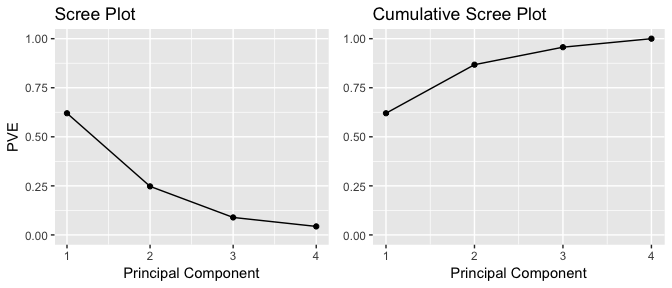
For a general n x p data matrix X, there are up to principal components that can be calculated. However, because the point of PCA is to significantly reduce the number of variables, we want to use the smallest number of principal components possible to explain most of the variability.
The frank answer is that there is no robust method for determining how many components to use. As the number of observations, the number of variables, and the application vary, a different level of accuracy and variable reduction are desirable.
The most common technique for determining how many principal components to keep is eyeballing the scree plot, which is the left-hand plot shown above and stored in the ggplot object PVEplot. To determine the number of components, we look for the “elbow point”, where the PVE significantly drops off.
In our example, because we only have 4 variables to begin with, reduction to 2 variables while still explaining 87% of the variability is a good improvement.
In the sections above we manually computed many of the attributes of PCA (i.e. eigenvalues, eigenvectors, principal components scores). This was meant to help you learn about PCA by understanding what manipulations are occuring with the data; however, using this process to repeatedly perform PCA may be a bit tedious. Fortunately R has several built-in functions (along with numerous add-on packages) that simplifies performing PCA.
One of these built-in functions is prcomp. With prcomp we can perform many of the previous calculations quickly. By default, the prcomp function centers the variables to have mean zero. By using the option scale = TRUE, we scale the variables to have standard deviation one. The output from prcomp contains a number of useful quantities.
pca_result <- prcomp(USArrests, scale = TRUE)
names(pca_result)
## [1] "sdev"     "rotation" "center"   "scale"    "x"
The center and scale components correspond to the means and standard deviations of the variables that were used for scaling prior to implementing PCA.
# means
pca_result$center
##   Murder  Assault UrbanPop     Rape
##    7.788  170.760   65.540   21.232

# standard deviations
pca_result$scale
##    Murder   Assault  UrbanPop      Rape
##  4.355510 83.337661 14.474763  9.366385
The rotation matrix provides the principal component loadings; each column of pca_result$rotation contains the corresponding principal component loading vector.2
pca_result$rotation
##                 PC1        PC2        PC3         PC4
## Murder   -0.5358995  0.4181809 -0.3412327  0.64922780
## Assault  -0.5831836  0.1879856 -0.2681484 -0.74340748
## UrbanPop -0.2781909 -0.8728062 -0.3780158  0.13387773
## Rape     -0.5434321 -0.1673186  0.8177779  0.08902432
We see that there are four distinct principal components. This is to be expected because there are in general informative principal components in a data set with n observations and p variables. Also, notice that PCA1 and PCA2 are opposite signs from what we computated earlier. Recall that by default, eigenvectors in R point in the negative direction. We can adjust this with a simple change.
pca_result$rotation <- -pca_result$rotation
pca_result$rotation
##                PC1        PC2        PC3         PC4
## Murder   0.5358995 -0.4181809  0.3412327 -0.64922780
## Assault  0.5831836 -0.1879856  0.2681484  0.74340748
## UrbanPop 0.2781909  0.8728062  0.3780158 -0.13387773
## Rape     0.5434321  0.1673186 -0.8177779 -0.08902432
Now our PC1 and PC2 match what we computed earlier. We can also obtain the principal components scores from our results as these are stored in the x list item of our results. However, we also want to make a slight sign adjustment to our scores to point them in the positive direction.
pca_result$x <- - pca_result$x
head(pca_result$x)
##                   PC1        PC2         PC3          PC4
## Alabama     0.9756604 -1.1220012  0.43980366 -0.154696581
## Alaska      1.9305379 -1.0624269 -2.01950027  0.434175454
## Arizona     1.7454429  0.7384595 -0.05423025  0.826264240
## Arkansas   -0.1399989 -1.1085423 -0.11342217  0.180973554
## California  2.4986128  1.5274267 -0.59254100  0.338559240
## Colorado    1.4993407  0.9776297 -1.08400162 -0.001450164
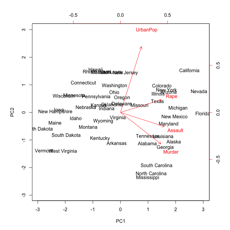
Now we can plot the first two principal components using biplot. Alternatively, if you wanted to plot principal components 3 vs. 4 you can include choices = 3:4 within biplot (the default is choices = 1:2). The output is very similar to what we produced earlier; however, you’ll notice the labeled errors which indicates the directional influence each variable has on the principal components. The scale = 0 argument to biplot ensures that the arrows are scaled to represent the loadings; other values for scale give slightly different biplots with different interpretations.
biplot(pca_result, scale = 0)
The prcomp function also outputs the standard deviation of each principal component.
pca_result$sdev
## [1] 1.5748783 0.9948694 0.5971291 0.4164494
The variance explained by each principal component is obtained by squaring these values:
(VE <- pca_result$sdev^2)
## [1] 2.4802416 0.9897652 0.3565632 0.1734301
To compute the proportion of variance explained by each principal component, we simply divide the variance explained by each principal component by the total variance explained by all four principal components:
PVE <- VE / sum(VE)
round(PVE, 2)
## [1] 0.62 0.25 0.09 0.04
As before, we see that that the first principal component explains 62% of the variance in the data, the next principal component explains 25% of the variance, and so forth. And we could proceed to plot the PVE and cumulative PVE to provide us our scree plots as we did earlier.
This tutorial gets you started with using PCA. Many statistical techniques, including regression, classification, and clustering can be easily adapted to using principal components. These techniques will not be outlined in this tutorial but will be presented in future tutorials and much of the procedures remain similar to what you learned here. In addition to our future tutorials on these other uses you can learn more about them by reading:
This tutorial was built as a supplement to section 10.2 of An Introduction to Statistical Learning. ↩
This function names it the rotation matrix, because when we matrix-multiply the X matrix by pca_result$rotation, it gives us the coordinates of the data in the rotated coordinate system. These coordinates are the principal component scores. ↩