![]() Follow me on twitter @bradleyboehmke
Follow me on twitter @bradleyboehmke
![]() Follow me on twitter @bradleyboehmke
Follow me on twitter @bradleyboehmke
 Time series forecasting is performed in nearly every organization that works with quantifiable data. Retail stores forecast sales. Energy companies forecast reserves, production, demand, and prices. Educational institutions forecast enrollment. Goverments forecast tax receipts and spending. International financial organizations forecast inflation and economic activity. The list is long but the point is short - forecasting is a fundamental analytic process in every organization. The purpose of this tutorial is to get you started doing some fundamental time series exploration and visualization.
This tutorial serves as an introduction to exploring and visualizing time series data and covers:
ts object for time series analysis.ts objects and differentiating trends, seasonality, and cycle variation.This tutorial leverages a variety of data sets to illustrate unique time series features. The data sets are all provided by the forecast and fpp2 packages. Furthermore, these packages provide various functions for computing and visualizing basic time series components.
library(forecast)
library(fpp2)
A time series can be thought of as a vector or matrix of numbers, along with some information about what times those numbers were recorded. This information is stored in a ts object in R. In most examples and exercises throughout the forecasting tutorials you will use data that are already in the time series format. However, if you want to work with your own data, you need to know how to create a ts object in R.
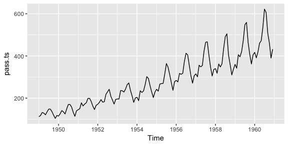
Here, I illustrate how to convert a data frame to a ts object. First, let’s assume we have a data frame named pass.df that looks like the following where we have the total number of airline passengers for each month for the years 1949-1960.
head(pass.df)
##   AirPassengers year month
## 1           112 1949   Jan
## 2           118 1949   Feb
## 3           132 1949   Mar
## 4           129 1949   Apr
## 5           121 1949   May
## 6           135 1949   Jun
We can convert this data frame to a time series object by us the ts() function. Here, the…
pass.df data frame and we index for just the columns with the data (we store the date-time data separately).pass.ts <- ts(pass.df["AirPassengers"], start = c(1949, 1), frequency = 12)
We now have converted our data frame into a time series object:
str(pass.ts)
##  Time-Series [1:144, 1] from 1949 to 1961: 112 118 132 129 121 135 148 148 136 119 ...
##  - attr(*, "dimnames")=List of 2
##   ..$ : NULL
##   ..$ : chr "AirPassengers"

pass.ts
##      Jan Feb Mar Apr May Jun Jul Aug Sep Oct Nov Dec
## 1949 112 118 132 129 121 135 148 148 136 119 104 118
## 1950 115 126 141 135 125 149 170 170 158 133 114 140
## 1951 145 150 178 163 172 178 199 199 184 162 146 166
## 1952 171 180 193 181 183 218 230 242 209 191 172 194
## 1953 196 196 236 235 229 243 264 272 237 211 180 201
## 1954 204 188 235 227 234 264 302 293 259 229 203 229
## 1955 242 233 267 269 270 315 364 347 312 274 237 278
## 1956 284 277 317 313 318 374 413 405 355 306 271 306
## 1957 315 301 356 348 355 422 465 467 404 347 305 336
## 1958 340 318 362 348 363 435 491 505 404 359 310 337
## 1959 360 342 406 396 420 472 548 559 463 407 362 405
## 1960 417 391 419 461 472 535 622 606 508 461 390 432
Go ahead and compare this pass.ts time series object to the built-in AirPassengers data set.
The first step in any data analysis task is to plot the data. Graphs enable you to visualize many features of the data, including patterns, unusual observations, changes over time, and relationships between variables. Just as the type of data determines which forecasting method to use, it also determines which graphs are appropriate.
Here, we use the autoplot() function to produce time plots of ts data. In time series plots, we should always look for outliers, seasonal patterns, overall trends, and other interesting features. This plot starts to illustrate the obvious trends that emerge over time.
autoplot(pass.ts)
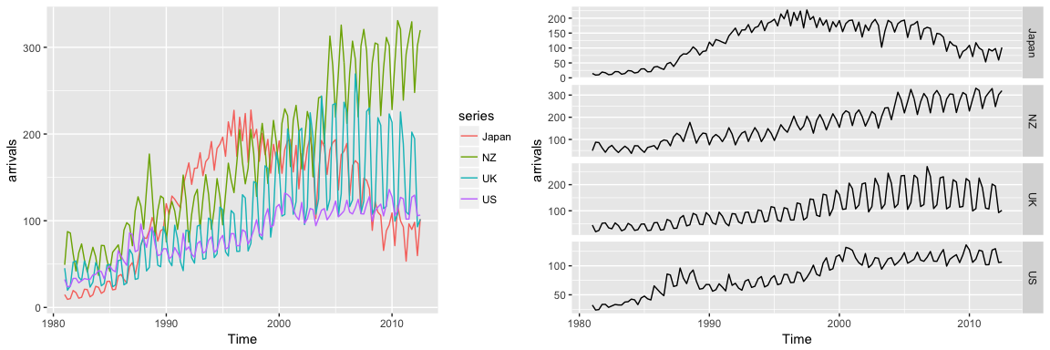
Often, we’ll have time series data that has multiple variables. For example, the fpp2::arrivals data set has time series data for “quarterly international arrivals (in thousands) to Australia from Japan, New Zealand, UK and the US. 1981Q1 - 2012Q3.” So this time series data has two variables (over and above the time stamp data) - (1) arrivals in thousands and (2) country.
head(arrivals)
##          Japan     NZ     UK     US
## 1981 Q1 14.763 49.140 45.266 32.316
## 1981 Q2  9.321 87.467 19.886 23.721
## 1981 Q3 10.166 85.841 24.839 24.533
## 1981 Q4 19.509 61.882 52.264 33.438
## 1982 Q1 17.117 42.045 53.636 33.527
## 1982 Q2 10.617 63.081 34.802 28.366
We can compare the trends across the different variables (countries) either in one plot or use the facetting option to separate the plots:
# left
autoplot(arrivals)

# right
autoplot(arrivals, facets = TRUE)
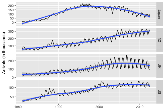
You may have noticed that autoplot() looks a lot like ggplot2 outputs. That’s because many of the visualizations in the forecast package are built on top of ggplot2. This allows us to easily add on to these plots with ggplot2 syntax. For example, we can add a smooth trend line and adjust titles:
autoplot(arrivals, facets = TRUE) +
  geom_smooth() +
  labs("International arrivals to Australia",
       y = "Arrivals (in thousands)",
       x = NULL)
These initial visualizations may spur additional questions such as what was the min, max, or average arrival amount for Japan. We can index and use many normal functions to assess these types of questions.
# index for Japan
japan <- arrivals[, "Japan"]

# Identify max arrival amount
summary(japan)
##    Min. 1st Qu.  Median    Mean 3rd Qu.    Max.
##   9.321  74.135 135.461 122.080 176.752 227.641
You can also use the frequency() function to get the number of observations per unit time. This example returns 4 which means the data are recorded on a quarterly interval.
frequency(japan)
## [1] 4
In viewing time series plots we can describe different components. We can describe the common components using this quarterly cement production data.
autoplot(fpp2::qcement)
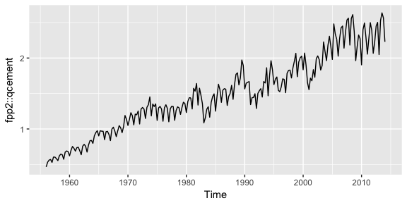
Later tutorials will illustrate how to decompose each of these components; however, next we’ll look at how to do some initial investigating regarding seasonality patterns.
There are a few useful ways of plotting data to emphasize seasonal patterns and show changes in these patterns over time. First, a seasonal plot is similar to a time plot except that the data are plotted against the individual “seasons” in which the data were observed. We can produce a seasonal plot with ggseasonplot():
ggseasonplot(qcement, year.labels=FALSE, continuous=TRUE)
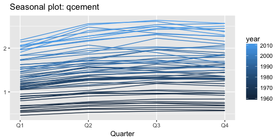
This is the same qcement data shown above, but now the data from each season are overlapped. A seasonal plot allows the underlying seasonal pattern to be seen more clearly, and can be useful in identifying years in which the pattern changes. Here, we see that cement production has consistently increased over the years as the lower (darker) lines represent earlier years and the higher (lighter) lines represent recent years. Also, we see that cement production tends to be the lowest in Q1 and typically peaks in Q3 before leveling off or decreasing slightly in Q4.
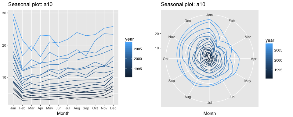
A particular useful variant of a season plot uses polar coordinates, where the time axis is circular rather than horizontal. Here, we plot the a10 data with the conventional seasonal plot versus a polar coordinate option to illustrate this variant. Both plots illustrate a sharp decrease in values in Feb and then a slow increase from Apr-Jan.
# left
ggseasonplot(a10, year.labels=FALSE, continuous=TRUE)

#right
ggseasonplot(a10, year.labels=FALSE, continuous=TRUE, polar = TRUE)
An alternative plot that emphasizes the seasonal patterns is where the data for each season (quarter in our example) are collected together in separate mini time plots. A subseries plot produced by ggsubseriesplot() creates mini time plots for each season. Here, the mean for each season is shown as a blue horizontal line.
ggsubseriesplot(qcement)
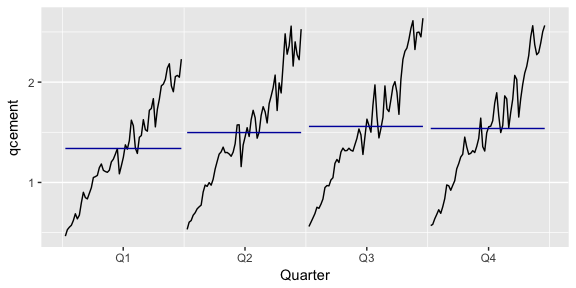
This form of plot enables the underlying seasonal pattern to be seen clearly, and also shows the changes in seasonality over time. It is especially useful in identifying changes within particular seasons. In this example, the plot is not particularly revealing; but in some cases, this is the most useful way of viewing seasonal changes over time.
Another way to look at time series data is to plot each observation against another observation that occurred some time previously. For example, you could plot against . This is called a lag plot because you are plotting the time series against lags of itself. The gglagplot() function produces various types of lag plots.
The correlations associated with the lag plots form what is called the “autocorrelation function”. Autocorrelation is nearly the same as correlation, which you can learn about in the Assessing Correlations tutorial. However, autocorrelation is the correlation of a time series with a delayed copy of itself. Autocorrelation between and for different values of k can be written as:
where T is the length of the time series. And similar to correlation, autocorrelation will always between +1 and -1.
When these autocorrelations are plotted, we get an ACF plot. The ggAcf() function produces ACF plots. Here we look at the total quarterly beer production in Australia (in megalitres) from 1956:Q1 to 2010:Q2. The data are available in the fpp2::ausbeer time series data.
# left: autoplot of the beer data
autoplot(ausbeer)

# middle: lag plot of the beer data
gglagplot(ausbeer)

# right: ACF plot of the beer data
ggAcf(ausbeer)
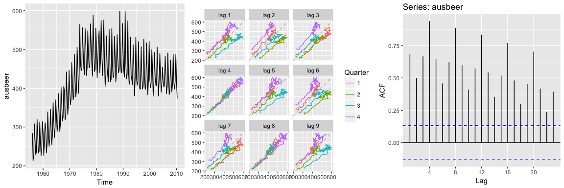
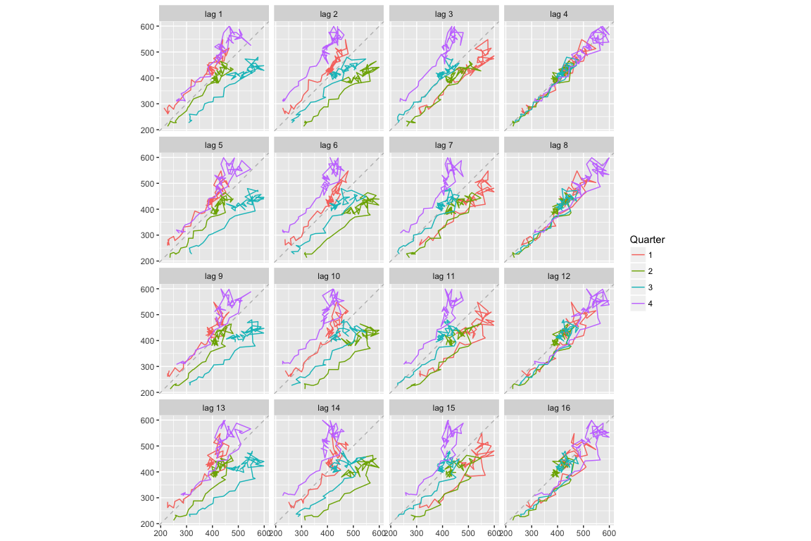
The middle plot provides the bivariate scatter plot for each level of lag (1-9 lags). The right plot provides a condensed plot of the autocorrelation values for the first 23 lags. The right plot shows that the greatest autocorrelation values occur at lags 4, 8, 12, 16, and 20. We can adjust the gglagplot to help illustrate this relationship. Here, we create a scatter plot for the first 16 lags. If you look at the right-most column (lags 4, 8, 12, 16) you can see that the relationship appears strongest for these lags, thus supporting our far right plot above.
We can also access these autocorrelation values with Acf. Here, we can see that the autocorrelation for the two strongest lags (4 and 8) is 0.94 and 0.887.
acf(ausbeer, plot = FALSE)
##
## Autocorrelations of series 'ausbeer', by lag
##
##  0.00  0.25  0.50  0.75  1.00  1.25  1.50  1.75  2.00  2.25  2.50  2.75
## 1.000 0.684 0.500 0.667 0.940 0.644 0.458 0.621 0.887 0.598 0.410 0.574
##  3.00  3.25  3.50  3.75  4.00  4.25  4.50  4.75  5.00  5.25  5.50  5.75
## 0.835 0.543 0.354 0.519 0.770 0.481 0.300 0.454 0.704 0.418 0.236 0.393
When data are either seasonal or cyclic, the ACF will peak around the seasonal lags or at the average cycle length. Thus, we see that the maximal autocorrelation for the ausbeer data occurs at a lag of 4 (right plot above). This makes sense since this is quarterly production data so the highest correlated value for a particular quarter will be the same quarter in the previous year.
A simplified approach to thinking about time series features and autocorrelation is as follows:
# left plot
autoplot(AirPassengers)

# right plot
ggAcf(AirPassengers)
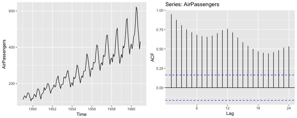
2. Seasonality will induce peaks at the seasonal lags. Think about the holidays, each holiday will have certain products that peak at that time each year and so the strongest correlation will be the values at that same time each year.
# left plot
autoplot(USAccDeaths)

# right plot
ggAcf(USAccDeaths)
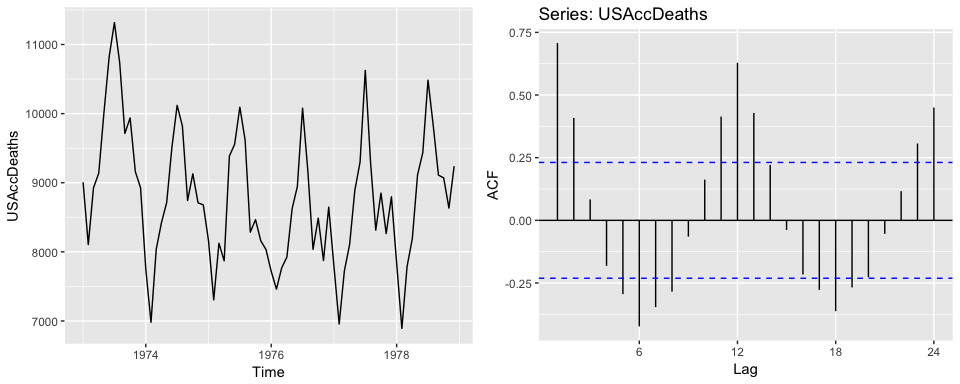
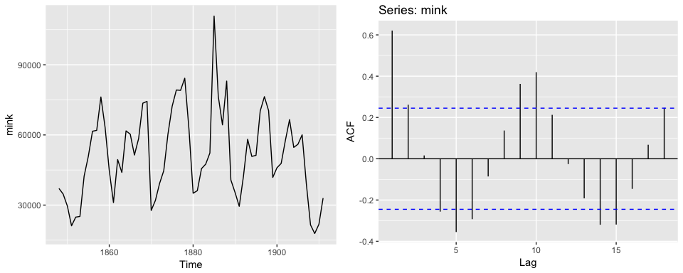
3. Cyclicity induces peaks at the average cycle length. Here we see that there tends to be cyclic impact to the mink population every 10 years. We also see this cause a peak in the ACF plot.
# left plot
autoplot(mink)

# right plot
ggAcf(mink)
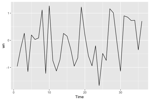
Time series that show no autocorrelation are called “white noise”. For example, the following plots 36 random numbers and illustrates a white noise series. This data is considered idependent and identically distributed (“iid”) because there is no trend, no seasonality, no autocorrelation…just randomness.
set.seed(3)
wn <- ts(rnorm(36))
autoplot(wn)
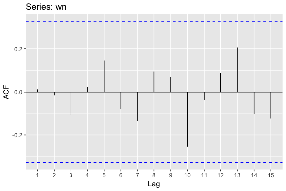
For white noise series, we expect each autocorrelation to be close to zero. Of course, they are not exactly equal to zero as there is some random variation. For a white noise series, we expect 95% of the spikes in the ACF to lie within where T is the length of the time series. It is common to plot these bounds on a graph of the ACF. If there are one or more large spikes outside these bounds, or if more than 5% of spikes are outside these bounds, then the series is probably not white noise.
When using ggAcf, the dotted blue lines represent the 95% threshold. Here, we see that none of the autocorrelations exceed the blue line so we can be confident there is no time series component to this data.
ggAcf(wn)
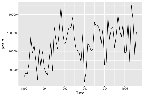
Assessing autocorrelation can be quite useful for data sets where trends and seasonalities are hard to see. For example, the following displays the monthly number of pigs slaughtered in Victoria, Australia from 1990-1995. There may be a slight trend over time but it is unclear.
pigs.ts <- ts(pigs[121:188], start = c(1990, 1), frequency = 12)

autoplot(pigs.ts)
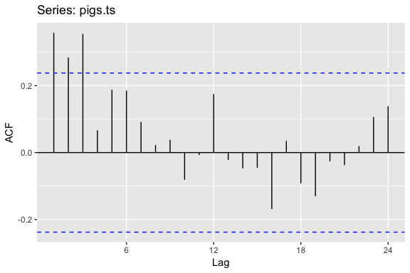
However, looking at the ACF plot makes the feature more clear. There is more information in this data then the plain time series plot provided. We see that the first three lags clearly exceed the blue line suggesting there is possible some signal in this time series component that can be used in a forecasting approach.
ggAcf(pigs.ts)
The ACF plots test if an individual lag autocorrelation is different than zero. An alternative approach is to use the Ljung-Box test, which tests whether any of a group of autocorrelations of a time series are different from zero. In essence it tests the “overall randomness” based on a number of lags. If the result is a small p-value than it indicates the data are probably not white noise.
Here, we perform a Ljung-Box test on the first 24 lag autocorrelations. The resulting p-value is significant at so this supports our ACF plot consideration above where we stated it’s likely this is not purely white noise and that some time series information exists in this data.
Box.test(pigs, lag = 24, fitdf = 0, type = "Lj")
##
## 	Box-Ljung test
##
## data:  pigs
## X-squared = 634.15, df = 24, p-value < 2.2e-16
There is a well-known result in economics called the “Efficient Market Hypothesis” that states that asset prices reflect all available information. A consequence of this is that the daily changes in stock prices should behave like white noise (ignoring dividends, interest rates and transaction costs). The consequence for forecasters is that the best forecast of the future price is the current price.
We can test this hypothesis by looking at the fpp2::goog series, which contains the closing stock price for Google over 1000 trading days ending on February 13, 2017. This data has been loaded into your workspace.
goog series using autoplot.diff(goog), this will produce a time series of the daily changes in Google stock prices. Save this output and plot the daily changes with autoplot. Does this appear to be white noise?ggAcf() function to check if these daily changes look like white noise.