![]() Follow me on twitter @bradleyboehmke
Follow me on twitter @bradleyboehmke
![]() Follow me on twitter @bradleyboehmke
Follow me on twitter @bradleyboehmke
Being able to create visualizations (graphical representations) of data is a key step in being able to communicate information and findings to others. In this module you will learn to use the ggplot2 library to declaratively make beautiful plots or charts of your data. Although R does provide built-in plotting functions, the ggplot2 library implements the Grammar of Graphics. This makes it particularly effective for describing how visualizations should represent data, and has turned it into the preeminent plotting library in R. Learning this library will allow you to make nearly any kind of (static) data visualization, customized to your exact specifications.

This tutorial will provide a general introduction to the ggplot syntax.1
ggplot grammarggplot2: Resources to learn more about ggplot2To reproduce the code throughout this tutorial you will need to load the ggplot2 package. Note that ggplot2 also comes with a number of built-in data sets. This tutorial will use the provided mpg data set as an example, which is a data frame that contains information about fuel economy for different cars.
library(ggplot2)

mpg
## # A tibble: 234 × 11
##    manufacturer      model displ  year   cyl      trans   drv   cty   hwy
##           <chr>      <chr> <dbl> <int> <int>      <chr> <chr> <int> <int>
## 1          audi         a4   1.8  1999     4   auto(l5)     f    18    29
## 2          audi         a4   1.8  1999     4 manual(m5)     f    21    29
## 3          audi         a4   2.0  2008     4 manual(m6)     f    20    31
## 4          audi         a4   2.0  2008     4   auto(av)     f    21    30
## 5          audi         a4   2.8  1999     6   auto(l5)     f    16    26
## 6          audi         a4   2.8  1999     6 manual(m5)     f    18    26
## 7          audi         a4   3.1  2008     6   auto(av)     f    18    27
## 8          audi a4 quattro   1.8  1999     4 manual(m5)     4    18    26
## 9          audi a4 quattro   1.8  1999     4   auto(l5)     4    16    25
## 10         audi a4 quattro   2.0  2008     4 manual(m6)     4    20    28
## # ... with 224 more rows, and 2 more variables: fl <chr>, class <chr>
Just as the grammar of language helps us construct meaningful sentences out of words, the Grammar of Graphics helps us to construct graphical figures out of different visual elements. This grammar gives us a way to talk about parts of a plot: all the circles, lines, arrows, and words that are combined into a diagram for visualizing data. Originally developed by Leland Wilkinson, the Grammar of Graphics was adapted by Hadley Wickham to describe the components of a plot, including
Wickham further organizes these components into layers, where each layer has a single geometric object, statistical transformation, and position adjustment. Following this grammar, you can think of each plot as a set of layers of images, where each image’s appearance is based on some aspect of the data set.
All together, this grammar enables us to discuss what plots look like using a standard set of vocabulary. And similar to how tidyr and dplyr provide efficient data transformation and manipulation, ggplot2 provides more efficient ways to create specific visual images.
In order to create a plot, you:
ggplot() function which creates a blank canvasgeom_point to add a layer with points (dot) elements as the geometric shapes to represent the data.# create canvas
ggplot(mpg)
# variables of interest mapped
ggplot(mpg, aes(x = displ, y = hwy))
# data plotted
ggplot(mpg, aes(x = displ, y = hwy)) +
geom_point()
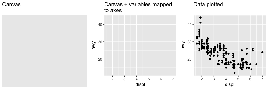
Note that when you added the geom layer you used the addition (+) operator. As you add new layers you will always use + to add onto your visualization.
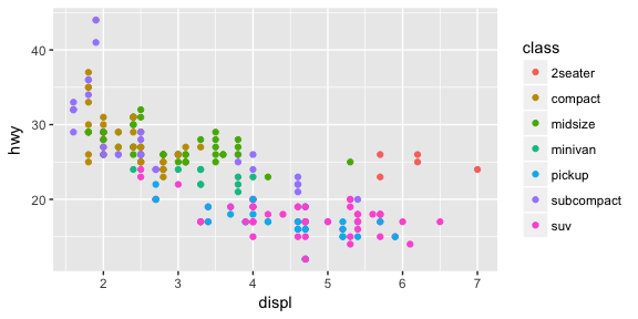
The aesthetic mappings take properties of the data and use them to influence visual characteristics, such as position, color, size, shape, or transparency. Each visual characteristic can thus encode an aspect of the data and be used to convey information.
All aesthetics for a plot are specified in the aes() function call (later in this tutorial you will see that each geom layer can have its own aes specification). For example, we can add a mapping from the class of the cars to a color characteristic:
ggplot(mpg, aes(x = displ, y = hwy, color = class)) +
  geom_point()
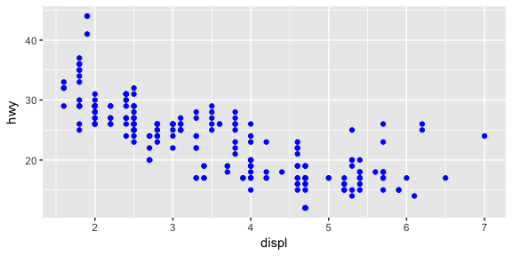
Note that using the aes() function will cause the visual channel to be based on the data specified in the argument. For example, using aes(color = "blue") won’t cause the geometry’s color to be “blue”, but will instead cause the visual channel to be mapped from the vector c("blue") — as if we only had a single type of engine that happened to be called “blue”. If you wish to apply an aesthetic property to an entire geometry, you can set that property as an argument to the geom method, outside of the aes() call:
ggplot(mpg, aes(x = displ, y = hwy)) +
  geom_point(color = "blue")
Building on these basics, ggplot2 can be used to build almost any kind of plot you may want. These plots are declared using functions that follow from the Grammar of Graphics.
The most obvious distinction between plots is what geometric objects (geoms) they include. ggplot2 supports a number of different types of geoms, including:
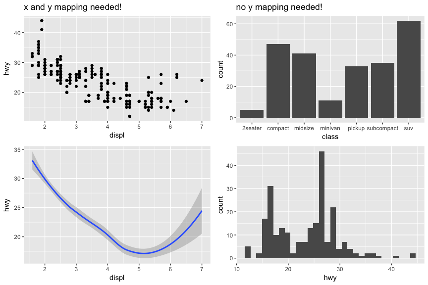
geom_point for drawing individual points (e.g., a scatter plot)geom_line for drawing lines (e.g., for a line charts)geom_smooth for drawing smoothed lines (e.g., for simple trends or approximations)geom_bar for drawing bars (e.g., for bar charts)geom_histogram for drawing binned values (e.g. a histogram)geom_polygon for drawing arbitrary shapesgeom_map for drawing polygons in the shape of a map! (You can access the data to use for these maps by using the map_data() function).Each of these geometries will leverage the aesthetic mappings supplied although the specific visual properties that the data will map to will vary. For example, you can map data to the shape of a geom_point (e.g., if they should be circles or squares), or you can map data to the linetype of a geom_line (e.g., if it is solid or dotted), but not vice versa.
Almost all geoms require an x and y mapping at the bare minimum.
# Left column: x and y mapping needed!
ggplot(mpg, aes(x = displ, y = hwy)) +
  geom_point()

ggplot(mpg, aes(x = displ, y = hwy)) +
  geom_smooth()

# Right column: no y mapping needed!
ggplot(data = mpg, aes(x = class)) +
  geom_bar()

ggplot(data = mpg, aes(x = hwy)) +
  geom_histogram()
What makes this really powerful is that you can add multiple geometries to a plot, thus allowing you to create complex graphics showing multiple aspects of your data.
# plot with both points and smoothed line
ggplot(mpg, aes(x = displ, y = hwy)) +
  geom_point() +
  geom_smooth()
Of course the aesthetics for each geom can be different, so you could show multiple lines on the same plot (or with different colors, styles, etc). It’s also possible to give each geom a different data argument, so that you can show multiple data sets in the same plot.
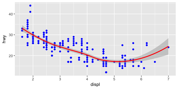
For example, we can plot both points and a smoothed line for the same x and y variable but specify unique colors within each geom:
ggplot(mpg, aes(x = displ, y = hwy)) +
  geom_point(color = "blue") +
  geom_smooth(color = "red")
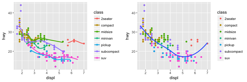
So as you can see if we specify an aesthetic within ggplot it will be passed on to each geom that follows. Or we can specify certain aes within each geom, which allows us to only show certain characteristics for that specificy layer (i.e. geom_point).
# color aesthetic passed to each geom layer
ggplot(mpg, aes(x = displ, y = hwy, color = class)) +
  geom_point() +
  geom_smooth(se = FALSE)

# color aesthetic specified for only the geom_point layer
ggplot(mpg, aes(x = displ, y = hwy)) +
  geom_point(aes(color = class)) +
  geom_smooth(se = FALSE)
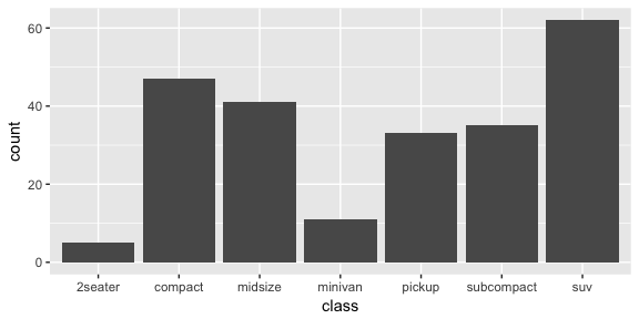
If you look at the below bar chart, you’ll notice that the the y axis was defined for us as the count of elements that have the particular type. This count isn’t part of the data set (it’s not a column in mpg), but is instead a statistical transformation that the geom_bar automatically applies to the data. In particular, it applies the stat_count transformation.
ggplot(mpg, aes(x = class)) +
  geom_bar()
ggplot2 supports many different statistical transformations. For example, the “identity” transformation will leave the data “as is”. You can specify which statistical transformation a geom uses by passing it as the stat argument. For example, consider our data already had the count as a variable:
class_count <- dplyr::count(mpg, class)
class_count
## # A tibble: 7 × 2
##        class     n
##        <chr> <int>
## 1    2seater     5
## 2    compact    47
## 3    midsize    41
## 4    minivan    11
## 5     pickup    33
## 6 subcompact    35
## 7        suv    62
We can use stat = "identity" within geom_bar to plot our bar height values to this variable. Also, note that we now include n for our y variable:
ggplot(class_count, aes(x = class, y = n)) +
  geom_bar(stat = "identity")

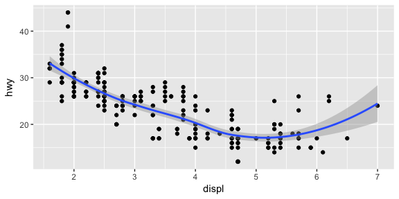
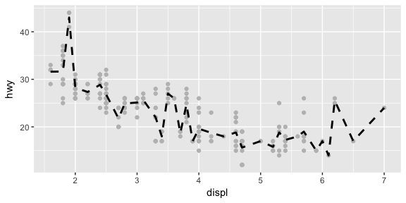
We can also call stat_ functions directly to add additional layers. For example, here we create a scatter plot of highway miles for each displacement value and then use stat_summary to plot the mean highway miles at each displacement value.
ggplot(mpg, aes(displ, hwy)) +
  geom_point(color = "grey") +
  stat_summary(fun.y = "mean", geom = "line", size = 1, linetype = "dashed")
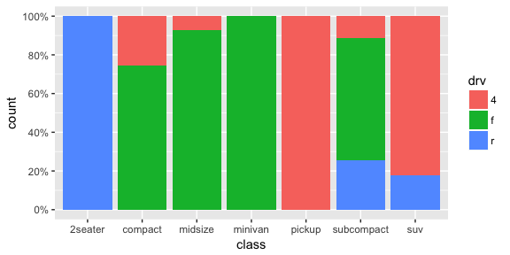
In addition to a default statistical transformation, each geom also has a default position adjustment which specifies a set of “rules” as to how different components should be positioned relative to each other. This position is noticeable in a geom_bar if you map a different variable to the color visual characteristic:
# bar chart of class, colored by drive (front, rear, 4-wheel)
ggplot(mpg, aes(x = class, fill = drv)) +
  geom_bar()
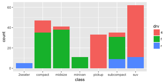
The geom_bar by default uses a position adjustment of "stack", which makes each rectangle’s height proprotional to its value and stacks them on top of each other. We can use the position argument to specify what position adjustment rules to follow:
# position = "dodge": values next to each other
ggplot(mpg, aes(x = class, fill = drv)) +
  geom_bar(position = "dodge")

# position = "fill": percentage chart
ggplot(mpg, aes(x = class, fill = drv)) +
  geom_bar(position = "fill")
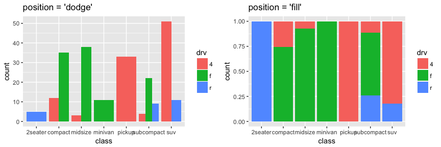
Check the documentation for each particular geom to learn more about its positioning adjustments.
Whenever you specify an aesthetic mapping, ggplot uses a particular scale to determine the range of values that the data should map to. Thus when you specify
# color the data by engine type
ggplot(mpg, aes(x = displ, y = hwy, color = class)) +
  geom_point()
ggplot automatically adds a scale for each mapping to the plot:
# same as above, with explicit scales
ggplot(mpg, aes(x = displ, y = hwy, color = class)) +
  geom_point() +
  scale_x_continuous() +
  scale_y_continuous() +
  scale_colour_discrete()
Each scale can be represented by a function with the following name: scale_, followed by the name of the aesthetic property, followed by an _ and the name of the scale. A continuous scale will handle things like numeric data (where there is a continuous set of numbers), whereas a discrete scale will handle things like colors (since there is a small list of distinct colors).
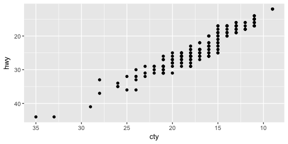
While the default scales will work fine, it is possible to explicitly add different scales to replace the defaults. For example, you can use a scale to change the direction of an axis:
# milage relationship, ordered in reverse
ggplot(mpg, aes(x = cty, y = hwy)) +
  geom_point() +
  scale_x_reverse() +
  scale_y_reverse()
Similarly, you can use scale_x_log10() and scale_x_sqrt() to transform your scale. You can also use scales to format your axes:
ggplot(mpg, aes(x = class, fill = drv)) +
  geom_bar(position = "fill") +
  scale_y_continuous(breaks = seq(0, 1, by = .2), labels = scales::percent)
A common parameter to change is which set of colors to use in a plot. While you can use the default coloring, a more common option is to leverage the pre-defined palettes from colorbrewer.org. These color sets have been carefully designed to look good and to be viewable to people with certain forms of color blindness. We can leverage color brewer palletes by specifying the scale_color_brewer() function, passing the pallete as an argument.
# default color brewer
ggplot(mpg, aes(x = displ, y = hwy, color = class)) +
  geom_point() +
  scale_color_brewer()

# specifying color palette
ggplot(mpg, aes(x = displ, y = hwy, color = class)) +
  geom_point() +
  scale_color_brewer(palette = "Set3")
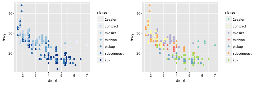
Note that you can get the palette name from the colorbrewer website by looking at the scheme query parameter in the URL. Or see the diagram here and hover the mouse over each palette for the name.
You can also specify continuous color values by using a gradient scale, or manually specify the colors you want to use as a named vector.
The next term from the Grammar of Graphics that can be specified is the coordinate system. As with scales, coordinate systems are specified with functions that all start with coord_ and are added as a layer. There are a number of different possible coordinate systems to use, including:
coord_cartesian the default cartesian coordinate system, where you specify x and y values (e.g. allows you to zoom in or out).coord_flip a cartesian system with the x and y flippedcoord_fixed a cartesian system with a “fixed” aspect ratio (e.g., 1.78 for a “widescreen” plot)coord_polar a plot using polar coordinatescoord_quickmap a coordinate system that approximates a good aspect ratio for maps. See documentation for more details.# zoom in with coord_cartesian
ggplot(mpg, aes(x = displ, y = hwy)) +
geom_point() +
coord_cartesian(xlim = c(0, 5))
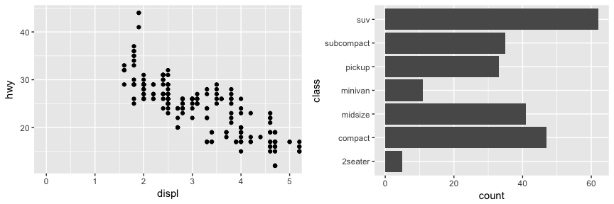
# flip x and y axis with coord_flip
ggplot(mpg, aes(x = class)) +
geom_bar() +
coord_flip()
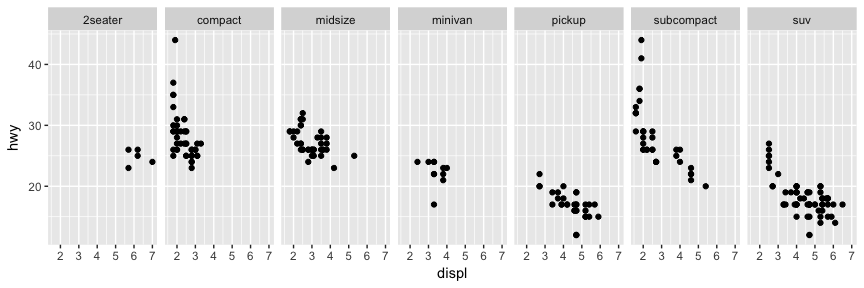
Facets are ways of grouping a data plot into multiple different pieces (subplots). This allows you to view a separate plot for each value in a categorical variable. You can construct a plot with multiple facets by using the facet_wrap() function. This will produce a “row” of subplots, one for each categorical variable (the number of rows can be specified with an additional argument):
ggplot(mpg, aes(x = displ, y = hwy)) +
  geom_point() +
  facet_grid(~ class)
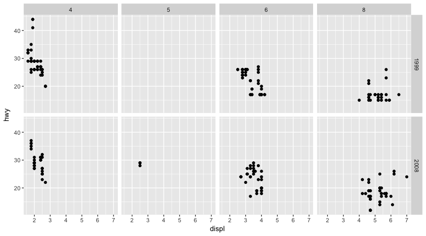
You can also facet_grid to facet your data by more than one categorical variable. Note that we use a tilde (~) in our facet functions. With facet_grid the variable to the left of the tilde will be represented in the rows and the variable to the right will be represented across the columns.
ggplot(mpg, aes(x = displ, y = hwy)) +
  geom_point() +
  facet_grid(year ~ cyl)
Textual labels and annotations (on the plot, axes, geometry, and legend) are an important part of making a plot understandable and communicating information. Although not an explicit part of the Grammar of Graphics (the would be considered a form of geometry), ggplot makes it easy to add such annotations.
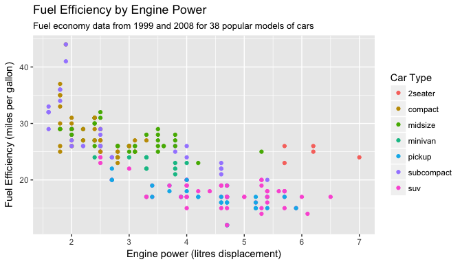
You can add titles and axis labels to a chart using the labs() function (not labels, which is a different R function!):
ggplot(mpg, aes(x = displ, y = hwy, color = class)) +
  geom_point() +
  labs(title = "Fuel Efficiency by Engine Power",
       subtitle = "Fuel economy data from 1999 and 2008 for 38 popular models of cars",
       x = "Engine power (litres displacement)",
       y = "Fuel Efficiency (miles per gallon)",
       color = "Car Type")
It is also possible to add labels into the plot itself (e.g., to label each point or line) by adding a new geom_text or geom_label to the plot; effectively, you’re plotting an extra set of data which happen to be the variable names:
library(dplyr)

# a data table of each car that has best efficiency of its type
best_in_class <- mpg %>%
  group_by(class) %>%
  filter(row_number(desc(hwy)) == 1)

ggplot(mpg, aes(x = displ, y = hwy)) +
  geom_point(aes(color = class)) +
  geom_label(data = best_in_class, aes(label = model), alpha = 0.5)
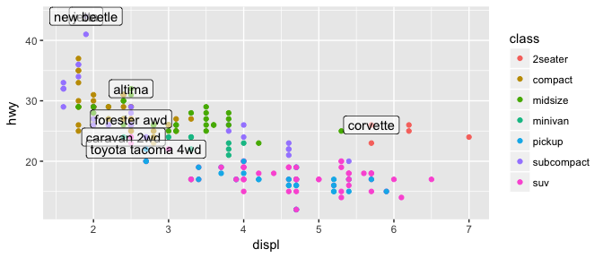
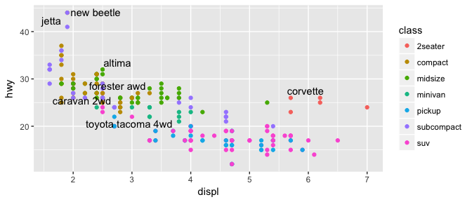
However, note that two labels overlap one-another in the top left part of the plot. We can use the geom_text_repel function from the ggrepel package to help position labels.
library(ggrepel)

ggplot(mpg, aes(x = displ, y = hwy)) +
  geom_point(aes(color = class)) +
  geom_text_repel(data = best_in_class, aes(label = model))
ggplot2This gets you started with ggplot2; however, this a lot more to learn. Future tutorials illustrate how to convert many common forms of visualization (i.e. histograms, bar charts, line charts) and turn them into advanced, publication worthy graphics. Furthermore, the following resources provide additional avenues to learn more:
ggplot2 is easily the most popular library for producing data visualizations in R. That said, ggplot2 is used to produce static visualizations: unchanging “pictures” of plots. Static plots are great for for explanatory visualizations: visualizations that are used to communicate some information—or more commonly, an argument about that information. All of the above visualizations have been ways for us to explain and demonstrate an argument about the data (e.g., the relationship between car engines and fuel efficiency).
Data visualizations can also be highly effective for exploratory analysis, in which the visualization is used as a way to ask and answer questions about the data (rather than to convey an answer or argument). While it is perfectly feasible to do such exploration on a static visualization, many explorations can be better served with interactive visualizations in which the user can select and change the view and presentation of that data in order to understand it.
While ggplot2 does not directly support interactive visualizations, there are a number of additional R libraries that provide this functionality, including:
ggvis is a library that uses the Grammar of Graphics (similar to ggplot), but for interactive visualizations.plotly is a open-source library for developing interactive visualizations. It provides a number of “standard” interactions (pop-up labels, drag to pan, select to zoom, etc) automatically. Moreover, it is possible to take a ggplot2 plot and wrap it in Plotly in order to make it interactive. Plotly has many examples to learn from, though a less effective set of documentation.htmlwidgets provides a way to utilize a number of JavaScript interactive visualization libraries. JavaScript is the programming language used to create interactive websites (HTML files), and so is highly specialized for creating interactive experiences.Examples in this module adapted from R for Data Science ↩